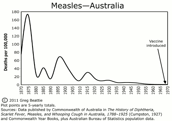
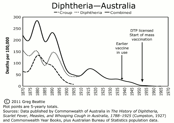
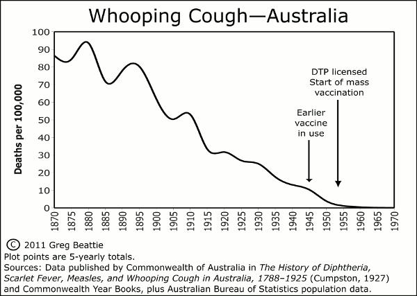
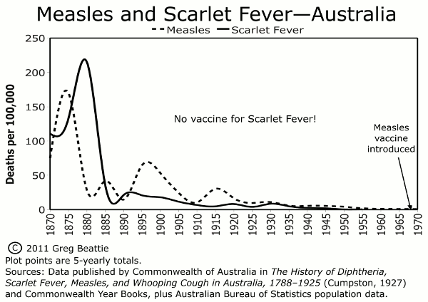
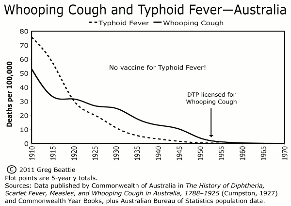
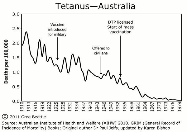
The following graphs are taken from Chapter One of “Fooling Ourselves”. They help us put vaccination into correct historical perspective.
To download an archive of all graphs in the book, please click here.
For an archive of printable (high quality) versions, please click here.
Note: you are free to use/republish any of my graphs as you see fit.
For a spreadsheet of the data used to plot these graphs, as well as links to the source data and a quick reference table of key data points, click here.