Part 2 in a series covering the COVID-19 issue. Please read Part 1 first.

It was the declaration that COVID-19 was spreading in epidemic fashion that justified the unprecedented restrictions we’re now living with. Was that declaration based on evidence?
When the media and, later, health experts all around the world, noted that the number of people testing positive was increasing substantially each day, they announced that the disease was spreading uncontrollably. But in Part 1 we discovered that they were overlooking something vital: that the number not testing positive was growing in parallel.
This is a basic mistake in science. Very basic. Let’s use another example to illustrate. Say we want to assess the extent of left-handedness in our city. We start by counting five left-handed people in our own street. A couple of days later we count 50 in our neighbourhood. We then recruit some helpers and count 500 in a whole suburb. The following week we ask the team to spend the next three weeks covering the whole city. Let’s say they count 5000.
Would that mean that the extent of left-handedness in our city increased dramatically from five to 5000 in the space of one month?
This naturally raises, then, another question: whether the available evidence supports the thesis that COVID-19 is or has been spreading.
To answer that question definitively, we need to know whether there has been an increase in COVID-19 incidence: cases per capita. This can be determined only by comparing random, representative samples of the population over time.
Unfortunately, on COVID-19, we don’t have such data. It is possible, though, to test the thesis here and there.
Daily testing figures from many countries have been published, and, as mentioned in Part 1, some of these include day-by-day totals for both the positive and negative test results. Although these samples are neither random nor representative, being fresh daily surveys of a defined subset of the population makes them worth looking at; and the eligibility criteria for this subset has remained fairly constant throughout. So plotting the ratio of positives to negatives for each day should let us gauge the trend. If the disease is spreading, the positive-to-negative ratio in a region should rise; and if the disease is spreading in epidemic fashion, the ratio should rise exponentially.
So let’s take a look at that. Starting again with South Korea, Figure 5 reminds us of the simple case count (i.e. the positives only) that was the basis for the pandemic declaration. (The data used to plot the following three graphs can be compiled from official South Korea media releases.) It looks convincing at first, doesn’t it.
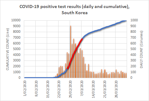
Remember, it was these numbers, reproduced for each country in turn, that prompted media calls for urgent action. (I’ve highlighted the steepest part of the rise in red; I’ll explain why shortly.)
Let’s now plot the daily ratio of positives to negatives. In a disease increasing in typical epidemic fashion, we should see this ratio increase markedly as the days pass. Let’s first examine the entire period that Figure 5 covered, before focusing on a particular part of it.
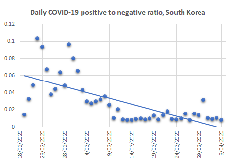
I’ve included a computer-generated ‘line of best fit’ in these plots to help us visualise the trend. As mentioned above, in an epidemic we should see an increase; in fact, it should be an exponential increase. But here we see the opposite: a decrease.
Hold that thought.
Now let’s check the most dramatic segment of the period: the part marked in red in Figure 5. Clearly this represents the steepest increase in cases. If that represents a spread in the disease, we should at least see an increase here in our ratio of positives to negatives (Figure 7).
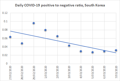
But, as you can see, we see no such increase. Even during this — apparently, South Korea’s worst — period, there was no increase. Significantly, too, the South Korean Government imposed no lockdowns, curfews, or other severe social restrictions on the population. Was this because South Korean health experts read the signs correctly? They focussed on extensive testing, quarantining only those who tested positive but not otherwise introducing physical distancing.
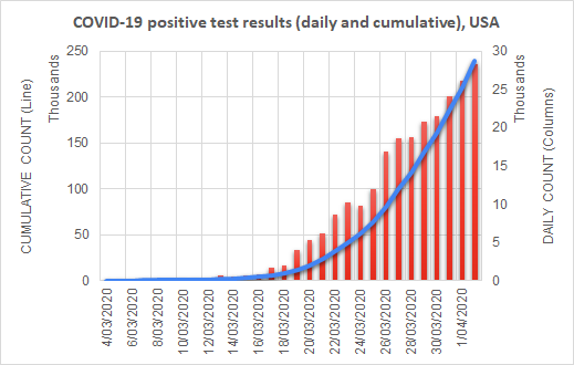
Let’s now take a look at the U.S.A., where a lot seems to have happened since I published Part 1. Again, we’ll start with a reminder, in Figure 8, of the image that prompted first the media and, later, health experts to call for severe social restrictions to curb the ‘pandemic’. (Data for the following two graphs is available from the COVID Tracking Project.)
Now let’s jump straight to the daily positive-to-negative ratio over the same period, in Figure 9.

This time, I’ve coloured the dots blue up to March 16 and red thereafter. I did this because the U.S.A. went into virtual lockdown after the 16th, giving us an opportunity to compare before and after and a line of best fit for each of the two periods.
The first thing to note is that the ratio decreased in the first period, just as it did in South Korea — and has increased since.
The blue half was the period during which the country was accused of dragging its heels: no social restrictions. President Trump was accused of not taking the threat seriously, and he came under intense international pressure to do something. So he did. It is only since then that the U.S.A. has been under ever-increasing lockdown, and only since then that test results suggest any evidence of COVID-19 spread.
Are you seeing a pattern yet? South Korea:- no lockdowns; COVID-19 incidence decreasing, even during the apparently worst period. The U.S.A.: no lockdowns, and incidence decreasing; then lockdowns and incidence increasing.
I mentioned in Part 1 that the published data for Australia were scanty. One state, however, has published enough data to enable a similar analysis: New South Wales. Figure 10 shows the ratio of positives to negatives in that state from early March. I have again split the data into before (blue) and since (red) restrictions were put into place.
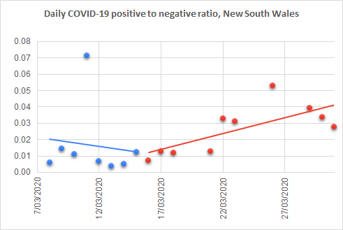
In Australia, restrictions date back to March 13, when the Prime Minister announced that outdoor gatherings were to be limited to 500 and indoor gatherings to 100. From that day, offices began instructing staff to work from home, and university students began switching to online classes. People were advised to stay 1.5 metres apart. On March 23, pubs, clubs, gyms, cinemas, and places of worship were closed by order, and restaurants and cafes were restricted to take-away trading. Gatherings were further restricted to 10, before being limited on March 27 to just two.
Again we see a downward trend in the ratio of positives to negatives prior to the restrictions, and an upward trend following them.
Since writing Part 1, some readers have urged me to present Italy’s data. Case numbers can be found via the official Italian source, or an English translation from Wikipedia, but, unfortunately, neither provides a day-by-day count of ‘negatives’. Although it’s tempting to calculate these by subtracting the ‘positives’ from the total number tested, I’ve resisted doing that so far, because it’s actually not the correct way to do things. Due to the time it takes to process tests, the positives reported on any day represent outcomes of tests that were likely carried out one, two, or even more days beforehand.
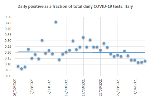
The data in Figure 11, showing the number of positives reported on each day as a fraction of the total tests reported on that day, will therefore be somewhat inaccurate due to such date slippages. Nevertheless, the numbers suggest a modest increase throughout most of the month of March, followed by a decrease at the tail end. Italy was under severe restrictions for the entire period graphed. The country’s lockdowns began on February 27 in several northern regions, and increased as the days went on, culminating in a strict nationwide lockdown on March 11. For two weeks following this strict lockdown, a very high proportion (around one-quarter) of tests returned positive results.
Back to the point
I present all of this not in order to argue that the restrictions were counterproductive, although they may have been, but rather to demonstrate that the justification for imposing them did not exist. Data for both Australia and the U.S.A. showed no indication that we were facing an epidemic that required unusual intervention, let alone the restrictions we now face; and South Korea, one of the most densely populated countries in the world, demonstrates that such measures were not needed there.
Of course, there may be other explanations for what we have observed here:
- there may be further data that the various governments have not published (although the possibility that they had published some of the data but left out the bits that provided the justification for their actions is so bizarre as to be unlikely);
- in the cases of Australia, the U.S.A., and Italy, the increases observed after restrictions would have been much worse had restrictions not been imposed (although South Korea suggests quite the converse);
- the data were of poor quality and shouldn’t be used for this (which, though valid, would raise the questions of what data they did base their decisions on and why they did not share them).
In relation to the last point, it’s worth noting that the tested population is not necessarily representative of the wider population (as those tested have had to meet certain criteria) and will change as the eligibility criteria for testing become more inclusive. To my knowledge, the criteria have been stable over the period examined in this post, at least in Australia. At the time of writing, however, news is emerging that the requirement to have had overseas travel or contact with a known case is about to be relaxed.
Hindsight is always good; I realise that. Nevertheless, the decision to impose social and other restrictions, the likes of which we’ve not seen before and hopefully will never see again, was evidently not justified even at the time it was made. Hindsight merely rubs that in.
One final point: even if we were facing a substantial threat, what is the evidence that lockdowns and other restrictions are the answer? Writing about the harms of exaggerated information in relation to COVID-19, John Ioannidis, one of the most cited medical researchers in the world, wrote that “A systematic review on measures to prevent the spread of respiratory viruses found insufficient evidence for entry port screening and social distancing in reducing epidemic spreading.”
Of course, we have not yet addressed the deaths ascribed to COVID-19. And I’m afraid that that topic will have to await the next instalment.