In 2020, we closed our doors — and, in the process, closed off many lives. We sent numerous businesses to the wall, never to be retrieved, and ruined livelihoods. In some cases, entire industries collapsed.
People were ordered to stay at home. Social interaction became a crime; human contact, a sin. We locked many of our most vulnerable members up and denied their families and friends the right to visit, even while they were dying. We stopped people from gathering in groups and banned handshakes, as well as sitting on beaches, even alone. We outlawed attendance at important social events, including weddings and funerals.
Desperate measures indeed, in response to apparently desperate circumstances. By all accounts, a pandemic was sweeping the globe; according to some, the worst in living memory. Record numbers were dying. Every day, our media channels were flooded with stories and images of hospitals and morgues overflowing, trucks carrying the dead away, and doctors openly weeping about the hopelessness of the situation. It must have been a very bad year. In fact, it must surely have been the worst in a long time.
But was it? In this instalment, we’ll compare it with previous years.
Our information comes from a new collection in the Human Mortality Database: Short-term Mortality Fluctuations. This contains weekly all-cause deaths in 38 countries. Of these, seven countries’ data were incomplete1 at the time of writing. That leaves 31 countries for analysis. I’ve chosen the period from 2000 to 2019 to compare with 2020, although many countries’ data were available only for the more recent years. My calculations and methods are available for perusal by anyone interested. (Note: all-cause deaths are all deaths regardless of cause.)
Was 2020 the worst year on recent record?
Figures 12 and 13 compare each country’s death rate in 2020 with the average of annual rates in its comparison period. For each country, the graphs show the percentage by which 2020’s rate exceeded or fell below that average. Figure 12 uses age-standardised rates; Figure 13, unadjusted (crude) rates.
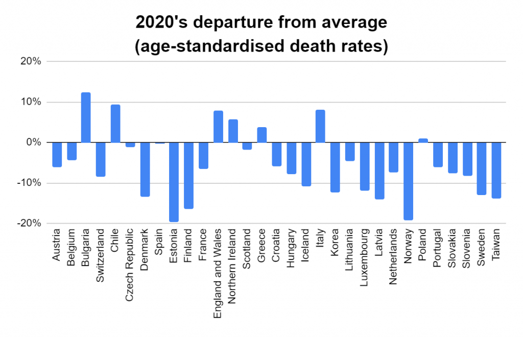
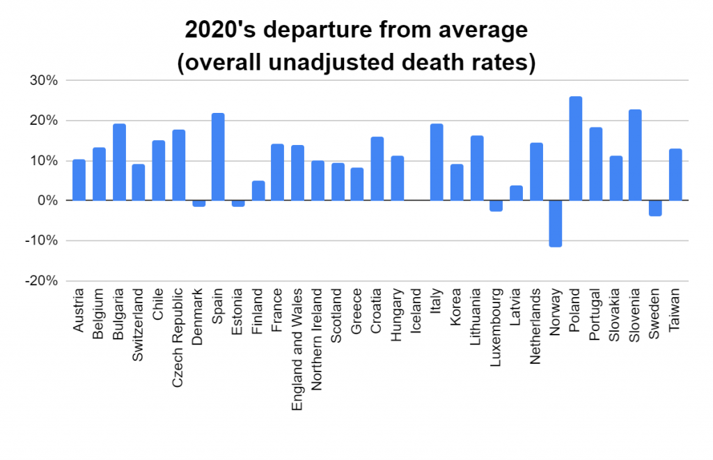
The two graphs tell quite different stories, don’t they. Figure 12 indicates that 2020 was uneventful in comparison with previous years. In only seven of the 31 countries was the death rate even above average. On the other hand, Figure 13 suggests that it was a bad year indeed.
If we pool the numbers from all 31 countries and analyse them as if they came from one big country, we find that the age-standardised rate was 7.6% below average in 2020, whereas the unadjusted death rate was 13% above it.
That’s a world of difference! Which should we be taking notice of?
The answer is that we should be taking notice of age-standardised rates — which means Figure 12. Although we are typically fed the unadjusted rates used in Figure 13, alongside headlines such as “Worst pandemic since… (pick a time)”, unadjusted rates are, for our purposes, virtually devoid of value. I’ll explain why that is, immediately below, and then we’ll move on and analyse the year more thoroughly.
Let’s begin by taking a close look at South Korea’s death rates (per 1000 population) over the past 11 years (Table 1).
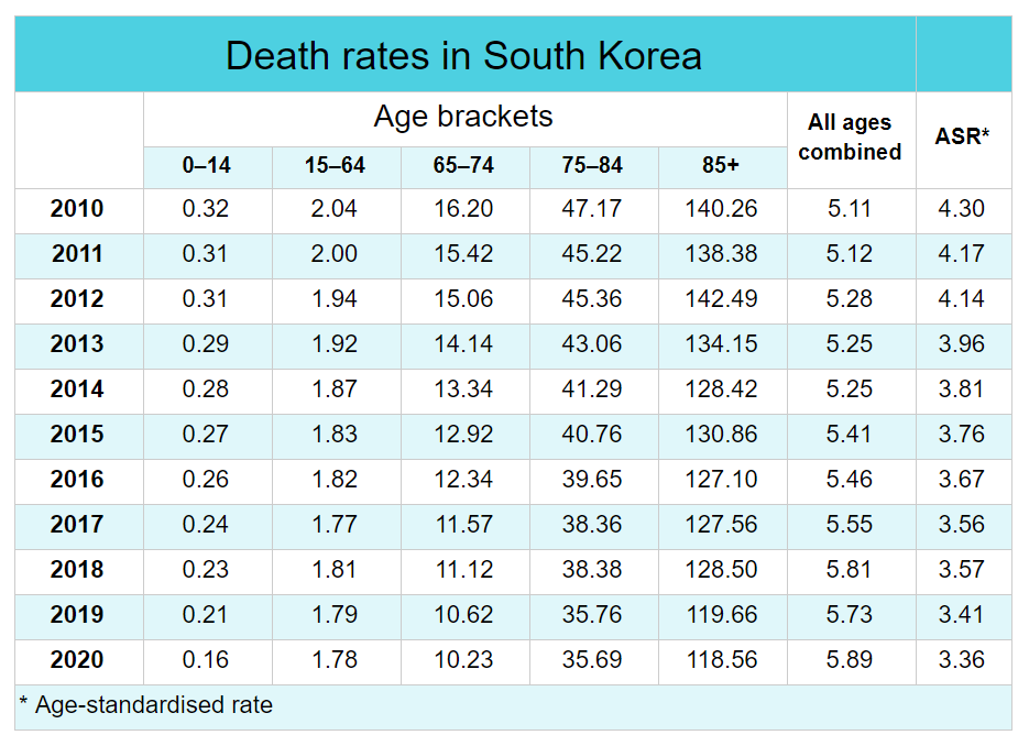
Focus firstly on the five columns under the heading “Age brackets”. These list, for each year, a separate death rate for each age category. Together they cover the entire age spectrum of the population. Note that there is a steady decrease in each and every one of these five columns over the period, with 2020 showing a record low. Of the 11 years on record, the best year for every age category in South Korea was 2020.
Now shift your attention to the “All ages combined” column. This is the death rate for the country as a whole, regardless of age (also called the unadjusted or crude death rate). One would think that it should reflect the same pattern evident in the previous five columns. But no — it shows a steady increase over the period, with the population’s 2020 death rate being a record high. That’s the exact opposite of what we see in the first five columns.
So did things get worse or better over the decade, and was 2020 the worst year or the best?
Getting old
It’s evident that, in South Korea, any one age category’s risk of dying lessened as time went by, and that 2020 was the best year. The reason we get such a different story when we view the overall population’s death rate is that the population as a whole was “ageing”. Over the 10 years from the end of 2010 to the end of 2020, although the number of under-65-year-olds remained fairly steady, the size of the over-65-year-old population grew by more than 50%. In fact, the number of people aged 85 years or more grew by a whopping 128%. And, of course, these are the ages at which most deaths occur naturally.
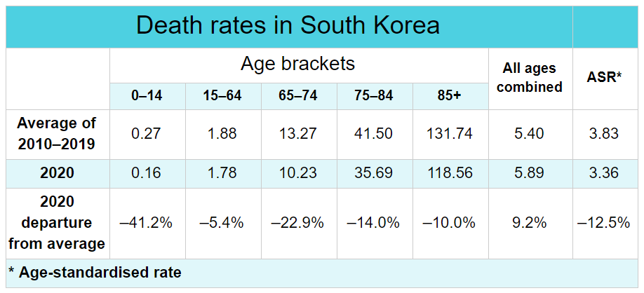
This explains why, in South Korea, although 2020 mortality in each and every age category was unmistakeably lower than the previous decade’s average, the overall death rate exceeded the average by 9.0% (Table 2). It occurred simply because, year by year, an increasing fraction of the population fell into the top age categories.
This “ageing population” phenomenon is not peculiar to South Korea. It is occurring to a greater or lesser extent in almost all countries, at present, and many of them display trends as starkly contrary as we see in South Korea.
[For a more thorough understanding of this perplexing phenomenon, look up Simpson’s Paradox. It’s well-known to statisticians and, in fact, the very reason that they calculate, and use, age-standardised rates when comparing deaths between populations.]
So we can’t rely, for guidance as to the severity, or even presence, of a pandemic or other unusual event, on overall death rates: they can be, and usually are, completely misleading. But unfortunately they’re also the rates most often quoted to us — leaving us to imagine that the population is facing growing danger when in reality it is simply growing in age.
In comparing 2020 death rates with previous years’ rates (and with other countries’ rates when it’s useful), one way to circumvent the “ageing population” problem is to confine our attention to rates such as those we saw in the five age categories in Table 1: age-specific rates. That seems simple enough, and we’ll do that as part of our analysis. But those rates are often not available to us. Even when they are, it means looking over a lot of numbers rather than a single rate for each year in each country. A more convenient way to draw valid comparisons is to use the age-specific rates to calculate age-standardised rates (ASRs), as we did for the first graph (Fig 12) and the final column of Tables 1 and 2.
The usefulness of age standardisation
What makes an ASR both appealing and useful is that it is a single figure summarising all of the age categories, but biased far less than the crude death rate is by the population’s age shape. ASRs are typically calculated by applying to the individual death rates of each age bracket the age shape of a reference population — a shape that remains constant. The rates shown in the ASR column in our tables were calculated using the WHO’s World Standard Population as the reference population. As can be seen in Table 1, a population’s ASRs provide a basis for single-figure comparisons of the risk of dying in a given year that is far more faithful to the patterns affecting each age category than crude death rates do.
The effect in older people
By all reports, the claimed increase in deaths in 2020 was focused squarely on the older section of the population. Exploring this is a simple matter of selecting three of the five age-specific columns we focused on in Table 1 — 65–74, 75–84, and ≥85 — for all 31 countries, and graphing for each category 2020’s departure from previous experience, as we did in Figure 12, beginning with 65- to 74-year-olds (Figure 14).

Here, we see that in the majority of countries (23 of the 31), the death rate in 2020 was actually lower than the previous average. With the exception of Bulgaria, the remaining countries had small to moderate increases above average.

Similarly, in 75- to 84-year-olds (Figure 15), only seven of the 31 countries registered a death rate in 2020 that was higher than the previous average, and none of these rose above 10% higher. Of the remaining 24 countries — all of which had a below-average death rate in 2020 — half were more than 10% lower, and two were at least 20% lower.

Finally, amongst those aged 85 years or more (Figure 16), in 18 countries the death rate was above average in 2020; and, in the remaining 13, it fell below average — the increases being similar in magnitude to the decreases. We should recall, however, that the open-endedness of this age category renders the category somewhat liable to the effects of Simpson’s Paradox. Should deaths for those 85 years or older be similarly broken down into 85- to 94-year-olds and those 95 years and older, 2020 may likewise reveal itself to be one of the kinder years on recent record in most countries even for those aged 85 or more.
To get back to our original question: was 2020 the worst year?
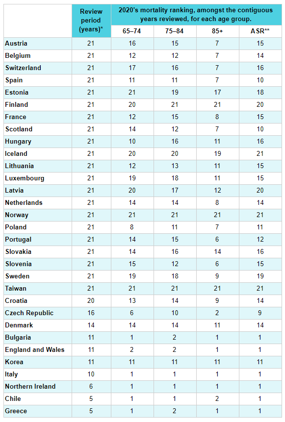
Let’s rank the years from worst to best. Table 3 does just that: rather than compare 2020 with the average of the previous years, it ranks each older age category’s 2020 mortality rates amongst those years, country by country. You’ll see a “1” where 2020 was the worst year, a “2” where it was second-worst, and so on, depending on how many years were available for review (see second column, “Review period”). 2020’s rank is listed independently for age groups 65–74, 75–84, and 85+, followed by its age-standardised death rate.
It looks perhaps a little daunting, but let’s take the first row, Austria, as an example. Reading the columns left to right, we see that Austria provided 21 years of data for review (covering our full review period, 2000–2020), and that 2020 was:
- the 16th-worst (or 6th-best) year for those aged 65–74 years;
- the 15th-worst (or 7th-best) year for 75- to 84-year-olds;
- the 7th-worst for those aged 85 or more; and
- the 15th-worst (or 7th-best) year for overall age-standardised death rate.
Derived using data from the Human Mortality Database. Calculations and methods.
* For most countries, the collection covers 2020 and the preceding 20 years. Four countries provided data from 10 years or less. Countries with fewer years available for review fall toward the end of the table.
** Age-standardised death rate of the entire population.
For those who find the table a bit cumbersome, let me summarise briefly. The table reveals, for each country, how 2020 stacked up against the previous years for each age category.
Among 65- to 74-year-olds, 2020 was:
- the worst year in five countries, but
- the best year in another five;
- in the worse half of the years in nine countries, but
- in the better half in 21;
- the median (middle) year in the remaining country.
In 75- to 84-year-olds, 2020 was:
- the worst year in three countries, but
- the best year in five;
- within the worse half of the years in six countries, but
- within the best half in 23;
- the median year in the remaining two countries.
For those aged 85 or more, 2020 was:
- the worst year in five countries, but
- the best year in another four;
- amongst the worse half in 19 countries, and
- the better half in nine;
- the median year in the remaining three.
But, as mentioned, we should recall that the category’s open-endedness renders it somewhat liable to the effects of Simpson’s Paradox. So, should deaths for those 85 years and older be further disaggregated, 2020 may likewise reveal itself to be one of the better years on recent record for most countries.
Finally, of overall age-standardised death rates, 2020 was:
- the worst year in six countries, but
- the best year in five;
- amongst the worse half of the years in eight countries, but
- among the better half in 22;
- the median year in one country.
Note that a “1” indicates that 2020 is the worst year of the relevant country’s review period — and that there are relatively few instances of it in the table’s 2020 mortality rankings. Yet if the event that the world endured in 2020 were in truth “the worst pandemic of our lifetime”, a few more 1’s would seem in order. Indeed, a “1” for 2020 in a majority of countries might seem a reasonable minimum requirement for contemplating the measures we recalled at this article’s outset. And if 2020 was not the worst year, meaning that other years were worse, why didn’t those years result in business closures, border closures, lockdowns, widespread media censorship, crippling of international airlines and the spectre of vaccine “passports”?
Perhaps the most common governmental reaction to the pandemic was not the paragon of rationality that it has been painted as. Perhaps a more rational response — one that resulted in a perfectly ordinary year by the country’s health standards without closing down an economy and a democracy — was the one pursued by the country made a pariah for taking a different approach: Sweden.
What happened in Sweden?
When Swedish authorities declined to impose lockdowns or other harsh restrictions on the country, they met with international condemnation and grim forecasts. Its different approach made Sweden, in the minds of many, the defacto “control” population in a worldwide experiment: one that would show us just how terribly the remaining countries could have suffered if they hadn’t shut down. Yet Sweden’s age-standardised death rate was in 2020 its third-lowest of the past 21 years. Even in the country’s oldest age category, eight of the previous 20 years saw higher death rates than did 2020.
If that’s as poorly as the rest of the world might have fared through adopting similar policies, then were we simply jumping at shadows?
It might have been tempting to imagine that the pandemic of a lifetime was in fact on our doorstep, and that death rates might have soared but for containment measures in the form of lockdowns and other harsh restrictions. But the experience of Sweden in managing a similar, perhaps better, outcome without resorting to any of those measures suggests otherwise.
Conclusion
The question of whether 2020 was the worst, or even a worse than average, year for mortality, of recent years, appears to be answered above. Whether the year represented a departure from trend, and why some countries experienced a problem though others did not, remain unanswered.
In the next article, I will provide individual graphs and a brief summary of the available data from each of the 31 countries in an attempt to shed more light on whether our actions in 2020 amounted to a necessary manoeuvre to outwit the most severe threat humanity has faced in recent times, or just a wishful grope in the dark.
The data and methods underlying this article are available at this link.
1. At the time of writing, three countries (Australia, Canada, and Russia) hadn’t yet collected all of 2020’s data. The data from a further four countries (Israel, New Zealand, Germany, and the U.S.A.) were split into age categories differing from the majority of countries’ categories. The creators of the collection artificially split the data from those countries into the more commonly used age categories by making assumptions on the basis of previous years, but doing so makes comparisons using the standard age brackets subject to some uncertainty. For these reasons, I’ve excluded those seven countries from the analysis. But similar analyses of the changes over time in Israeli, New Zealander, German, and U.S. death rates, using their defined age brackets, may still provide useful insights.
[Acknowledgement: special thanks to John P. Harvey for substantial comment, suggestion, and editorial assistance.]
Im interested to know the modes of which people were dying. Did strokes go down? What kind of mortality was going up and what down, in which age groups? I see it possible that we afforded quite a good year that would have otherwise been the worst, via making everyone stay home at attention and missing out on a lot of leisurely and exciting activities and even flus. But I’d have guessed it to be the opposite: that more people will die in this emergency drill setting… Maybe the 75-84yo group were much less inclined to do activities in general, i’d say thats why their death rate was improved in general for these countries addressed here. It appears as though no significant issue such as a plague has presented for this group of people in 2020.
Heavy reading but well researched and explained. I wonder what businesses and the general public would say if they knew these facts.
Thanks Greg (and John) I look forward to reading these articles.
The media will never come forth with any of this info.