In Part 7, we looked at a few different ways to approach calculating excess deaths and discussed their relative merits. We focused on Australia.
In this instalment, we take a look at a further 35 countries. These represent all of the countries included in the Short-term Mortality Fluctuations (STMF) dataset available from the Human Mortality Database.
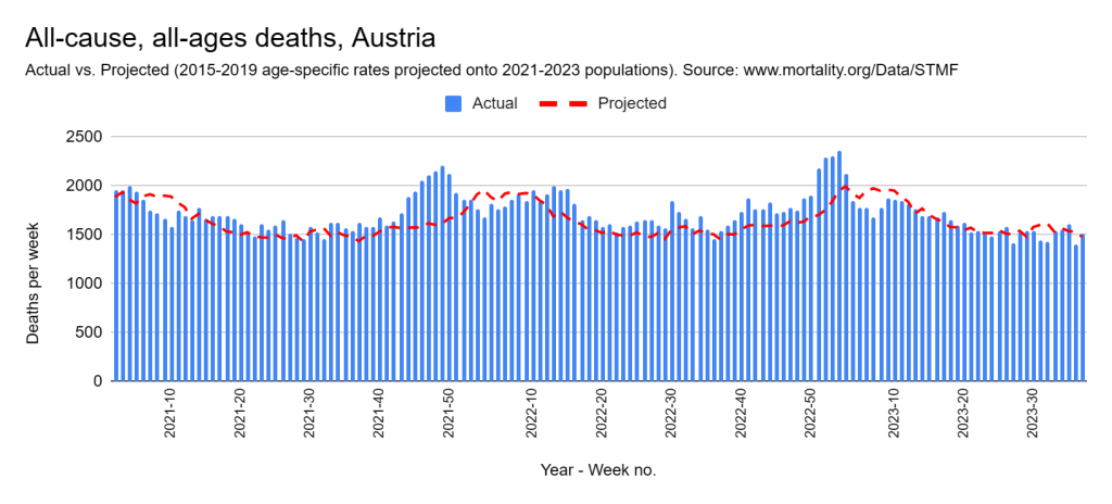
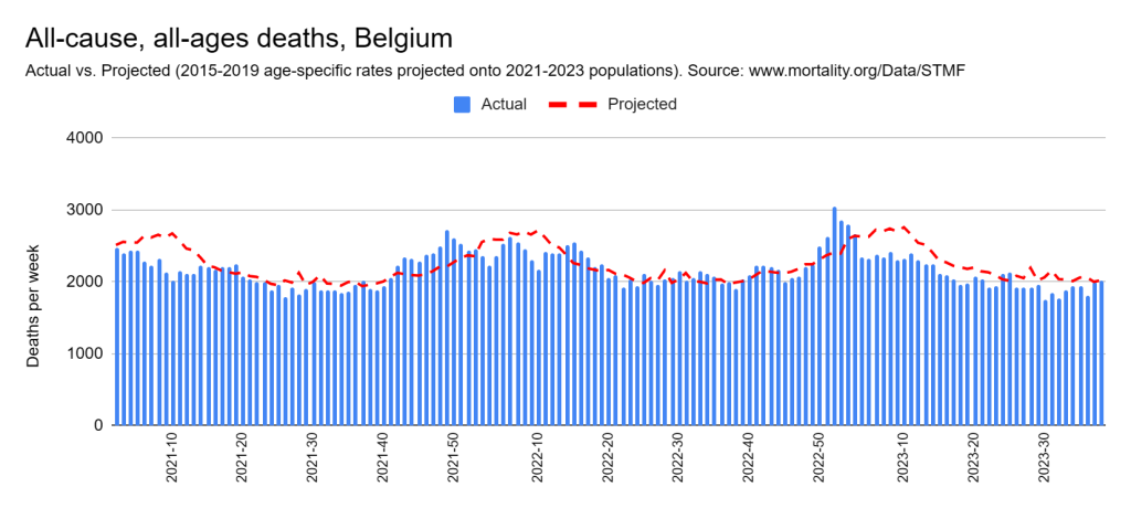
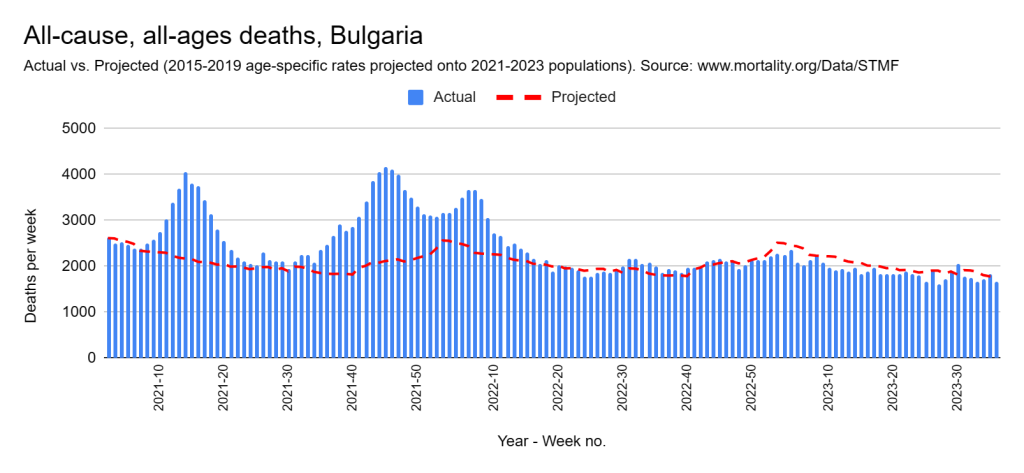
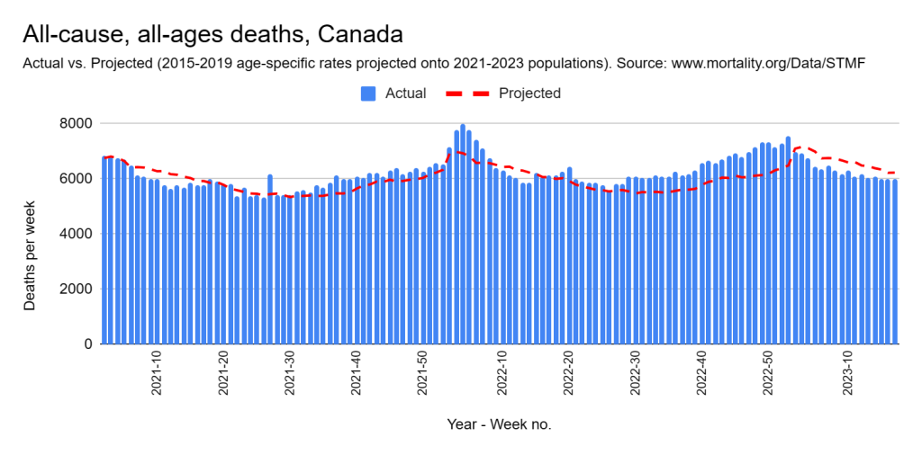
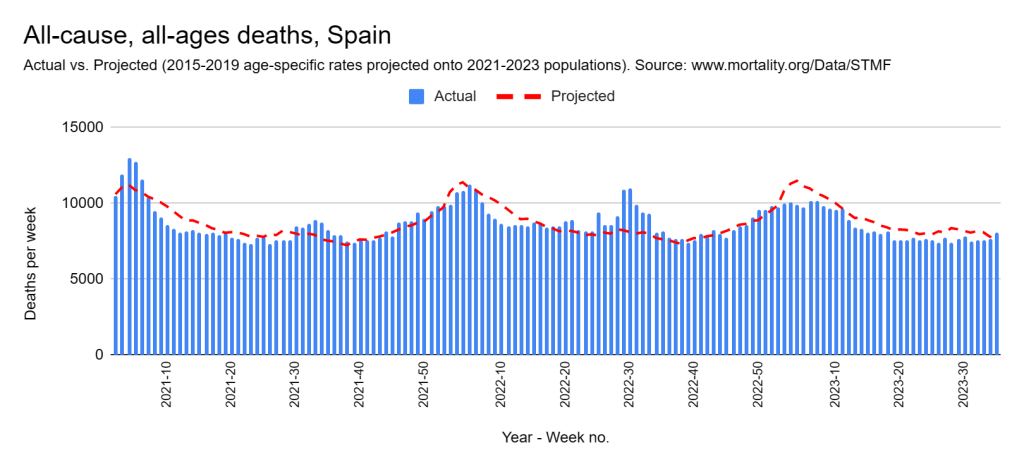
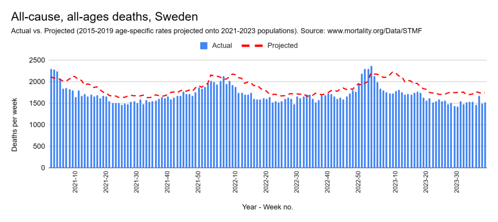
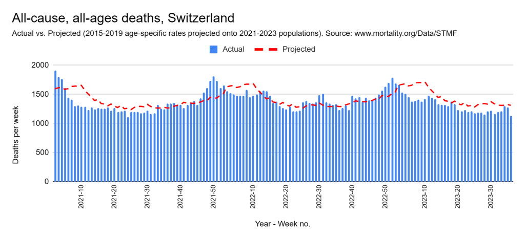
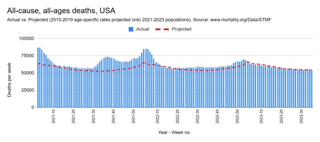
The graphs are presented below. Each country is covered from the start of 2021 through to the latest week in 2023 for which data was available. The blue columns represent weekly death counts. The red dotted line shows the count we expect to see had the conditions of the five years immediately preceding 2020 in that country prevailed. The only adjustments made to these projections is for population size and age-structure. Please read Part 7 for a more detailed explanation.
What do we see?
Each country has been placed into the following table in the column that I think it belongs regarding how well it fared compared with the previous period. You may have a different take and I urge you to look through the graphs and decide for yourself.
No worse
Perhaps worse
Definitely worse
Belgium
Austria
Bulgaria
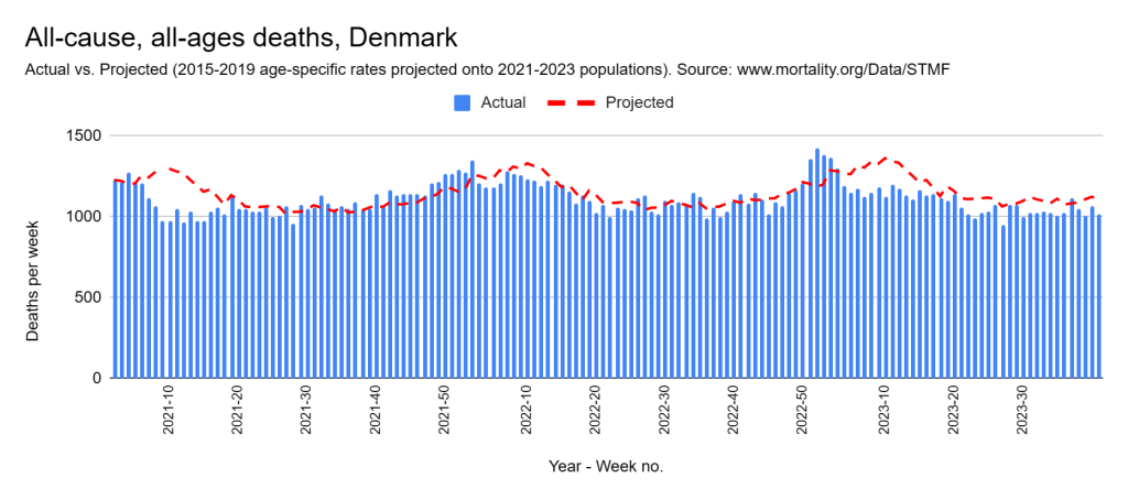
Denmark
Canada
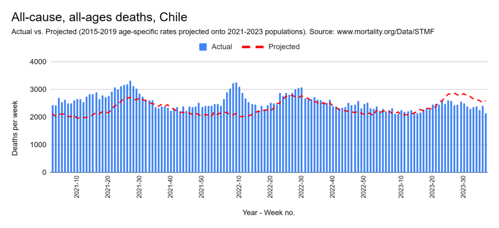
Chile
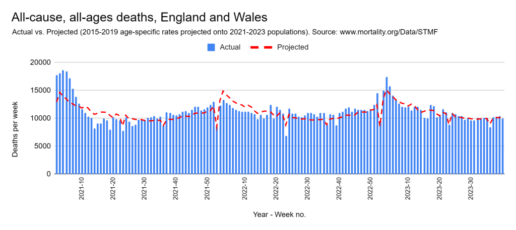
England and Wales
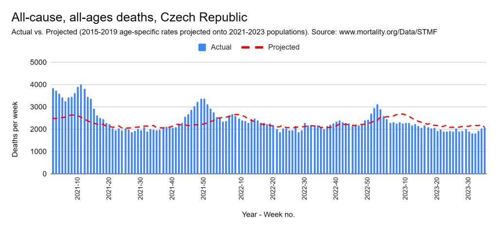
Czech Republic
Croatia
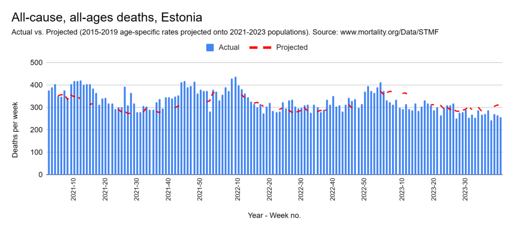
Estonia
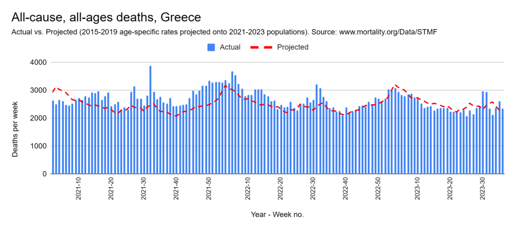
Greece
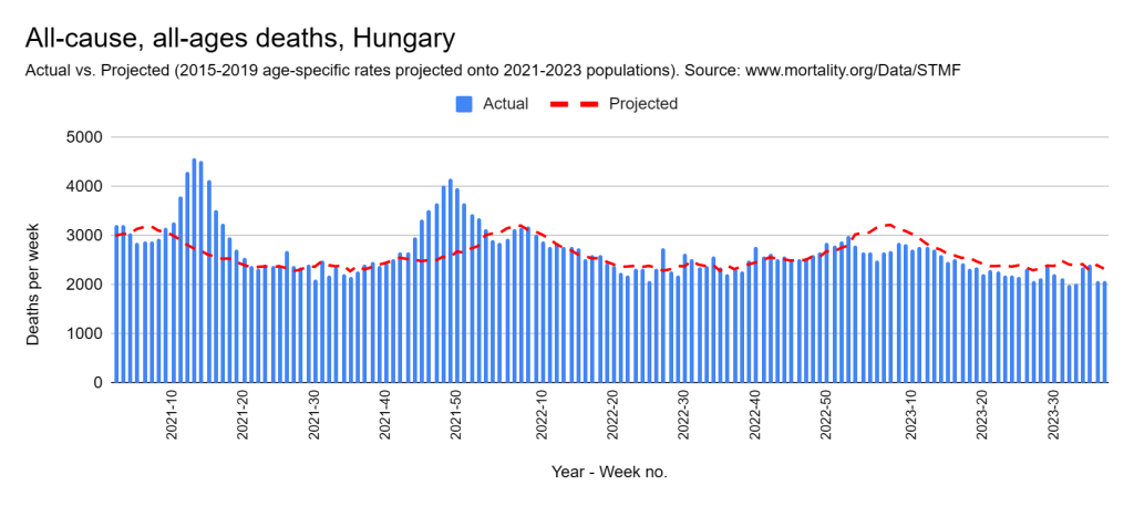
Hungary
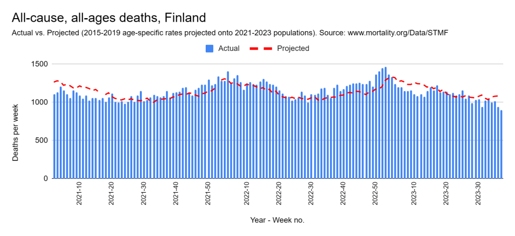
Finland
Germany
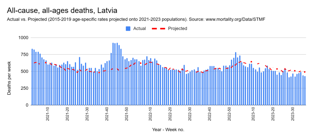
Latvia
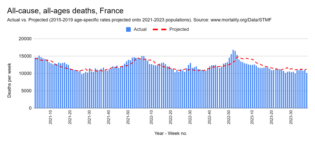
France
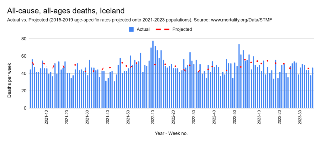
Iceland
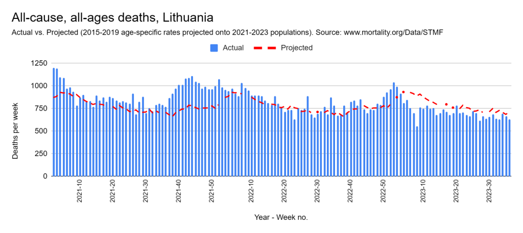
Lithuania
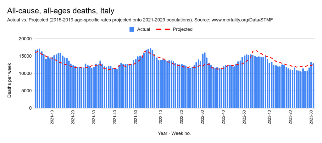
Italy
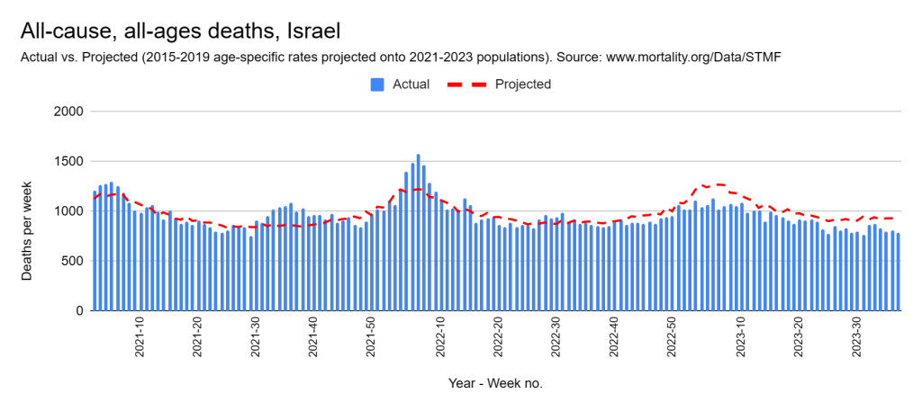
Israel
Poland
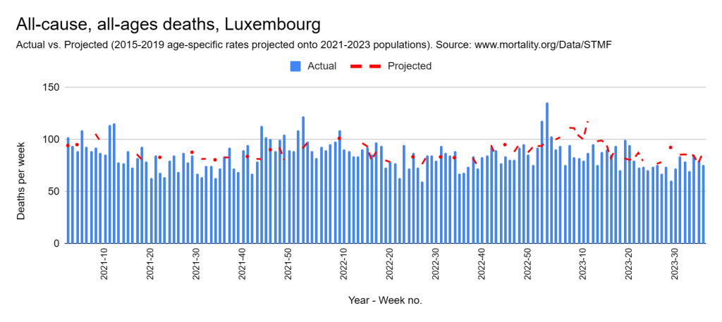
Luxembourg
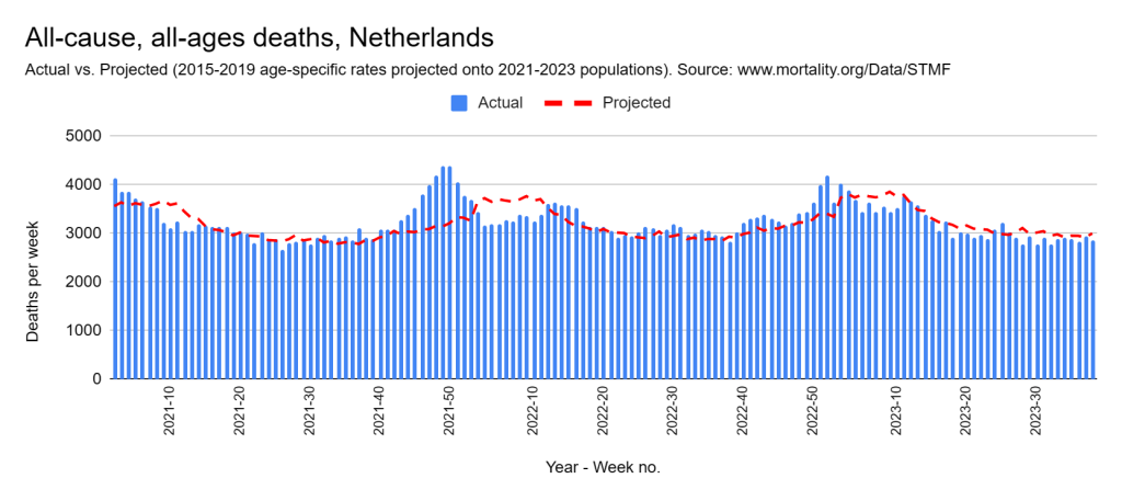
Netherlands
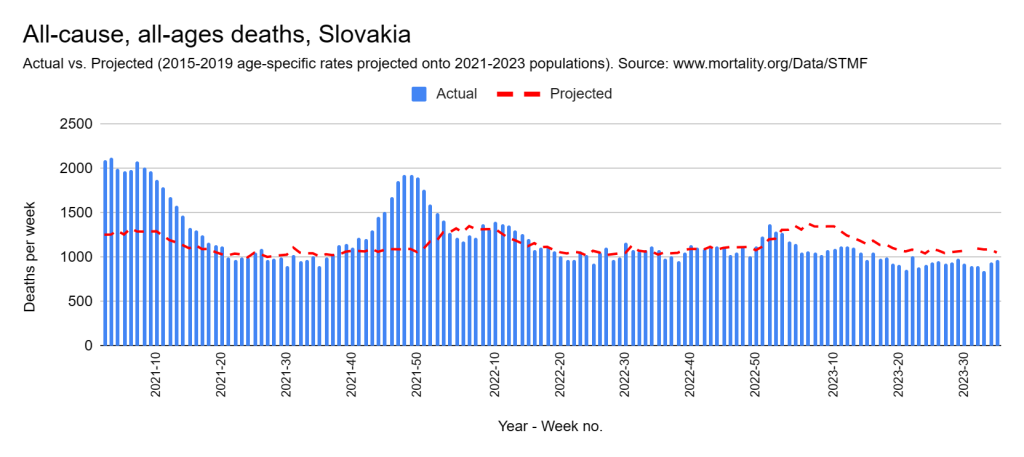
Slovakia
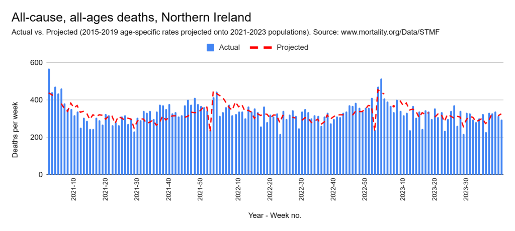
Northern Ireland
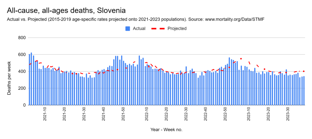
Slovenia
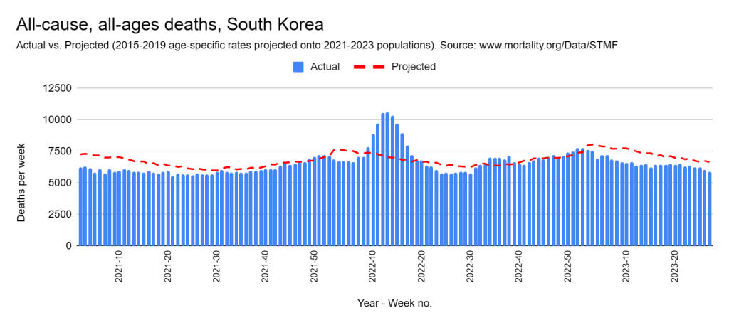
South Korea
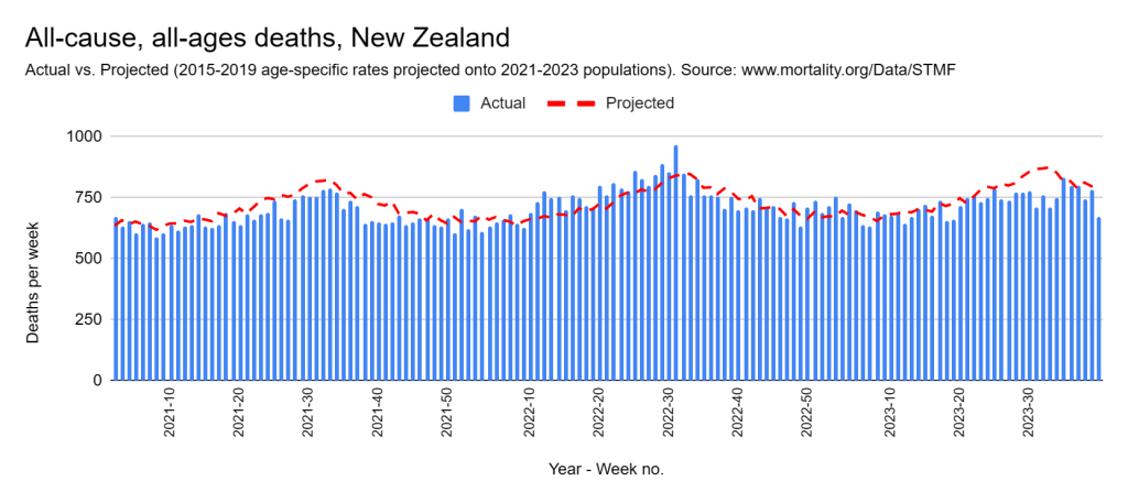
New Zealand
USA
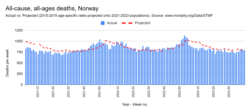
Norway
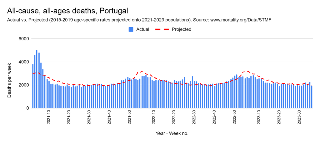
Portugal
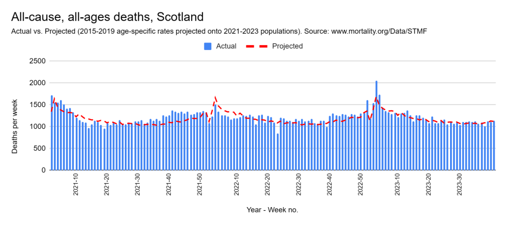
Scotland
Spain
Sweden
Switzerland
One stand-out feature is the experience of England and Wales, Northern Ireland, and Scotland. Their death counts appear to be almost a replica of those experienced in the earlier period, after adjusting for population factors. But there are many other countries that appear to have fared no worse, as evidenced by the list in the first column.
A couple of other points to note:
1. For all countries that have definitely fared worse, the bulk of their problems occurred before 2022, with the exception of South Korea.
2. As of 2023, all countries are doing no worse, and sometimes better, than they did before 2020 — without exception!
Now to the graphs! (Scroll to the end for notes on method and data.)
[Method: To arrive at the expected death counts, age-specific death rates for the period 2015-2019 were averaged and then projected onto their matching populations for 2021 2022, and 2023. (Please read Part 7 for a more detailed explanation of this.)
All of the data for the graphs comes from the STMF output file, which can be downloaded here. The SQL query that I used to assemble the data ready for plotting is here. Population estimates were reverse engineered from age-specific death rates and counts. For some countries with very small populations (e.g. Iceland), certain weeks had zero deaths recorded for the youngest age group, resulting in a ‘divide by zero’ error. For this reason, some projected values are missing. These could be easily supplemented with population estimates from the official sources or adjacent calculations.
I acknowledge the Human Mortality Database and the various custodians of the original data for making this valuable resource available to the public.]
That’s a rather provocative title, isn’t it. The content below might be even more so. And why not, given that it’s my first post in more than two years.
This wasn’t the Part 7 that I’d intended to write. That’ll have to be Part 8 or 9 now because this has taken my attention. Let’s get into it!
You’ve all seen alarming articles and posts about ‘excess’ deaths. Be wary of them. Many are flawed. Some calculate large excesses and blame the COVID vaccine rollout. The stories are simple, very appealing, and understandably attract reactions of outrage.
Australia has been singled out as being of particular concern.
Let me start by saying that this was a difficult post for me to write. And it’s only after multiple unsuccessful attempts to reach out to some that I’ve done so. Anyone familiar with my work knows that I’m no fan of vaccination. My position hasn’t changed. I’ve no doubt that the COVID vaccines have caused or contributed to death and disablement. I think there’s ample evidence for that. But many of the simplistic excess deaths arguments I’ve seen are inaccurate.
Excess deaths are difficult to calculate. Actually, they’re impossible. That’s because ‘excess’ is the difference between the number we should’ve seen and the number we did see. And the problem with that is we don’t know the former – too many variables. And when we don’t know something, theories abound.
To illustrate the difficulty, consider the following two simplified approaches. Let’s call them the red-line and the green-line approaches. The graph below illustrates each. It shows weekly deaths in Australia from the year 2015 up to halfway through 2023 (all the public data available at the time of writing).
I’ve coloured the reference period in grey (the “pre-covid” years) and the latter years in blue.
Both approaches involve looking at what happened in the reference period (2015-2019) and predicting then what should’ve happened in the latter years. You won’t ordinarily see these presented with straight lines for the average or trend, mind you. Instead, you’ll likely see a wave-like curve similar to the ‘actual’ deaths, in which each week is presented separately. Now let me explain each.
The red-line
This is the most common approach. It takes a simple average of the reference years and suggests we should see the same in the latter years. Simple and appealing. On the graph, you can see how this works. The solid red line shows the average number of deaths for the reference period. The dotted red line is its projection into the latter years.
To calculate the accumulated excess in the latter years we simply add the amount by which deaths fall above the line and take away the amount by which they fall below the line. Quite large estimates have been published. My calculation is almost 50,000 from the beginning of 2020.
The green-line
Rather than averaging the reference years, the green line shows their trend – also known as the line of best fit. Again, I’ve projected it into the latter years. This time the estimate of excess is much less. In fact, not quite 25,000.
That’s a huge difference! But neither method is accurate. Let’s look at why.
First, why does the green line slope upward? The answer is that deaths increased in number over the reference period. That’s no surprise. They’ve increased constantly for more than a hundred years. And they will continue to do so for many years to come.
That’s because our population is changing in two ways. Firstly, it’s growing in size. A bigger population means there are more people to die.
Secondly – and this is often overlooked – the older part of the population has grown much faster than the younger in recent years. It’s called ‘population ageing’. Over the entire period covered by the above graph, the number of over-75s grew by more than 30%. Given that this is the age at which people typically die, you can imagine what such growth does to the death count.
The first approach (the red-line) fails to take account of these important population factors and that’s why it’s inaccurate.
On the other hand, the second approach (the green-line) is volatile. One or two different results in the reference period can change its slope slightly. And a slight change in slope becomes a big change by the time it’s extended into the latter years. The green-line also amalgamates all the factors that influence that slope, without regard for how they might independently vary.
What do we do?
We clearly need to account for population changes. Ideally, we’d take our simple average from the reference period and adjust it to the new (larger and older) populations of 2021-2023. It turns out we can do that easily!
Age-specific death rates
We first take the reference years and group the population into specific age groups. Dividing the number of deaths in each age group by the population in that group gives us what are called age-specific death rates. These reflect the true frequency of death in each group. In this case of Australia, deaths have been broken down into the following age groups:
0-44, 45-64, 65-74, 75-84, 85 and over.
As you may have guessed, age-specific rates have not been rising over the years, even though raw death counts have. Instead, they’ve slowly declined, reflecting a steady improvement in living conditions. This is the pre-existing trend.
Hold that thought because we’ll come back to it.
If we calculate age-specific death rates for each of the reference years and average them, we’re left with one average reference ‘year’ with five age-specific rates. This gives us a good snapshot of how things were before the pandemic was declared. We can then project that snapshot onto the populations of the years that followed. We do that by multiplying the rate for each group by the population size of that group in the latter years. In doing so, we convert them back to death counts, which we sum for a total count.
This gives us the best of both worlds. Population factors are singled out and taken care of and there is no volatile slope that we need to be cautious about amplifying.
To summarise, this method shows us what would’ve happened in the latter years had nothing changed (other than population factors).
So let’s do that now.
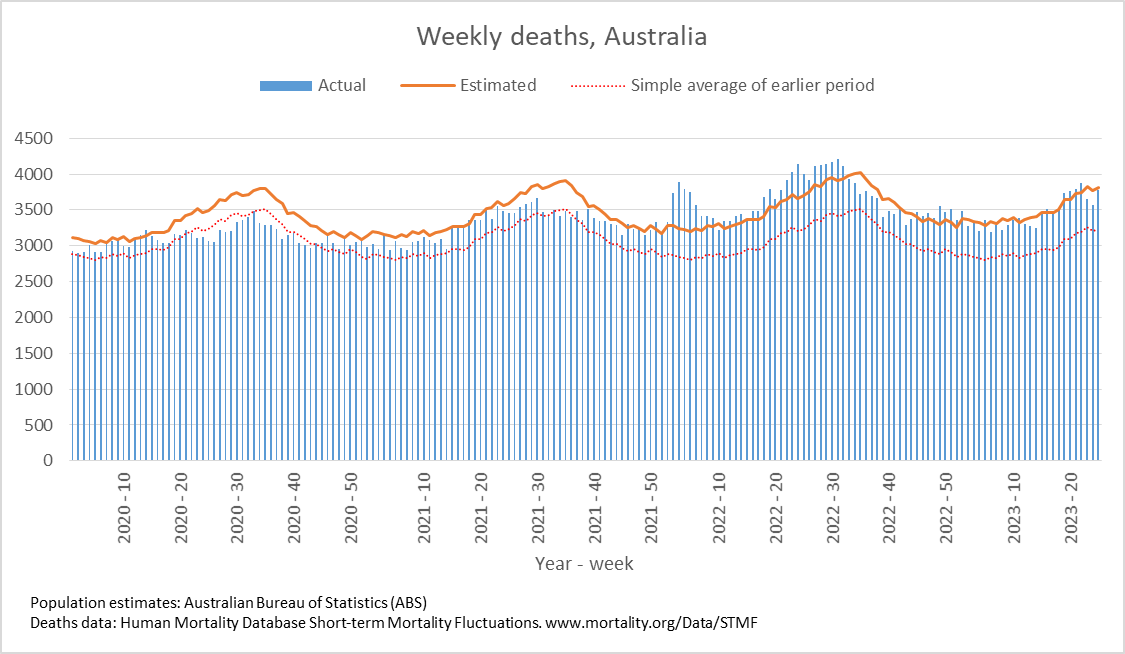
This time the graph covers the latter period, starting in 2020. We see the actual weekly deaths (blue columns) and those we expected to see (orange line) had the circumstances of the reference period prevailed.
Rather than a straight line for the reference average, this time I’ve calculated the averages week by week. That’s why the ‘Estimated’ line follows the wave-like shape of a typical year.
For comparison, I’ve included a dotted red line that shows the red-line (simple average) approach, to serve as a reminder of the magnitude of difference when one fails to account for population changes.
This is our most accurate way of comparing what happened to what would’ve happened had nothing else changed.
So, what do we see?
For a start, deaths in the year 2020 and 2021 appear to be substantially less than expected. There was a major ‘excess’ however in the first half of 2022 followed by an apparent return to normal for the latter half and into 2023 (so far).
The excess in 2022 works out to a little over 6500 for the year. On the other hand, if we accumulate all excess from 2021-2023 (so far) we find almost 1500 fewer deaths than expected, without including 2020 in the calculation!
We were fortunate in Australia. Some countries didn’t fare so well. In the next instalment, we’ll look at them.
ABS and Actuaries
There’s one more question which may be on your lips. Why do the ABS and the Australian Actuaries Institute calculate higher amounts of excess than I have?
Estimates from those two agencies, although they differ slightly from each other, fall about midway between my own and the commonly used red-line approach. They differ from the latter for obvious reasons – they account for population factors.
The main reason they differ from mine is that, in addition to population size and age-structure, they also account for pre-existing trend.
Remember I mentioned earlier that age-specific death rates have been slowly declining over the years, reflecting improvements in living conditions? It works out to roughly 1% decline each year. If we assume that that were to continue, and measure from the mid-point of the reference period, by 2021-2023 we’d expect around 4-6% fewer deaths than we otherwise would’ve expected.
And reduced expectation results in increased estimates of excess.
Their approach asks, “What if we assume that the pre-existing trend continued?”
Mine asks, “What do we see without that assumption?”
The reason I choose to avoid making that assumption is I don’t think it’s reasonable to assume that we could go through something as tumultuous as we did – the panic, the restrictions, the loss of income and support, the mandates etc. – and assume that our circumstances would’ve continued improving.
Having said that, I’m not suggesting that they’re wrong in making that assumption. Their approach illustrates how far we may have deviated from the long-established path.
Another way of putting it: The ABS and Actuaries ask, “Did things keep getting better?” while my approach asks, “Did they get worse?”.
The bottom line is that after accounting for population we appear to be in no worse shape than we were in the reference period, other than the worrying surge at the start of 2022.
In contrast, the red-line approach that so many have used starts with the assumption that nothing – not even population – has changed. This is clearly flawed. Simple and appealing but flawed.
I’ll try to publish the next part in less than two years.
[The data used in this post originates from the Australian Bureau of Statistics: directly in the case of population estimates, and via the Human Mortality Database Short-term Mortality Fluctuations input data downloaded from www.mortality.org/Data/STMF on 2 November 2023 in the case of deaths.]