In Part 7, we looked at a few different ways to approach calculating excess deaths and discussed their relative merits. We focused on Australia.
In this instalment, we take a look at a further 35 countries. These represent all of the countries included in the Short-term Mortality Fluctuations (STMF) dataset available from the Human Mortality Database.
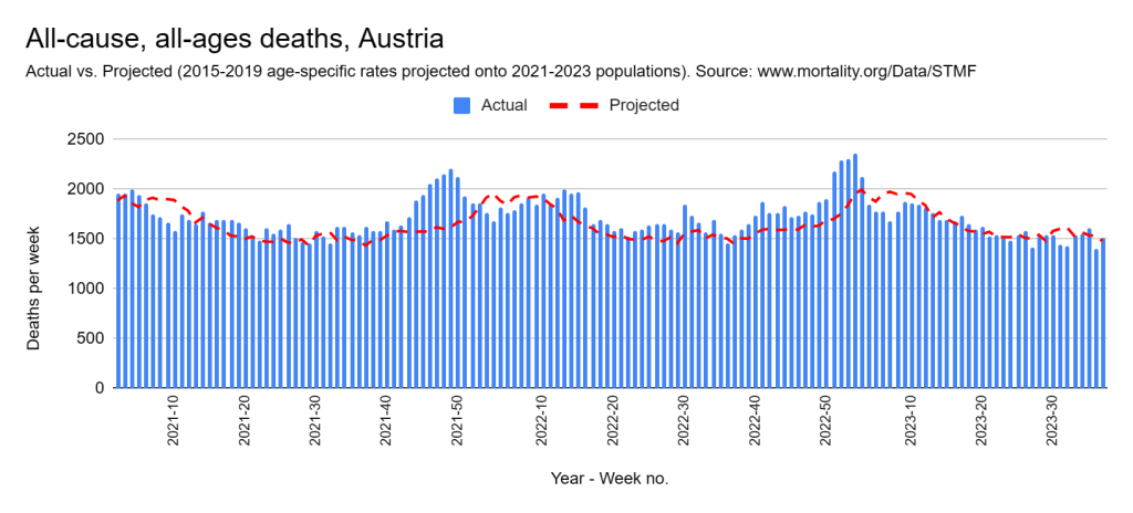
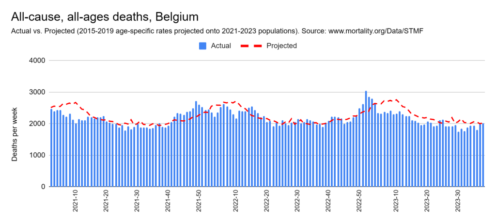
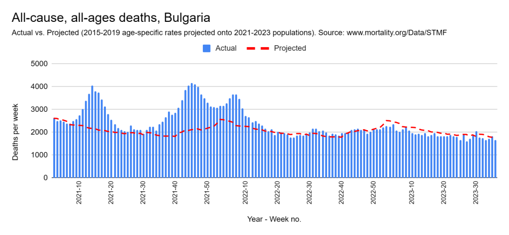
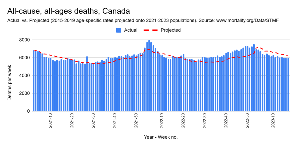
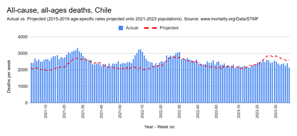
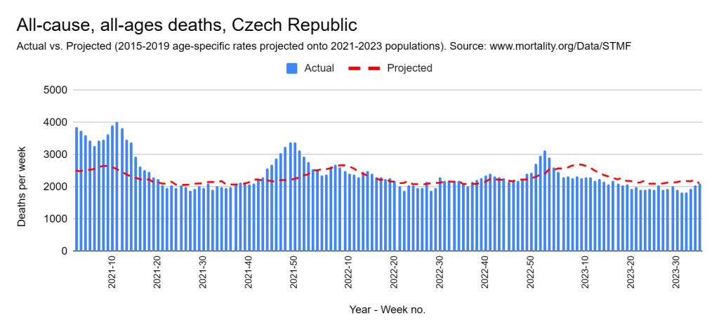
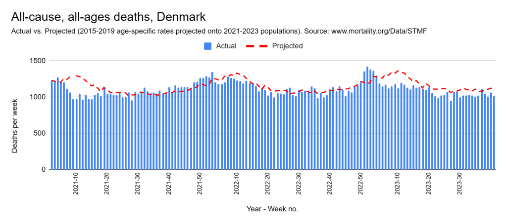
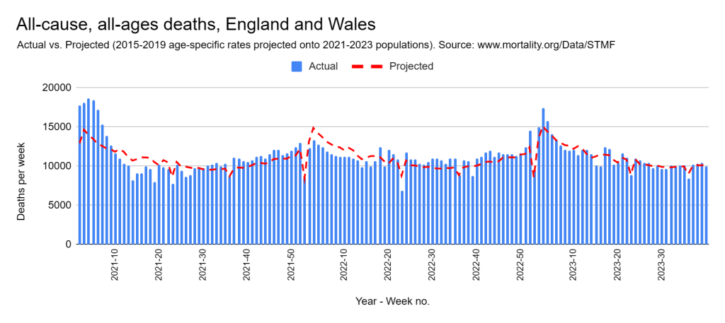
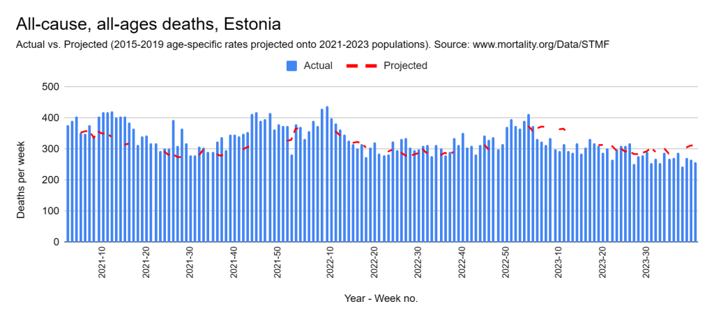
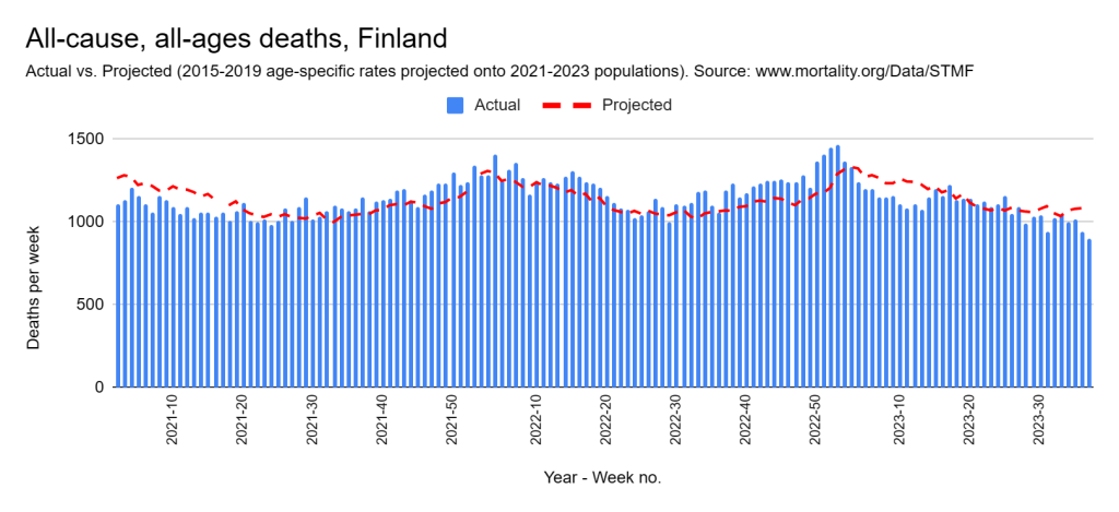
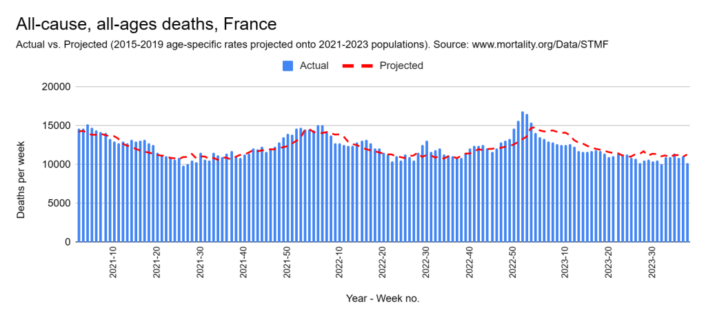
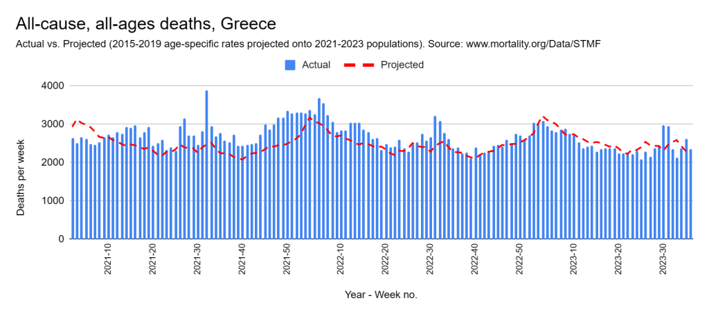
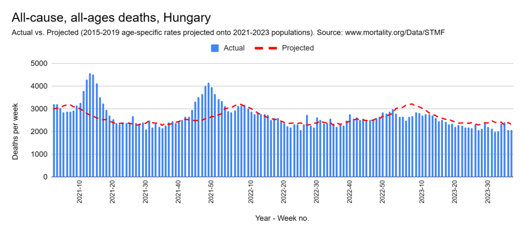
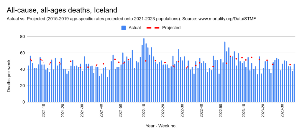
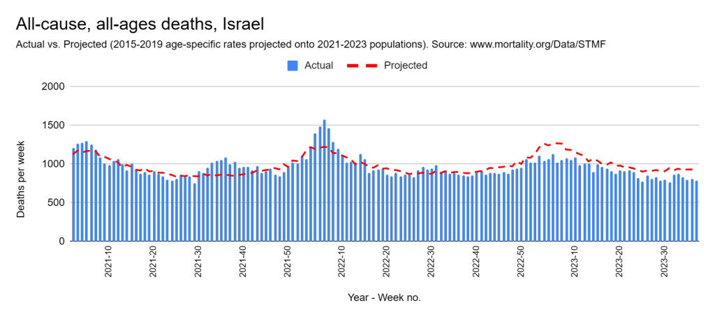
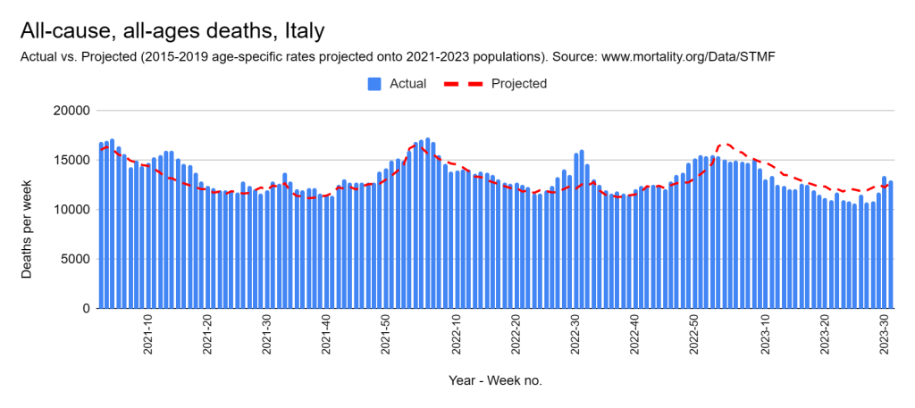
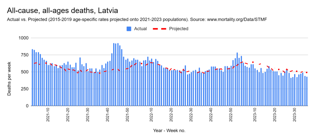
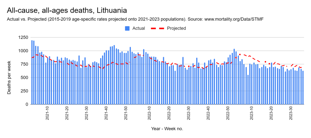
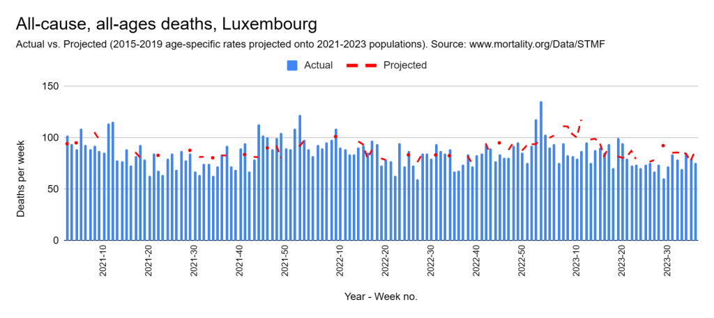
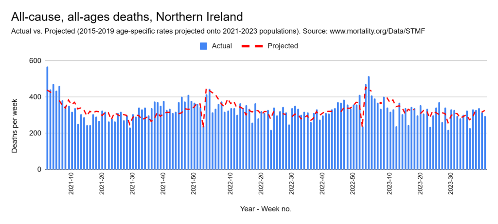
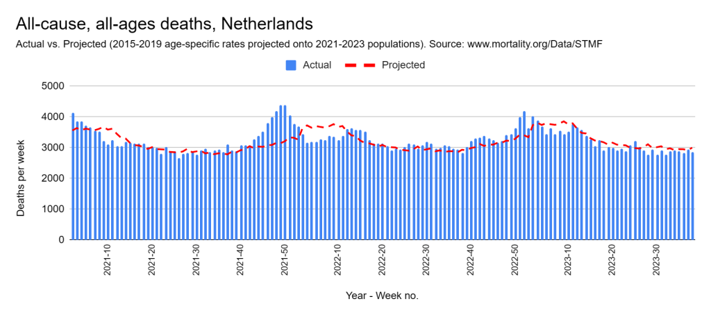
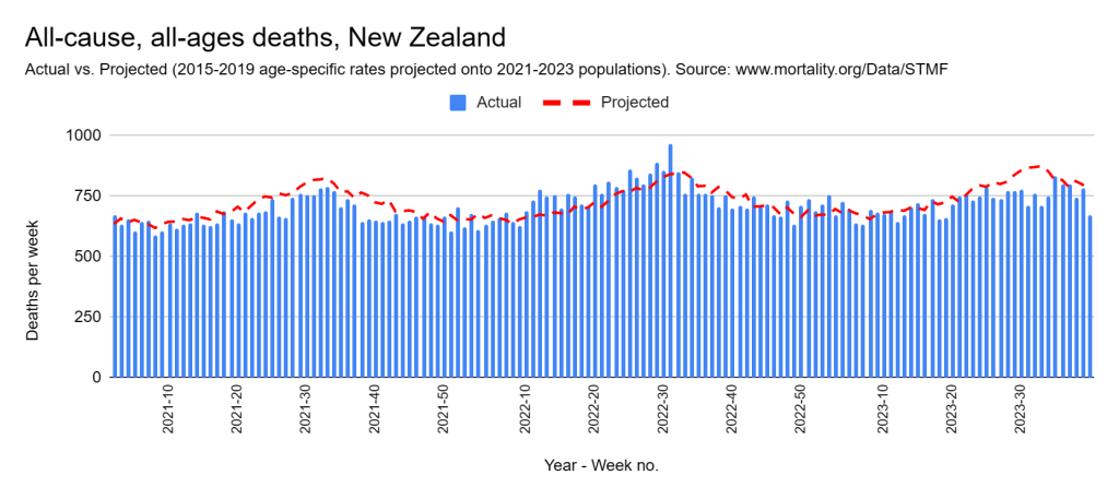
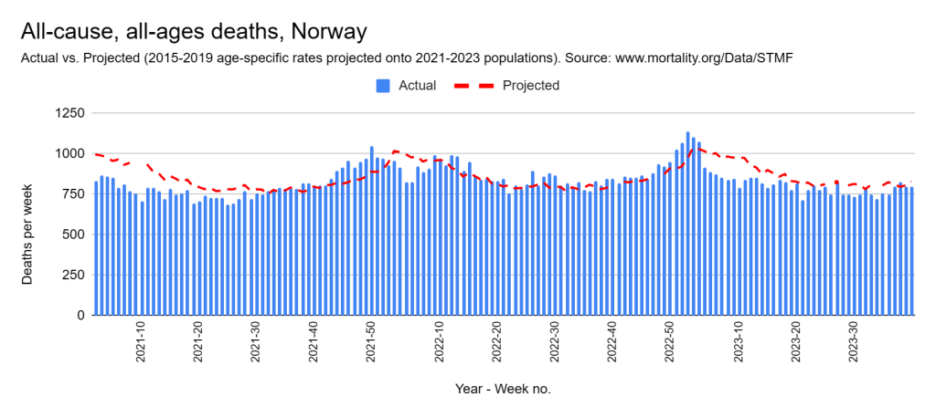
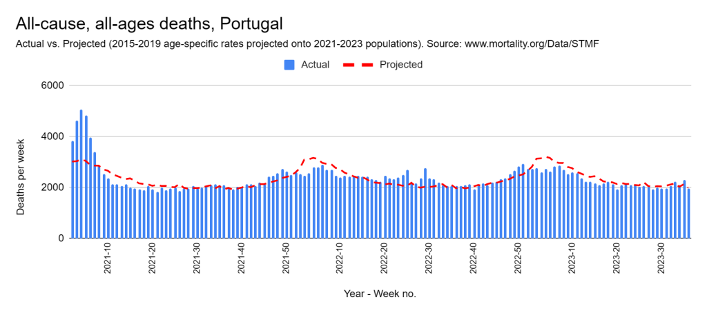
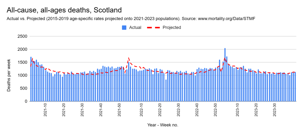
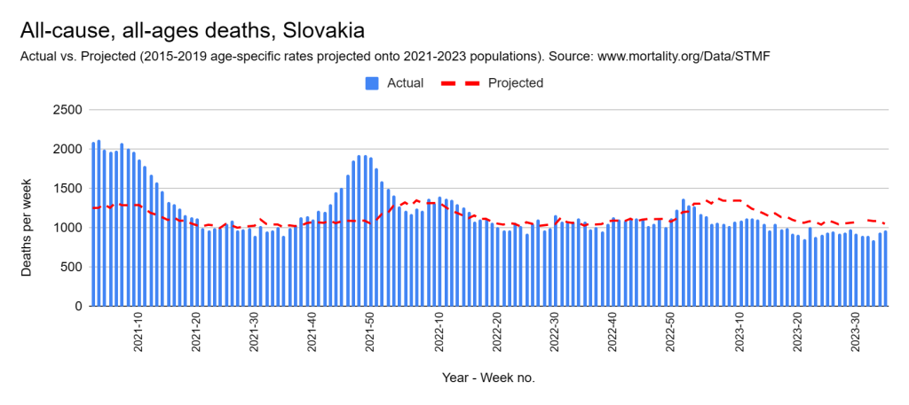
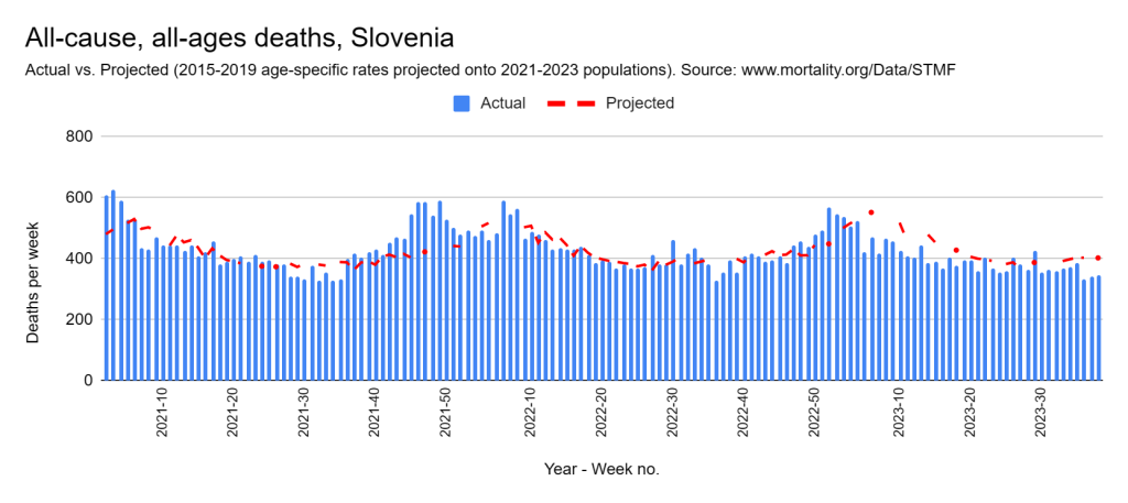
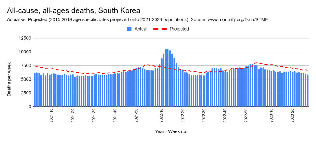
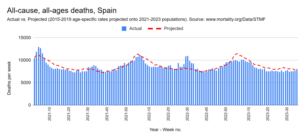
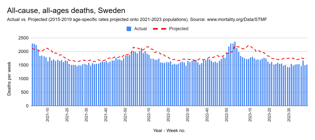
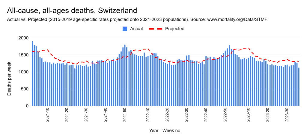
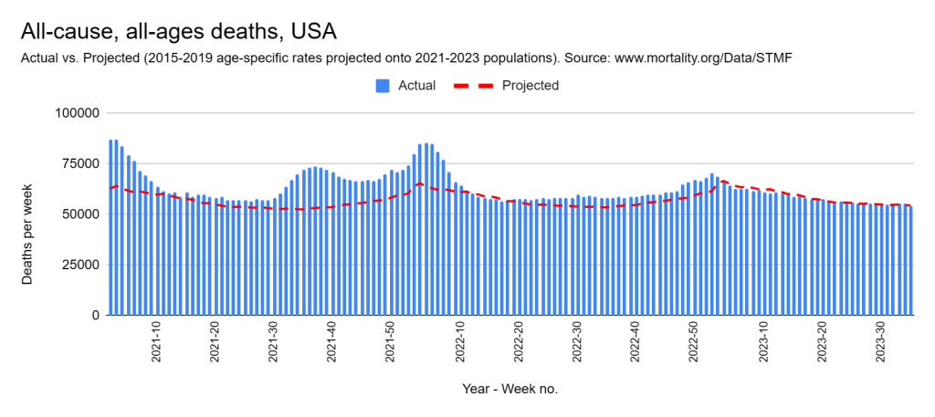
The graphs are presented below. Each country is covered from the start of 2021 through to the latest week in 2023 for which data was available. The blue columns represent weekly death counts. The red dotted line shows the count we expect to see had the conditions of the five years immediately preceding 2020 in that country prevailed. The only adjustments made to these projections is for population size and age-structure. Please read Part 7 for a more detailed explanation.
What do we see?
Each country has been placed into the following table in the column that I think it belongs regarding how well it fared compared with the previous period. You may have a different take and I urge you to look through the graphs and decide for yourself.
| No worse | Perhaps worse | Definitely worse |
| Belgium | Austria | Bulgaria |
| Denmark | Canada | Chile |
| England and Wales | Czech Republic | Croatia |
| Estonia | Greece | Hungary |
| Finland | Germany | Latvia |
| France | Iceland | Lithuania |
| Italy | Israel | Poland |
| Luxembourg | Netherlands | Slovakia |
| Northern Ireland | Slovenia | South Korea |
| New Zealand | USA | |
| Norway | ||
| Portugal | ||
| Scotland | ||
| Spain | ||
| Sweden | ||
| Switzerland |
One stand-out feature is the experience of England and Wales, Northern Ireland, and Scotland. Their death counts appear to be almost a replica of those experienced in the earlier period, after adjusting for population factors. But there are many other countries that appear to have fared no worse, as evidenced by the list in the first column.
A couple of other points to note:
1. For all countries that have definitely fared worse, the bulk of their problems occurred before 2022, with the exception of South Korea.
2. As of 2023, all countries are doing no worse, and sometimes better, than they did before 2020 — without exception!
Now to the graphs! (Scroll to the end for notes on method and data.)


[Method:
To arrive at the expected death counts, age-specific death rates for the period 2015-2019 were averaged and then projected onto their matching populations for 2021 2022, and 2023. (Please read Part 7 for a more detailed explanation of this.)
All of the data for the graphs comes from the STMF output file, which can be downloaded here. The SQL query that I used to assemble the data ready for plotting is here. Population estimates were reverse engineered from age-specific death rates and counts. For some countries with very small populations (e.g. Iceland), certain weeks had zero deaths recorded for the youngest age group, resulting in a ‘divide by zero’ error. For this reason, some projected values are missing. These could be easily supplemented with population estimates from the official sources or adjacent calculations.
I acknowledge the Human Mortality Database and the various custodians of the original data for making this valuable resource available to the public.]
Why have you said that all countries are doing no worse or better in 2023 than they were before 2020, and not included the visual data presentation for this?
I think the entire page is one big visual presentation of it. So I have no idea what you’re thinking, sorry.