COVID-19. Part 8 — excess deaths outside of Australia

In Part 7, we looked at a few different ways to approach calculating excess deaths and discussed their relative merits. We focused on Australia.

In this instalment, we take a look at a further 35 countries. These represent all of the countries included in the Short-term Mortality Fluctuations (STMF) dataset available from the Human Mortality Database.

The graphs are presented below. Each country is covered from the start of 2021 through to the latest week in 2023 for which data was available. The blue columns represent weekly death counts. The red dotted line shows the count we expect to see had the conditions of the five years immediately preceding 2020 in that country prevailed. The only adjustments made to these projections is for population size and age-structure. Please read Part 7 for a more detailed explanation.

What do we see?

Each country has been placed into the following table in the column that I think it belongs regarding how well it fared compared with the previous period. You may have a different take and I urge you to look through the graphs and decide for yourself.

No worsePerhaps worseDefinitely worse
BelgiumAustriaBulgaria
DenmarkCanadaChile
England and WalesCzech RepublicCroatia
EstoniaGreeceHungary
FinlandGermanyLatvia
FranceIcelandLithuania
ItalyIsraelPoland
LuxembourgNetherlandsSlovakia
Northern IrelandSloveniaSouth Korea
New ZealandUSA
Norway
Portugal
Scotland
Spain
Sweden
Switzerland

One stand-out feature is the experience of England and Wales, Northern Ireland, and Scotland. Their death counts appear to be almost a replica of those experienced in the earlier period, after adjusting for population factors. But there are many other countries that appear to have fared no worse, as evidenced by the list in the first column.

A couple of other points to note:

1. For all countries that have definitely fared worse, the bulk of their problems occurred before 2022, with the exception of South Korea.

2. As of 2023, all countries are doing no worse, and sometimes better, than they did before 2020 — without exception!

Now to the graphs! (Scroll to the end for notes on method and data.)

[Method:
To arrive at the expected death counts, age-specific death rates for the period 2015-2019 were averaged and then projected onto their matching populations for 2021 2022, and 2023. (Please read Part 7 for a more detailed explanation of this.)

All of the data for the graphs comes from the STMF output file, which can be downloaded here. The SQL query that I used to assemble the data ready for plotting is here. Population estimates were reverse engineered from age-specific death rates and counts. For some countries with very small populations (e.g. Iceland), certain weeks had zero deaths recorded for the youngest age group, resulting in a ‘divide by zero’ error. For this reason, some projected values are missing. These could be easily supplemented with population estimates from the official sources or adjacent calculations.

I acknowledge the Human Mortality Database and the various custodians of the original data for making this valuable resource available to the public.]

COVID-19. Part 7 — Beware excess deaths arguments

That’s a rather provocative title, isn’t it. The content below might be even more so. And why not, given that it’s my first post in more than two years.

This wasn’t the Part 7 that I’d intended to write. That’ll have to be Part 8 or 9 now because this has taken my attention. Let’s get into it!

You’ve all seen alarming articles and posts about ‘excess’ deaths. Be wary of them. Many are flawed. Some calculate large excesses and blame the COVID vaccine rollout. The stories are simple, very appealing, and understandably attract reactions of outrage. 

Australia has been singled out as being of particular concern. 

Let me start by saying that this was a difficult post for me to write. And it’s only after multiple unsuccessful attempts to reach out to some that I’ve done so. Anyone familiar with my work knows that I’m no fan of vaccination. My position hasn’t changed. I’ve no doubt that the COVID vaccines have caused or contributed to death and disablement. I think there’s ample evidence for that. But many of the simplistic excess deaths arguments I’ve seen are inaccurate.

Excess deaths are difficult to calculate. Actually, they’re impossible. That’s because ‘excess’ is the difference between the number we should’ve seen and the number we did see. And the problem with that is we don’t know the former – too many variables. And when we don’t know something, theories abound.

To illustrate the difficulty, consider the following two simplified approaches. Let’s call them the red-line and the green-line approaches. The graph below illustrates each. It shows weekly deaths in Australia from the year 2015 up to halfway through 2023 (all the public data available at the time of writing).

I’ve coloured the reference period in grey (the “pre-covid” years) and the latter years in blue.

Both approaches involve looking at what happened in the reference period (2015-2019) and predicting then what should’ve happened in the latter years. You won’t ordinarily see these presented with straight lines for the average or trend, mind you. Instead, you’ll likely see a wave-like curve similar to the ‘actual’ deaths, in which each week is presented separately. Now let me explain each.

The red-line

This is the most common approach. It takes a simple average of the reference years and suggests we should see the same in the latter years. Simple and appealing. On the graph, you can see how this works. The solid red line shows the average number of deaths for the reference period. The dotted red line is its projection into the latter years.

To calculate the accumulated excess in the latter years we simply add the amount by which deaths fall above the line and take away the amount by which they fall below the line. Quite large estimates have been published. My calculation is almost 50,000 from the beginning of 2020.

The green-line

Rather than averaging the reference years, the green line shows their trend – also known as the line of best fit. Again, I’ve projected it into the latter years. This time the estimate of excess is much less. In fact, not quite 25,000.

That’s a huge difference! But neither method is accurate. Let’s look at why.

First, why does the green line slope upward? The answer is that deaths increased in number over the reference period. That’s no surprise. They’ve increased constantly for more than a hundred years. And they will continue to do so for many years to come. 

That’s because our population is changing in two ways. Firstly, it’s growing in size. A bigger population means there are more people to die. 

Secondly – and this is often overlooked – the older part of the population has grown much faster than the younger in recent years. It’s called ‘population ageing’. Over the entire period covered by the above graph, the number of over-75s grew by more than 30%. Given that this is the age at which people typically die, you can imagine what such growth does to the death count.

The first approach (the red-line) fails to take account of these important population factors and that’s why it’s inaccurate.

On the other hand, the second approach (the green-line) is volatile. One or two different results in the reference period can change its slope slightly. And a slight change in slope becomes a big change by the time it’s extended into the latter years. The green-line also amalgamates all the factors that influence that slope, without regard for how they might independently vary.

What do we do?

We clearly need to account for population changes. Ideally, we’d take our simple average from the reference period and adjust it to the new (larger and older) populations of 2021-2023. It turns out we can do that easily!

Age-specific death rates

We first take the reference years and group the population into specific age groups. Dividing the number of deaths in each age group by the population in that group gives us what are called age-specific death rates. These reflect the true frequency of death in each group. In this case of Australia, deaths have been broken down into the following age groups:

0-44, 45-64, 65-74, 75-84, 85 and over.

As you may have guessed, age-specific rates have not been rising over the years, even though raw death counts have. Instead, they’ve slowly declined, reflecting a steady improvement in living conditions. This is the pre-existing trend.

Hold that thought because we’ll come back to it.

If we calculate age-specific death rates for each of the reference years and average them, we’re left with one average reference ‘year’ with five age-specific rates. This gives us a good snapshot of how things were before the pandemic was declared. We can then project that snapshot onto the populations of the years that followed. We do that by multiplying the rate for each group by the population size of that group in the latter years. In doing so, we convert them back to death counts, which we sum for a total count.  

This gives us the best of both worlds. Population factors are singled out and taken care of and there is no volatile slope that we need to be cautious about amplifying.

To summarise, this method shows us what would’ve happened in the latter years had nothing changed (other than population factors).

So let’s do that now.

This time the graph covers the latter period, starting in 2020. We see the actual weekly deaths (blue columns) and those we expected to see (orange line) had the circumstances of the reference period prevailed.

Rather than a straight line for the reference average, this time I’ve calculated the averages week by week. That’s why the ‘Estimated’ line follows the wave-like shape of a typical year. 

For comparison, I’ve included a dotted red line that shows the red-line (simple average) approach, to serve as a reminder of the magnitude of difference when one fails to account for population changes.

This is our most accurate way of comparing what happened to what would’ve happened had nothing else changed.

So, what do we see?

For a start, deaths in the year 2020 and 2021 appear to be substantially less than expected. There was a major ‘excess’ however in the first half of 2022 followed by an apparent return to normal for the latter half and into 2023 (so far).

The excess in 2022 works out to a little over 6500 for the year. On the other hand, if we accumulate all excess from 2021-2023 (so far) we find almost 1500 fewer deaths than expected, without including 2020 in the calculation! 

We were fortunate in Australia. Some countries didn’t fare so well. In the next instalment, we’ll look at them.

ABS and Actuaries

There’s one more question which may be on your lips. Why do the ABS and the Australian Actuaries Institute calculate higher amounts of excess than I have?

Estimates from those two agencies, although they differ slightly from each other, fall about midway between my own and the commonly used red-line approach. They differ from the latter for obvious reasons – they account for population factors. 

The main reason they differ from mine is that, in addition to population size and age-structure, they also account for pre-existing trend. 

Remember I mentioned earlier that age-specific death rates have been slowly declining over the years, reflecting improvements in living conditions? It works out to roughly 1% decline each year. If we assume that that were to continue, and measure from the mid-point of the reference period, by 2021-2023 we’d expect around 4-6% fewer deaths than we otherwise would’ve expected. 

And reduced expectation results in increased estimates of excess.

Their approach asks, “What if we assume that the pre-existing trend continued?”

Mine asks, “What do we see without that assumption?”

The reason I choose to avoid making that assumption is I don’t think it’s reasonable to assume that we could go through something as tumultuous as we did – the panic, the restrictions, the loss of income and support, the mandates etc. – and assume that our circumstances would’ve continued improving.

Having said that, I’m not suggesting that they’re wrong in making that assumption. Their approach illustrates how far we may have deviated from the long-established path.

Another way of putting it: The ABS and Actuaries ask, “Did things keep getting better?” while my approach asks, “Did they get worse?”.

The bottom line is that after accounting for population we appear to be in no worse shape than we were in the reference period, other than the worrying surge at the start of 2022.

In contrast, the red-line approach that so many have used starts with the assumption that nothing – not even population – has changed. This is clearly flawed. Simple and appealing but flawed.

I’ll try to publish the next part in less than two years.

[The data used in this post originates from the Australian Bureau of Statistics: directly in the case of population estimates, and via the Human Mortality Database Short-term Mortality Fluctuations input data downloaded from www.mortality.org/Data/STMF on 2 November 2023 in the case of deaths.]

COVID-19. Part 6 — Comparing 2020 death rates with previous years’…continued

This Post will build incrementally as I find time. Please visit regularly to check for updates.

In Part 5, we compared recent years’ death rates in 31 countries to see whether 2020 was indeed a standout year. We found that for most countries, including Sweden, which was roundly criticised for not imposing harsh restrictions on its citizens, 2020 was about average mortality-wise.

This instalment covers each of those 31 countries in detail. A selection of countries that weren’t suitable for inclusion in Part 5 (as their data were not in a form that enabled direct comparison) will also be included here.

For each country, a collection of five graphs is provided. These may be useful aids when discussing the justification for lockdowns and other restrictions imposed in your own country. Each of the five graphs cover a specific age group: 0-14, 15-64, 65-74, 75-84, and 85+ years. Thus, together they cover the entire age-spectrum of the country’s population.

This is a very long post. To skip to a country of interest, choose it from the table below.

AUSTRIA

Figure 17.  Deaths per 1000 per year in Austria, ages 85 and over.  Derived using data from the Human Mortality Database.  Calculations and methods.
Figure 18.  Deaths per 1000 per year in Austria, ages 75-84.  Derived using data from the Human Mortality Database.  Calculations and methods.
Figure 19.  Deaths per 1000 per year in Austria, ages 65-74.  Derived using data from the Human Mortality Database.  Calculations and methods.
Figure 20.  Deaths per 1000 per year in Austria, ages 15-64.  Derived using data from the Human Mortality Database.  Calculations and methods
Figure 21.  Deaths per 1000 per year in Austria, ages 0-14.  Derived using data from the Human Mortality Database.  Calculations and methods.

Return to table of countries

BELGIUM

Figure 22.  Deaths per 1000 per year in Belgium, ages 85 and over.  Derived using data from the Human Mortality Database.  Calculations and methods.
Figure 23.  Deaths per 1000 per year in Belgium, ages 75-84.  Derived using data from the Human Mortality Database.  Calculations and methods
Figure 24.  Deaths per 1000 per year in Belgium, ages 65-74.  Derived using data from the Human Mortality Database.  Calculations and methods
Figure 25.  Deaths per 1000 per year in Belgium, ages 15-64.  Derived using data from the Human Mortality Database.  Calculations and methods
Figure 26.  Deaths per 1000 per year in Belgium, ages 0-14.  Derived using data from the Human Mortality Database.  Calculations and methods

Return to table of countries

BULGARIA

Figure 27.  Deaths per 1000 per year in Bulgaria, ages 85 and over.  Derived using data from the Human Mortality Database.  Calculations and methods
Figure 28.  Deaths per 1000 per year in Bulgaria, ages 75-84.  Derived using data from the Human Mortality Database.  Calculations and methods
Figure 29.  Deaths per 1000 per year in Bulgaria, ages 65-74.  Derived using data from the Human Mortality Database.  Calculations and methods
Figure 30.  Deaths per 1000 per year in Bulgaria, ages 15-64.  Derived using data from the Human Mortality Database.  Calculations and methods
Figure 31.  Deaths per 1000 per year in Bulgaria, ages 0-14.  Derived using data from the Human Mortality Database.  Calculations and methods

Return to table of countries

SWITZERLAND

Figure 32.  Deaths per 1000 per year in Switzerland, ages 85 and over.  Derived using data from the Human Mortality Database.  Calculations and methods
Figure 33.  Deaths per 1000 per year in Switzerland, ages 75-84.  Derived using data from the Human Mortality Database.  Calculations and methods
Figure 34.  Deaths per 1000 per year in Switzerland, ages 65-74.  Derived using data from the Human Mortality Database.  Calculations and methods
Figure 35.  Deaths per 1000 per year in Switzerland, ages 15-64.  Derived using data from the Human Mortality Database.  Calculations and methods
Figure 36.  Deaths per 1000 per year in Switzerland, ages 0-14.  Derived using data from the Human Mortality Database.  Calculations and methods

Return to table of countries

CHILE

Figure 37.  Deaths per 1000 per year in Chile, ages 85 and over.  Derived using data from the Human Mortality Database.  Calculations and methods
Figure 38.  Deaths per 1000 per year in Chile, ages 75-84.  Derived using data from the Human Mortality Database.  Calculations and methods
Figure 39.  Deaths per 1000 per year in Chile, ages 65-74.  Derived using data from the Human Mortality Database.  Calculations and methods
Figure 40.  Deaths per 1000 per year in Chile, ages 15-64.  Derived using data from the Human Mortality Database.  Calculations and methods
Figure 41.  Deaths per 1000 per year in Chile, ages 0-14.  Derived using data from the Human Mortality Database.  Calculations and methods

Return to table of countries

CZECH REPUBLIC

Figure 42.  Deaths per 1000 per year in Czech Republic, ages 85 and over.  Derived using data from the Human Mortality Database.  Calculations and methods
Figure 43.  Deaths per 1000 per year in Czech Republic, ages 75-84.  Derived using data from the Human Mortality Database.  Calculations and methods
Figure 44.  Deaths per 1000 per year in Czech Republic, ages 65-74.  Derived using data from the Human Mortality Database.  Calculations and methods
Figure 45.  Deaths per 1000 per year in Czech Republic, ages 15-64.  Derived using data from the Human Mortality Database.  Calculations and methods
Figure 46.  Deaths per 1000 per year in Czech Republic, ages 0-14.  Derived using data from the Human Mortality Database.  Calculations and methods

Return to table of countries

DENMARK

Figure 47.  Deaths per 1000 per year in Denmark, ages 85 and over.  Derived using data from the Human Mortality Database.  Calculations and methods
Figure 48.  Deaths per 1000 per year in Denmark, ages 75-84.  Derived using data from the Human Mortality Database.  Calculations and methods
Figure 49.  Deaths per 1000 per year in Denmark, ages 65-74.  Derived using data from the Human Mortality Database.  Calculations and methods
Figure 50.  Deaths per 1000 per year in Denmark, ages 15-64.  Derived using data from the Human Mortality Database.  Calculations and methods
Figure 51.  Deaths per 1000 per year in Denmark, ages 0-14.  Derived using data from the Human Mortality Database.  Calculations and methods

Return to table of countries

SPAIN

Deaths per 1000 per year in Spain, ages 85 and over.  Derived using data from the Human Mortality Database.  Calculations and methods
Deaths per 1000 per year in Spain, ages 75-84.  Derived using data from the Human Mortality Database.  Calculations and methods
Deaths per 1000 per year in Spain, ages 65-74.  Derived using data from the Human Mortality Database.  Calculations and methods
Deaths per 1000 per year in Spain, ages 15-64.  Derived using data from the Human Mortality Database.  Calculations and methods
Deaths per 1000 per year in Spain, ages 0-14.  Derived using data from the Human Mortality Database.  Calculations and methods

Return to table of countries

ESTONIA

Deaths per 1000 per year in Estonia, ages 85 and over.  Derived using data from the Human Mortality Database.  Calculations and methods
Deaths per 1000 per year in Estonia, ages 75-84.  Derived using data from the Human Mortality Database.  Calculations and methods
Deaths per 1000 per year in Estonia, ages 65-74.  Derived using data from the Human Mortality Database.  Calculations and methods
Deaths per 1000 per year in Estonia, ages 15-64.  Derived using data from the Human Mortality Database.  Calculations and methods
Deaths per 1000 per year in Estonia, ages 0-14.  Derived using data from the Human Mortality Database.  Calculations and methods

Return to table of countries

FINLAND

Deaths per 1000 per year in Finland, ages 85 years and over.  Derived using data from the Human Mortality Database.  Calculations and methods
Deaths per 1000 per year in Finland, ages 75-84.  Derived using data from the Human Mortality Database.  Calculations and methods
Deaths per 1000 per year in Finland, ages 65-74.  Derived using data from the Human Mortality Database.  Calculations and methods
Deaths per 1000 per year in Finland, ages 15-64.  Derived using data from the Human Mortality Database.  Calculations and methods
Deaths per 1000 per year in Finland, ages 0-14.  Derived using data from the Human Mortality Database.  Calculations and methods

Return to table of countries

FRANCE

Deaths per 1000 per year in France, ages 85 years and over.  Derived using data from the Human Mortality Database.  Calculations and methods
Deaths per 1000 per year in France, ages 75-84.  Derived using data from the Human Mortality Database.  Calculations and methods
Deaths per 1000 per year in France, ages 65-74.  Derived using data from the Human Mortality Database.  Calculations and methods
Deaths per 1000 per year in France, ages 15-64.  Derived using data from the Human Mortality Database.  Calculations and methods
Deaths per 1000 per year in France, ages 0-14.  Derived using data from the Human Mortality Database.  Calculations and methods

Return to table of countries

NORTHERN IRELAND

Deaths per 1000 per year in Northern Ireland, ages 85 and over.  Derived using data from the Human Mortality Database.  Calculations and methods
Deaths per 1000 per year in Northern Ireland, ages 75-84.  Derived using data from the Human Mortality Database.  Calculations and methods
Deaths per 1000 per year in Northern Ireland, ages 65-74.  Derived using data from the Human Mortality Database.  Calculations and methods
Deaths per 1000 per year in Northern Ireland, ages 15-64.  Derived using data from the Human Mortality Database.  Calculations and methods
Deaths per 1000 per year in Northern Ireland, ages 0-14.  Derived using data from the Human Mortality Database.  Calculations and methods

Return to table of countries

SCOTLAND

Deaths per 1000 per year in Scotland, ages 85 years and over.  Derived using data from the Human Mortality Database.  Calculations and methods
Deaths per 1000 per year in Scotland, ages 75-84.  Derived using data from the Human Mortality Database.  Calculations and methods
Deaths per 1000 per year in Scotland, ages 65-74.  Derived using data from the Human Mortality Database.  Calculations and methods
Deaths per 1000 per year in Scotland, ages 15-64.  Derived using data from the Human Mortality Database.  Calculations and methods
Deaths per 1000 per year in Scotland, ages 0-14.  Derived using data from the Human Mortality Database.  Calculations and methods

Return to table of countries

ENGLAND AND WALES

Deaths per 1000 per year in England and Wales, ages 85 years and over.  Derived using data from the Human Mortality Database.  Calculations and methods
Deaths per 1000 per year in England and Wales, ages 75-84.  Derived using data from the Human Mortality Database.  Calculations and methods
Deaths per 1000 per year in England and Wales, ages 65-74.  Derived using data from the Human Mortality Database.  Calculations and methods
Deaths per 1000 per year in England and Wales, ages 15-64.  Derived using data from the Human Mortality Database.  Calculations and methods
Deaths per 1000 per year in England and Wales, ages 0-14.  Derived using data from the Human Mortality Database.  Calculations and methods

Return to table of countries

GREECE

Deaths per 1000 per year in Greece, ages 85 years and over.  Derived using data from the Human Mortality Database.  Calculations and methods
Deaths per 1000 per year in Greece, ages 75-84.  Derived using data from the Human Mortality Database.  Calculations and methods
Deaths per 1000 per year in Greece, ages 65-74.  Derived using data from the Human Mortality Database.  Calculations and methods
Deaths per 1000 per year in Greece, ages 15-64.  Derived using data from the Human Mortality Database.  Calculations and methods
Deaths per 1000 per year in Greece, ages 0-14.  Derived using data from the Human Mortality Database.  Calculations and methods

Return to table of countries

CROATIA

Deaths per 1000 per year in Croatia, ages 85 years and over.  Derived using data from the Human Mortality Database.  Calculations and methods
Deaths per 1000 per year in Croatia, ages 75-84.  Derived using data from the Human Mortality Database.  Calculations and methods
Deaths per 1000 per year in Croatia, ages 65-74.  Derived using data from the Human Mortality Database.  Calculations and methods
Deaths per 1000 per year in Croatia, ages 15-64.  Derived using data from the Human Mortality Database.  Calculations and methods
Deaths per 1000 per year in Croatia, ages 0-14.  Derived using data from the Human Mortality Database.  Calculations and methods

Return to table of countries

HUNGARY

Deaths per 1000 per year in Hungary, ages 85 years and over.  Derived using data from the Human Mortality Database.  Calculations and methods
Deaths per 1000 per year in Hungary, ages 75-84.  Derived using data from the Human Mortality Database.  Calculations and methods
Deaths per 1000 per year in Hungary, ages 65-74.  Derived using data from the Human Mortality Database.  Calculations and methods
Deaths per 1000 per year in Hungary, ages 15-64.  Derived using data from the Human Mortality Database.  Calculations and methods
Deaths per 1000 per year in Hungary, ages 0-14.  Derived using data from the Human Mortality Database.  Calculations and methods

Return to table of countries

ICELAND

Deaths per 1000 per year in Iceland, ages 85 years and over.  Derived using data from the Human Mortality Database.  Calculations and methods
Deaths per 1000 per year in Iceland, ages 75-84.  Derived using data from the Human Mortality Database.  Calculations and methods

Deaths per 1000 per year in Iceland, ages 65-74.  Derived using data from the Human Mortality Database.  Calculations and methods

Deaths per 1000 per year in Iceland, ages 15-64.  Derived using data from the Human Mortality Database.  Calculations and methods

Deaths per 1000 per year in Iceland, ages 0-14.  Derived using data from the Human Mortality Database.  Calculations and methods

Return to table of countries

ITALY

Deaths per 1000 per year in Italy, ages 85 years and over.  Derived using data from the Human Mortality Database.  Calculations and methods

Deaths per 1000 per year in Italy, ages 75-84.  Derived using data from the Human Mortality Database.  Calculations and methods

Deaths per 1000 per year in Italy, ages 65-74.  Derived using data from the Human Mortality Database.  Calculations and methods

Deaths per 1000 per year in Italy, ages 15-64.  Derived using data from the Human Mortality Database.  Calculations and methods

Deaths per 1000 per year in Italy, ages 0-14.  Derived using data from the Human Mortality Database.  Calculations and methods

Return to table of countries

SOUTH KOREA

Deaths per 1000 per year in South Korea, ages 85 years and over.  Derived using data from the Human Mortality Database.  Calculations and methods

Deaths per 1000 per year in South Korea, ages 75-84.  Derived using data from the Human Mortality Database.  Calculations and methods
Deaths per 1000 per year in South Korea, ages 65-74.  Derived using data from the Human Mortality Database.  Calculations and methods

Deaths per 1000 per year in South Korea, ages 15-64.  Derived using data from the Human Mortality Database.  Calculations and methods

Deaths per 1000 per year in South Korea, ages 0-14.  Derived using data from the Human Mortality Database.  Calculations and methods

Return to table of countries

LITHUANIA

Deaths per 1000 per year in Lithuania, ages 85 years and over.  Derived using data from the Human Mortality Database.  Calculations and methods

Deaths per 1000 per year in Lithuania, ages 75-84.  Derived using data from the Human Mortality Database.  Calculations and methods

Deaths per 1000 per year in Lithuania, ages 65-74.  Derived using data from the Human Mortality Database.  Calculations and methods

Deaths per 1000 per year in Lithuania, ages 15-64.  Derived using data from the Human Mortality Database.  Calculations and methods
Deaths per 1000 per year in Lithuania, ages 0-14.  Derived using data from the Human Mortality Database.  Calculations and methods

Return to table of countries

LUXEMBOURG

Deaths per 1000 per year in Luxembourg, ages 85 years and over.  Derived using data from the Human Mortality Database.  Calculations and methods

Deaths per 1000 per year in Luxembourg, ages 75-84.  Derived using data from the Human Mortality Database.  Calculations and methods

Deaths per 1000 per year in Luxembourg, ages 65-74.  Derived using data from the Human Mortality Database.  Calculations and methods

Deaths per 1000 per year in Luxembourg, ages 15-64.  Derived using data from the Human Mortality Database.  Calculations and methods

Deaths per 1000 per year in Luxembourg, ages 0-14.  Derived using data from the Human Mortality Database.  Calculations and methods

Return to table of countries

LATVIA

Deaths per 1000 per year in Latvia, ages 85 years and over.  Derived using data from the Human Mortality Database.  Calculations and methods

Deaths per 1000 per year in Latvia, ages 75-84.  Derived using data from the Human Mortality Database.  Calculations and methods

Deaths per 1000 per year in Latvia, ages 65-74.  Derived using data from the Human Mortality Database.  Calculations and methods

Deaths per 1000 per year in Latvia, ages 15-64.  Derived using data from the Human Mortality Database.  Calculations and methods

Deaths per 1000 per year in Latvia, ages 0-14.  Derived using data from the Human Mortality Database.  Calculations and methods

Return to table of countries

NETHERLANDS

Deaths per 1000 per year in Netherlands, ages 85 years and over.  Derived using data from the Human Mortality Database.  Calculations and methods

Deaths per 1000 per year in Netherlands, ages 75-84.  Derived using data from the Human Mortality Database.  Calculations and methods
Deaths per 1000 per year in Netherlands, ages 65-74.  Derived using data from the Human Mortality Database.  Calculations and methods

Deaths per 1000 per year in Netherlands, ages 15-64.  Derived using data from the Human Mortality Database.  Calculations and methods

Deaths per 1000 per year in Netherlands, ages 0-14.  Derived using data from the Human Mortality Database.  Calculations and methods

Return to table of countries

NORWAY

Deaths per 1000 per year in Norway, ages 85 years and over.  Derived using data from the Human Mortality Database.  Calculations and methods

Deaths per 1000 per year in Norway, ages 75-84.  Derived using data from the Human Mortality Database.  Calculations and methods

Deaths per 1000 per year in Norway, ages 65-74.  Derived using data from the Human Mortality Database.  Calculations and methods

Deaths per 1000 per year in Norway, ages 15-64.  Derived using data from the Human Mortality Database.  Calculations and methods

Deaths per 1000 per year in Norway, ages 0-14.  Derived using data from the Human Mortality Database.  Calculations and methods

Return to table of countries

POLAND

Deaths per 1000 per year in Poland, ages 85 years and over.  Derived using data from the Human Mortality Database.  Calculations and methods

Deaths per 1000 per year in Poland, ages 75-84.  Derived using data from the Human Mortality Database.  Calculations and methods

Deaths per 1000 per year in Poland, ages 65-74.  Derived using data from the Human Mortality Database.  Calculations and methods

Deaths per 1000 per year in Poland, ages 15-64.  Derived using data from the Human Mortality Database.  Calculations and methods

Deaths per 1000 per year in Poland, ages 0-14.  Derived using data from the Human Mortality Database.  Calculations and methods

Return to table of countries

PORTUGAL

Deaths per 1000 per year in Portugal, ages 85 years and over.  Derived using data from the Human Mortality Database.  Calculations and methods

Deaths per 1000 per year in Portugal, ages 75-84.  Derived using data from the Human Mortality Database.  Calculations and methods

Deaths per 1000 per year in Portugal, ages 65-74.  Derived using data from the Human Mortality Database.  Calculations and methods

Deaths per 1000 per year in Portugal, ages 15-64.  Derived using data from the Human Mortality Database.  Calculations and methods

Deaths per 1000 per year in Portugal, ages 0-14.  Derived using data from the Human Mortality Database.  Calculations and methods

Return to table of countries

SLOVAKIA

Deaths per 1000 per year in Slovakia, ages 85 years and over.  Derived using data from the Human Mortality Database.  Calculations and methods

Deaths per 1000 per year in Slovakia, ages 75-84.  Derived using data from the Human Mortality Database.  Calculations and methods

Deaths per 1000 per year in Slovakia, ages 65-74.  Derived using data from the Human Mortality Database.  Calculations and methods

Deaths per 1000 per year in Slovakia, ages 15-64.  Derived using data from the Human Mortality Database.  Calculations and methods

Deaths per 1000 per year in Slovakia, ages 0-14.  Derived using data from the Human Mortality Database.  Calculations and methods

Return to table of countries

SLOVENIA

Deaths per 1000 per year in Slovenia, ages 85 years and over.  Derived using data from the Human Mortality Database.  Calculations and methods

Deaths per 1000 per year in Slovenia, ages 75-84.  Derived using data from the Human Mortality Database.  Calculations and methods

Deaths per 1000 per year in Slovenia, ages 65-74.  Derived using data from the Human Mortality Database.  Calculations and methods

Deaths per 1000 per year in Slovenia, ages 15-64.  Derived using data from the Human Mortality Database.  Calculations and methods

Deaths per 1000 per year in Slovenia, ages 0-14.  Derived using data from the Human Mortality Database.  Calculations and methods

Return to table of countries

SWEDEN

Deaths per 1000 per year in Sweden, ages 85 years and over.  Derived using data from the Human Mortality Database.  Calculations and methods

Deaths per 1000 per year in Sweden, ages 75-84.  Derived using data from the Human Mortality Database.  Calculations and methods

Deaths per 1000 per year in Sweden, ages 65-74.  Derived using data from the Human Mortality Database.  Calculations and methods

Deaths per 1000 per year in Sweden, ages 15-64.  Derived using data from the Human Mortality Database.  Calculations and methods

Deaths per 1000 per year in Sweden, ages 0-14.  Derived using data from the Human Mortality Database.  Calculations and methods

Return to table of countries

TAIWAN

Deaths per 1000 per year in Taiwan, ages 85 years and over.  Derived using data from the Human Mortality Database.  Calculations and methods

Deaths per 1000 per year in Taiwan, ages 75-84.  Derived using data from the Human Mortality Database.  Calculations and methods

Deaths per 1000 per year in Taiwan, ages 65-74.  Derived using data from the Human Mortality Database.  Calculations and methods

Deaths per 1000 per year in Taiwan, ages 15-64.  Derived using data from the Human Mortality Database.  Calculations and methods

Deaths per 1000 per year in Taiwan, ages 0-14.  Derived using data from the Human Mortality Database.  Calculations and methods

Return to table of countries

COVID-19. Part 5 — Comparing 2020 death rates with previous years’

In 2020, we closed our doors — and, in the process, closed off many lives.  We sent numerous businesses to the wall, never to be retrieved, and ruined livelihoods.  In some cases, entire industries collapsed.

People were ordered to stay at home.  Social interaction became a crime; human contact, a sin.  We locked many of our most vulnerable members up and denied their families and friends the right to visit, even while they were dying.  We stopped people from gathering in groups and banned handshakes, as well as sitting on beaches, even alone.  We outlawed attendance at important social events, including weddings and funerals.

Desperate measures indeed, in response to apparently desperate circumstances.  By all accounts, a pandemic was sweeping the globe; according to some, the worst in living memory.  Record numbers were dying.  Every day, our media channels were flooded with stories and images of hospitals and morgues overflowing, trucks carrying the dead away, and doctors openly weeping about the hopelessness of the situation.  It must have been a very bad year.  In fact, it must surely have been the worst in a long time.

But was it?  In this instalment, we’ll compare it with previous years.

Our information comes from a new collection in the Human Mortality Database: Short-term Mortality Fluctuations.  This contains weekly all-cause deaths in 38 countries.  Of these, seven countries’ data were incomplete1 at the time of writing.  That leaves 31 countries for analysis.  I’ve chosen the period from 2000 to 2019 to compare with 2020, although many countries’ data were available only for the more recent years.  My calculations and methods are available for perusal by anyone interested.  (Note: all-cause deaths are all deaths regardless of cause.)

Was 2020 the worst year on recent record?

Figures 12 and 13 compare each country’s death rate in 2020 with the average of annual rates in its comparison period.  For each country, the graphs show the percentage by which 2020’s rate exceeded or fell below that average.  Figure 12 uses age-standardised rates; Figure 13, unadjusted (crude) rates.

Figure 12.  Changes in age-standardised death rate from previous average, in 31 countries.  Derived using data from the Human Mortality Database.  Calculations and methods.
Figure 13.  Changes in crude death rate from previous average, in 31 countries.  Derived using data from the Human Mortality Database.  Calculations and methods.

The two graphs tell quite different stories, don’t they.  Figure 12 indicates that 2020 was uneventful in comparison with previous years.  In only seven of the 31 countries was the death rate even above average.  On the other hand, Figure 13 suggests that it was a bad year indeed.

If we pool the numbers from all 31 countries and analyse them as if they came from one big country, we find that the age-standardised rate was 7.6% below average in 2020, whereas the unadjusted death rate was 13% above it.

That’s a world of difference!  Which should we be taking notice of?

The answer is that we should be taking notice of age-standardised rates — which means Figure 12.  Although we are typically fed the unadjusted rates used in Figure 13, alongside headlines such as “Worst pandemic since… (pick a time)”, unadjusted rates are, for our purposes, virtually devoid of value.  I’ll explain why that is, immediately below, and then we’ll move on and analyse the year more thoroughly.

Let’s begin by taking a close look at South Korea’s death rates (per 1000 population) over the past 11 years (Table 1).  

Table 1.  Declining age-specific death rates and rising overall death rate, 2010–2020, South Korea.  Derived using data from the Human Mortality Database.  Calculations and methods.

Focus firstly on the five columns under the heading “Age brackets”.  These list, for each year, a separate death rate for each age category.  Together they cover the entire age spectrum of the population.  Note that there is a steady decrease in each and every one of these five columns over the period, with 2020 showing a record low.  Of the 11 years on record, the best year for every age category in South Korea was 2020.

Now shift your attention to the “All ages combined” column.  This is the death rate for the country as a whole, regardless of age (also called the unadjusted or crude death rate).  One would think that it should reflect the same pattern evident in the previous five columns.  But no — it shows a steady increase over the period, with the population’s 2020 death rate being a record high.  That’s the exact opposite of what we see in the first five columns.

So did things get worse or better over the decade, and was 2020 the worst year or the best?

Getting old

It’s evident that, in South Korea, any one age category’s risk of dying lessened as time went by, and that 2020 was the best year.  The reason we get such a different story when we view the overall population’s death rate is that the population as a whole was “ageing”.  Over the 10 years from the end of 2010 to the end of 2020, although the number of under-65-year-olds remained fairly steady, the size of the over-65-year-old population grew by more than 50%.  In fact, the number of people aged 85 years or more grew by a whopping 128%.  And, of course, these are the ages at which most deaths occur naturally.
This explains why, in South Korea, although 2020 mortality in each and every age category was unmistakeably lower than the previous decade’s average, the overall death rate exceeded the average by 9.0% (Table 2).  It occurred simply because, year by year, an increasing fraction of the population fell into the top age categories.

Table 2.  Decrease in age-specific death rates and increase in overall death rate, 2010–2020, South Korea.  Derived using data from the Human Mortality Database.  Calculations and methods.

This “ageing population” phenomenon is not peculiar to South Korea.  It is occurring to a greater or lesser extent in almost all countries, at present, and many of them display trends as starkly contrary as we see in South Korea.

[For a more thorough understanding of this perplexing phenomenon, look up Simpson’s Paradox.  It’s well-known to statisticians and, in fact, the very reason that they calculate, and use, age-standardised rates when comparing deaths between populations.]

So we can’t rely, for guidance as to the severity, or even presence, of a pandemic or other unusual event, on overall death rates: they can be, and usually are, completely misleading.  But unfortunately they’re also the rates most often quoted to us — leaving us to imagine that the population is facing growing danger when in reality it is simply growing in age.

In comparing 2020 death rates with previous years’ rates (and with other countries’ rates when it’s useful), one way to circumvent the “ageing population” problem is to confine our attention to rates such as those we saw in the five age categories in Table 1: age-specific rates.  That seems simple enough, and we’ll do that as part of our analysis.  But those rates are often not available to us.  Even when they are, it means looking over a lot of numbers rather than a single rate for each year in each country.  A more convenient way to draw valid comparisons is to use the age-specific rates to calculate age-standardised rates (ASRs), as we did for the first graph (Fig 12) and the final column of Tables 1 and 2.

The usefulness of age standardisation

What makes an ASR both appealing and useful is that it is a single figure summarising all of the age categories, but biased far less than the crude death rate is by the population’s age shape.  ASRs are typically calculated by applying to the individual death rates of each age bracket the age shape of a reference population — a shape that remains constant.  The rates shown in the ASR column in our tables were calculated using the WHO’s World Standard Population as the reference population.  As can be seen in Table 1, a population’s ASRs provide a basis for single-figure comparisons of the risk of dying in a given year that is far more faithful to the patterns affecting each age category than crude death rates do.

The effect in older people

By all reports, the claimed increase in deaths in 2020 was focused squarely on the older section of the population.  Exploring this is a simple matter of selecting three of the five age-specific columns we focused on in Table 1 — 65–74, 75–84, and ≥85 — for all 31 countries, and graphing for each category 2020’s departure from previous experience, as we did in Figure 12, beginning with 65- to 74-year-olds (Figure 14).

Figure 14.  Changes in 65- to 74-year-old death rate from previous average in 31 countries.  Derived using data from the Human Mortality Database.  Calculations and methods.

Here, we see that in the majority of countries (23 of the 31), the death rate in 2020 was actually lower than the previous average.  With the exception of Bulgaria, the remaining countries had small to moderate increases above average.

Figure 15.  Changes in 75- to 84-year-old death rate from previous average in 31 countries.  Derived using data from the Human Mortality Database.  Calculations and methods.

Similarly, in 75- to 84-year-olds (Figure 15), only seven of the 31 countries registered a death rate in 2020 that was higher than the previous average, and none of these rose above 10% higher.  Of the remaining 24 countries — all of which had a below-average death rate in 2020 — half were more than 10% lower, and two were at least 20% lower.

Figure 16.  Changes in 85-or-more-year-old death rate from previous average in 31 countries.  Derived using data from the Human Mortality Database.  Calculations and methods.

Finally, amongst those aged 85 years or more (Figure 16), in 18 countries the death rate was above average in 2020; and, in the remaining 13, it fell below average — the increases being similar in magnitude to the decreases.  We should recall, however, that the open-endedness of this age category renders the category somewhat liable to the effects of Simpson’s Paradox.  Should deaths for those 85 years or older be similarly broken down into 85- to 94-year-olds and those 95 years and older, 2020 may likewise reveal itself to be one of the kinder years on recent record in most countries even for those aged 85 or more.

To get back to our original question: was 2020 the worst year?

Let’s rank the years from worst to best.  Table 3 does just that: rather than compare 2020 with the average of the previous years, it ranks each older age category’s 2020 mortality rates amongst those years, country by country.  You’ll see a “1” where 2020 was the worst year, a “2” where it was second-worst, and so on, depending on how many years were available for review (see second column, “Review period”).  2020’s rank is listed independently for age groups 65–74, 75–84, and 85+, followed by its age-standardised death rate.

It looks perhaps a little daunting, but let’s take the first row, Austria, as an example.  Reading the columns left to right, we see that Austria provided 21 years of data for review (covering our full review period, 2000–2020), and that 2020 was:

  • the 16th-worst (or 6th-best) year for those aged 65–74 years;
  • the 15th-worst (or 7th-best) year for 75- to 84-year-olds; 
  • the 7th-worst for those aged 85 or more; and
  • the 15th-worst (or 7th-best) year for overall age-standardised death rate.
Table 3.  Ranking of 2020 death rates in contiguous years, 31 countries.
Derived using data from the Human Mortality Database.  Calculations and methods.
* For most countries, the collection covers 2020 and the preceding 20 years.  Four countries provided data from 10 years or less.  Countries with fewer years available for review fall toward the end of the table.
** Age-standardised death rate of the entire population.

For those who find the table a bit cumbersome, let me summarise briefly.  The table reveals, for each country, how 2020 stacked up against the previous years for each age category.

Among 65- to 74-year-olds, 2020 was:

  • the worst year in five countries, but
  • the best year in another five;
  • in the worse half of the years in nine countries, but
  • in the better half in 21;
  • the median (middle) year in the remaining country.

In 75- to 84-year-olds, 2020 was:

  • the worst year in three countries, but
  • the best year in five;
  • within the worse half of the years in six countries, but
  • within the best half in 23;
  • the median year in the remaining two countries.

For those aged 85 or more, 2020 was:

  • the worst year in five countries, but
  • the best year in another four;
  • amongst the worse half in 19 countries, and
  • the better half in nine;
  • the median year in the remaining three.

But, as mentioned, we should recall that the category’s open-endedness renders it somewhat liable to the effects of Simpson’s Paradox.  So, should deaths for those 85 years and older be further disaggregated, 2020 may likewise reveal itself to be one of the better years on recent record for most countries.

Finally, of overall age-standardised death rates, 2020 was:

  • the worst year in six countries, but
  • the best year in five;
  • amongst the worse half of the years in eight countries, but
  • among the better half in 22;
  • the median year in one country.

Note that a “1” indicates that 2020 is the worst year of the relevant country’s review period — and that there are relatively few instances of it in the table’s 2020 mortality rankings.  Yet if the event that the world endured in 2020 were in truth “the worst pandemic of our lifetime”, a few more 1’s would seem in order.  Indeed, a “1” for 2020 in a majority of countries might seem a reasonable minimum requirement for contemplating the measures we recalled at this article’s outset.  And if 2020 was not the worst year, meaning that other years were worse,  why didn’t those years result in business closures, border closures, lockdowns, widespread media censorship, crippling of international airlines and the spectre of vaccine “passports”?

Perhaps the most common governmental reaction to the pandemic was not the paragon of rationality that it has been painted as.  Perhaps a more rational response — one that resulted in a perfectly ordinary year by the country’s health standards without closing down an economy and a democracy — was the one pursued by the country made a pariah for taking a different approach: Sweden.

What happened in Sweden?

When Swedish authorities declined to impose lockdowns or other harsh restrictions on the country, they met with international condemnation and grim forecasts.  Its different approach made Sweden, in the minds of many, the defacto “control” population in a worldwide experiment: one that would show us just how terribly the remaining countries could have suffered if they hadn’t shut down.  Yet Sweden’s age-standardised death rate was in 2020 its third-lowest of the past 21 years.  Even in the country’s oldest age category, eight of the previous 20 years saw higher death rates than did 2020.

If that’s as poorly as the rest of the world might have fared through adopting similar policies, then were we simply jumping at shadows?

It might have been tempting to imagine that the pandemic of a lifetime was in fact on our doorstep, and that death rates might have soared but for containment measures in the form of lockdowns and other harsh restrictions.  But the experience of Sweden in managing a similar, perhaps better, outcome without resorting to any of those measures suggests otherwise.

Conclusion

The question of whether 2020 was the worst, or even a worse than average, year for mortality, of recent years, appears to be answered above.  Whether the year represented a departure from trend, and why some countries experienced a problem though others did not, remain unanswered.

In the next article, I will provide individual graphs and a brief summary of the available data from each of the 31 countries in an attempt to shed more light on whether our actions in 2020 amounted to a necessary manoeuvre to outwit the most severe threat humanity has faced in recent times, or just a wishful grope in the dark.

The data and methods underlying this article are available at this link.

1. At the time of writing, three countries (Australia, Canada, and Russia) hadn’t yet collected all of 2020’s data.  The data from a further four countries (Israel, New Zealand, Germany, and the U.S.A.) were split into age categories differing from the majority of countries’ categories.  The creators of the collection artificially split the data from those countries into the more commonly used age categories by making assumptions on the basis of previous years, but doing so makes comparisons using the standard age brackets subject to some uncertainty.  For these reasons, I’ve excluded those seven countries from the analysis.  But similar analyses of the changes over time in Israeli, New Zealander, German, and U.S. death rates, using their defined age brackets, may still provide useful insights.

[Acknowledgement: special thanks to John P. Harvey for substantial comment, suggestion, and editorial assistance.]

COVID-19. Part 4 — The real fatality ratio, and what it means

[Updated 23 April 2021. In red]

In parts 1, 2, and 3 we discovered that the ‘announced’ fatality ratio average was 3.4%.

The truth is that it was lower than that: much much lower.  Professor John Ioannidis — probably the world’s most cited medical researcher, and a renowned expert on the evaluation of scientific evidence — has, ever since the alarm was sounded, called for, and even participated in producing, an estimate of the ratio on a basis of rigorous science.  His latest estimate, published by the World Health Organisation (WHO) and now widely accepted as reasonably accurate, is 0.23% — less than a fourteenth of the ratio that was paraded by the media and various health spokespersons for the affair’s first nine months.

If you search, you will find other estimates.  Ioannidis himself included in his analysis estimates that ranged from 0.0% to 1.63%.  The median was 0.23%.  He also pointed out that most of the estimates in his analysis were from locations with higher COVID mortality than the global average, and that the true global ratio may therefore be substantially lower.

Naturally, the fatality ratio varied considerably across age groups.  In people younger than 70 years, the median was 0.05% — one seventieth (1/70th) of the original estimate paraded to us for so long.

You will come across much heated debate about these estimates — Ioannidis himself was pilloried considerably for his work in this area.  This is understandable, as the new estimates were a substantial downward revision of the very frightening parameter on which our initial actions were largely based.  Many reputations hung in the balance, and emotions were consequently high.  The drastic measures supported by some scientists and imposed by almost all governments — social distancing, mask wearing, business closures, stay-at-home orders, no visitors for the elderly — all arose from the initially high estimate of the fatality ratio.  Thankfully, some of the heated reluctance has dissipated in recent months, and the revised, more accurate estimates are now widely accepted.

What does it mean?

So we overestimated, substantially.  But what does the figure mean anyway?  Knowing that 0.23% of those who had antibodies to the virus died at some point later may tell us very little, for the simple reason that of the rest of the population — i.e., of those who were not infected — a possibly similar proportion died.

In Australia, somewhere between 0.6% and 0.7% of the population dies each year.  But that’s one of the lowest rates in the developed world.  In the U.S.A., the figure approaches 1%.  Countries in the European Union also average 1%.  Many of them exceed that rate — e.g. Hungary, Estonia, Belgium, Belarus, Croatia, Czech Republic, Germany, and Greece.  The likes of Latvia, Lithuania, and Bulgaria lose a whopping 1.5% of their populations each year.

Why do these people die?  Because everybody dies at some time.  And the primary reason the rate is higher in some countries than in others is not that some countries are more developed or are safer.  It’s primarily because those countries have an older population, and death rates are much higher in older populations.  For instance, most developed countries lose around 15% of those aged over 85 every year.

So what does it mean, to say that we lost 0.23% of those who were at some point infected by the virus?

Your guess is as good as mine, but I’d say the answer is probably very little.

[UPDATE 23 April 2021. Since this post was published, a more recent estimate from Ioannidis, based on multiple systematic evaluations and published just this month, revised the fatality ratio down to only 0.15% less than one twentieth of the original estimate!]

In addition to those already highlighted in this series, there are many more reasons to disregard all of the covid-specific statistics we’ve been fed.  In summary, it would appear that:

  1. The test we’ve been using to identify cases has been so unreliable that experts suggest that almost all of the cases identified are likely to have been false positives.
  2. The virus has never been satisfactorily demonstrated to cause any illness whatsoever.
  3. The virus has never even been satisfactorily isolated.

I’ll leave you to research those further if you’re so inclined.  There are many many publicly available expert articles and videos on the internet that cover these issues.

The problem with over-reacting

At the start of this whole fiasco, many tried to anticipate government recommendations — sporting clubs, recreational groups, and meeting places were the first to buckle, curbing normal procedures and, in some cases, closing up altogether, well before the government recommended anything of the sort.  They wanted to get ahead of the curve and be seen as socially responsible.  Understandably, businesses acted later.  They had to look after the incomes of their employees, as well as their own.

I served on the management committee of a sporting club at the time.  Some in that committee argued that we needed to join the bandwagon and impose restrictions prematurely.  I argued the opposite.

In my view, concerns of a pandemic were hypothetical.  The only threats that we knew our members faced were panic and isolation.  If we were to shut down our service or introduce other dramatic changes, how might that affect our members, many of whom were elderly or otherwise vulnerable?

Apart from social isolation — something huge in itself — the effect of the panic that such moves might generate is difficult to quantify.  After all, it would amount to announcing that we were in the midst of a threat so dire that it demanded shutting down activities that have been a fixture for all of someone’s life.  That’s no small thing, and would no doubt suggest that the threat was very real and very large, particularly for the elderly.  Imagine that you’re over 80 and awake one morning with a tickle in your throat.  Time to get your affairs in order?

I predicted that if the restrictions (and the associated fear campaign) went ahead full tilt, as it turned out they did, many would die as a result; and, of course, those deaths would be focused on the most vulnerable: mainly the elderly, and especially those with pre-existing health problems such as heart disease.

We all understand that the elderly are statistically more likely to die — at any time — simply because of their age.  So we expect them to feature heavily in COVID-19 death statistics.  And they do.  It may interest you to know that the median age of COVID-19 fatalities in the U.K. is 81 for males and 85 for females — exactly the same as the median age of all fatalities.  So are the quoted ‘COVID’ deaths simply just deaths?  Would they have occurred even if COVID had not existed?  I aim in the next instalment to shed light on these questions.

In Parts 1, 2, and 3 we explored the basis on which COVID-19 was declared a pandemic and on which we systematically shredded our communities’ economic and social structures.  In the current instalment, we’ve shone a spotlight on just how inaccurate important estimates may be, when made in haste and with no solid foundation.  We’ve also seen how even the idea of evaluating things in the way that we did was fraught with traps and unknowns.

In the next piece, we’ll look at the only dependable way to gauge whether there was a problem and, if so, how big it was: changes in mortality.

COVID-19. Part 3 — What’s with the high fatality ratio?

There were two indicators that formed the basis for ‘locking down’ and other drastic actions: spread and severity.

In Parts 1 and 2, we saw that the knee-jerk strategy for monitoring the virus’s spread was so flawed that those monitoring it had no idea when, where, or even whether it was spreading.  In this instalment, we’ll take a look at attempts to estimate its severity.  But first, let me tell you a story.

The speckled-duck story

Jones has a duck farm with two varieties of ducks.  To keep things simple, we’ll call them white and speckled.  The white ducks are all white; the speckled ducks are also white but they have speckles to varying degrees.  The two varieties are difficult to distinguish until you actually pick them up and take a close look.

One morning Jones felt that something was killing the speckled variety.  His careful tally of the 100-odd duck carcasses collected each month showed that, on average, half of them (50) were speckled.  Of course, this would be expected if speckled ducks made up half of his flock, but Jones was quite certain that only around 10% of his flock looked speckled.  He decided to check.

In order to check, he had to count them.  But there was a problem.  There were roughly 10,000 ducks on the farm — all in one large pen — and the variety of each duck couldn’t be distinguished without catching and examining it.  How would he do this?  

There were three ways.  The first was to catch each and every duck and tally how many were speckled.  This is what’s known as taking a census.  Jones had neither the time nor the inclination for such a tedious task.  

The second was to catch a smaller number of ducks — say 100 (which amounts to 100th of the total flock) — and count how many of these were speckled.  Then, provided he’d randomly selected the ducks (and not simply targeted the birds with darker or lighter shading) he could multiply the count by 100 to get an estimate of the total number of speckled birds in the flock: a survey.  But Jones knew nothing about surveying, so he didn’t choose this option.

The third was to simply catch as many as possible in the time that he had available that morning — about two hours — examine them for speckles, and tally the results.  However many speckled ducks he could find during that time would then become his best estimate of the total number of speckled ducks on the farm.  

Obviously the last option isn’t methodologically sound (no one should ever make an important estimate in this way), but it’s included here because it’s the one that appealed to Jones, and it’s the one that he adopted.  After morning tea, he caught and counted furiously and didn’t stop until lunch.  But Jones worked smart.  He didn’t attempt to catch and examine all the ducks; that would take him days.  He’d worked with ducks for many years, and reckoned he could pick those most likely to be speckled by their slightly darker shading — a kind of off-white.  Using this duck-sense, he would knock the job over quickly.

At any rate, by lunchtime Jones had a grand tally of 1000 speckled ducks and, from that moment, declared that there were 1000 speckled ducks on the farm.

Now it was time for some calculations.  The normal rate of loss of farm ducks in Jones’s location was 1% per month.  In other words, provided conditions were normal, duck farmers expected 1% of their flock to die each month due to old age, attack, etc.  That’s one death per hundred ducks, or 10 per 1000.  But Jones was losing 50 of his 1000 speckled ducks each month — which was 5% of his total speckled ducks!

Jones immediately called in an expert, who alerted the authorities, who in turn placed his farm in quarantine amid fears of a mystery illness.  Production ground to a halt, workers were laid off, and Jones started reaching into his savings to pay for what seemed to be never-ending and ever-conflicting advice.  

Finally, after nearly two months and exhaustive forensic efforts, it was decided that the speckled ducks did in fact have a mystery illness and needed to be destroyed.  Furthermore, the destruction had to be carried out by the authorities at a cost of one dollar per duck.  Reluctantly, Jones gave the go-ahead and drove to the bank to withdraw the last $1000 from his savings account to pay for destruction of every speckled duck.

Alas, on his return from the bank, he was handed a bill for $5000!  

It turned out that the authorities carefully examined each and every duck and found that 5000 were speckled.

The moral of the story?  It’s important to count your ducks carefully, especially when the farm depends on it.  Jones had been careful in calculating how many of the dead ducks were speckled.  That was easy.  The problem arose because he didn’t make the same effort in calculating the speckled proportion of the rest of the flock.

Of 5000 speckled ducks, 50 of them dying each month represented a 1% per month death rate — completely normal.

There had been no problem to begin with!

COVID-19  

When governments world wide declared states of emergency, closed businesses, and ordered people to stay apart or at home, they did so due to a perception that people with the virus were dying at a high rate.  The primary indicator behind this perception was the fatality ratio.

A virus’s fatality ratio is simply the proportion who died, of those infected with it.  It is commonly expressed as a percentage, and calculated — as it was in the duck example above — via a fraction, with the number of deaths on the top and the total number infected on the bottom.

In order to understand what went wrong with the fatality ratio for COVID-19, we need to look at how these numbers were arrived at.

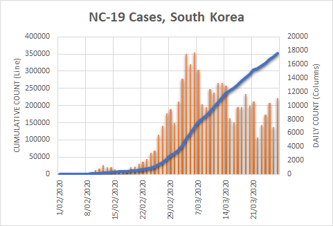
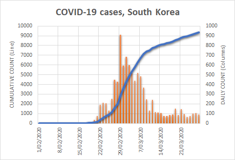
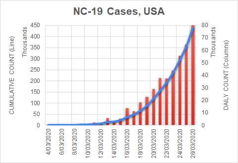
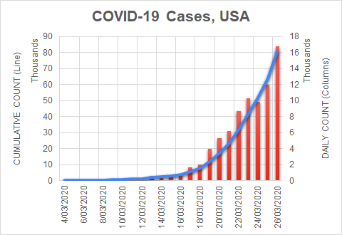
First, the bottom number was, as we highlighted in Parts 1 and 2, a  simple count of those who had so far tested positive for infection with the virus.  The top number was the number of deaths in those who had tested positive either before or after they died.  The ratios calculated in this way were published in relation to the world as a whole; to various countries; and to communities within countries.

For example, if a community counted 100 deaths and a total of 10,000 infected people, the fatality ratio was 1%.

On the surface, a fatality ratio calculates the average chance of dying if infected.  But the calculation’s legitimacy rests on a very important condition: that the effort to examine the living for evidence of the virus was equal, proportionally, to the effort to examine the dead.  

That rings a bell, doesn’t it?  Jones carefully examined the dead ducks for speckles, but his troubles occurred because he neglected to carefully examine the living ducks.  

Unequal testing effort

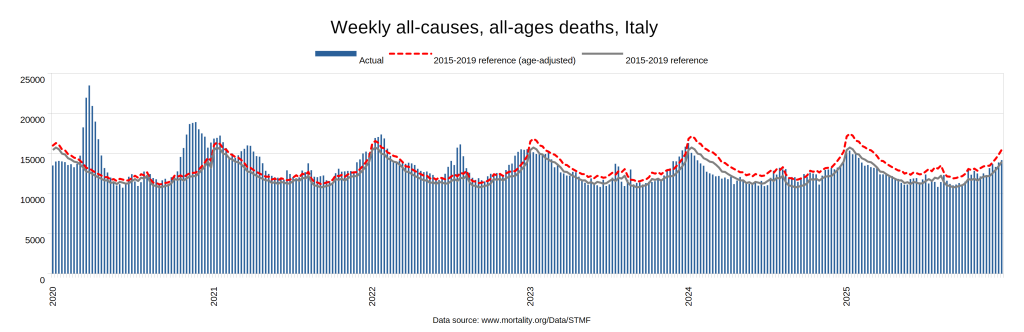
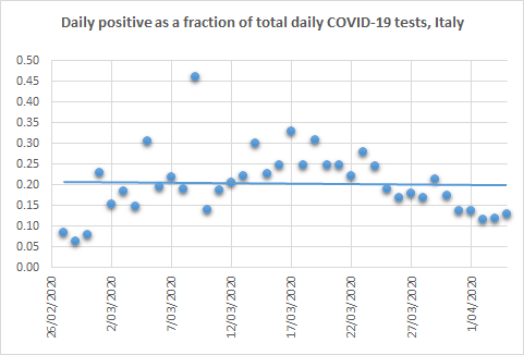
Italy attracted attention early on due to what appeared to be a high death toll, so other parts of the world looked to it for an estimate of the fatality ratio.  Here’s how it was calculated.

By March 20, as Australia was phasing in its shelter-in-place measures, Italy had recorded just over 4000 COVID-19 deaths.  These formed the top number of the fatality ratio.  At that time, the country had tested just over 200,000 individuals for the virus.  The simple count of positive results from these tests (47,000) formed the bottom number.  

A quick calculation yields a fatality ratio of more than 8 per cent.  This is a very large fatality ratio, and certainly ample justification for drastic action.  But let’s check for duck-farm blunders.  Remember, Jones carefully examined all the dead ducks but made a very poor effort to examine the living ducks.  He didn’t even conduct a survey!  That’s what got him into trouble.  

What did they do in Italy?

By March 20, the authorities had tested around 200,000 people for the virus, as mentioned.  As the calculation below shows, this represents roughly 0.33% of the Italian population. 

The virus-positive results from this miniscule effort formed the bottom number of the fraction (47,000).  To put that effort into perspective, consider Jones selecting 33 ducks from his 10,000 flock, counting how many of them were speckled (16 or 17 if they were chosen randomly; 33 if he really did have an eye for the speckles), and using that for his total count of speckled ducks on the farm.  As you can imagine, no matter how hard he’d tried to choose the birds most likely to be speckled, such a plan would be pure folly.  Yet medical authorities around the world obtained their infection figures in exactly this way.

The next question we need to ask is whether this proportion (0.33%) of the entire population was comparable with the proportion of deaths examined (tested) for the virus.  Unfortunately the proportion of deaths tested isn’t published, but we can still answer our question.

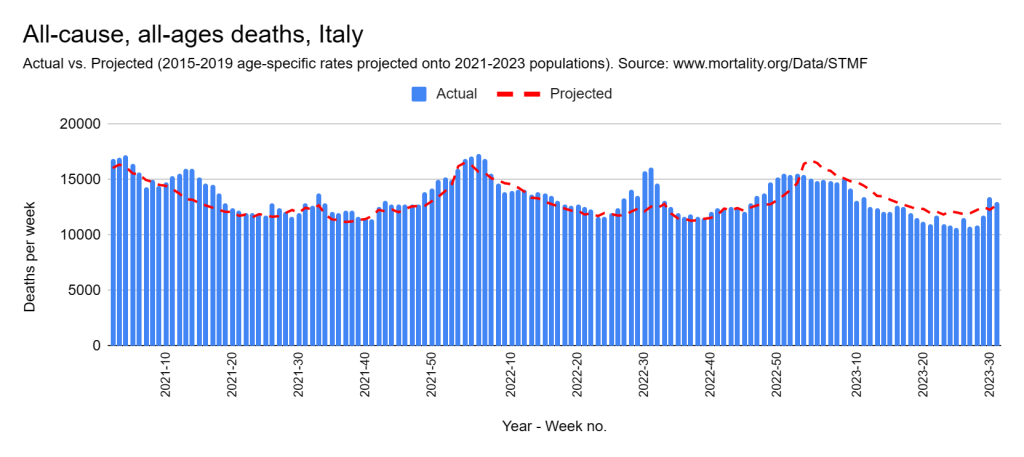
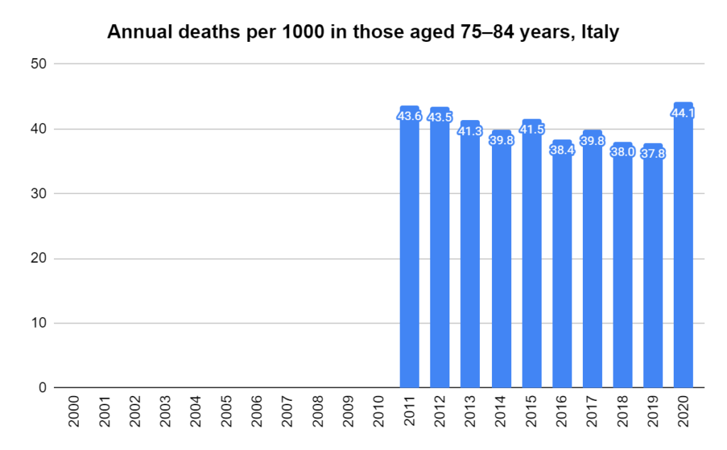
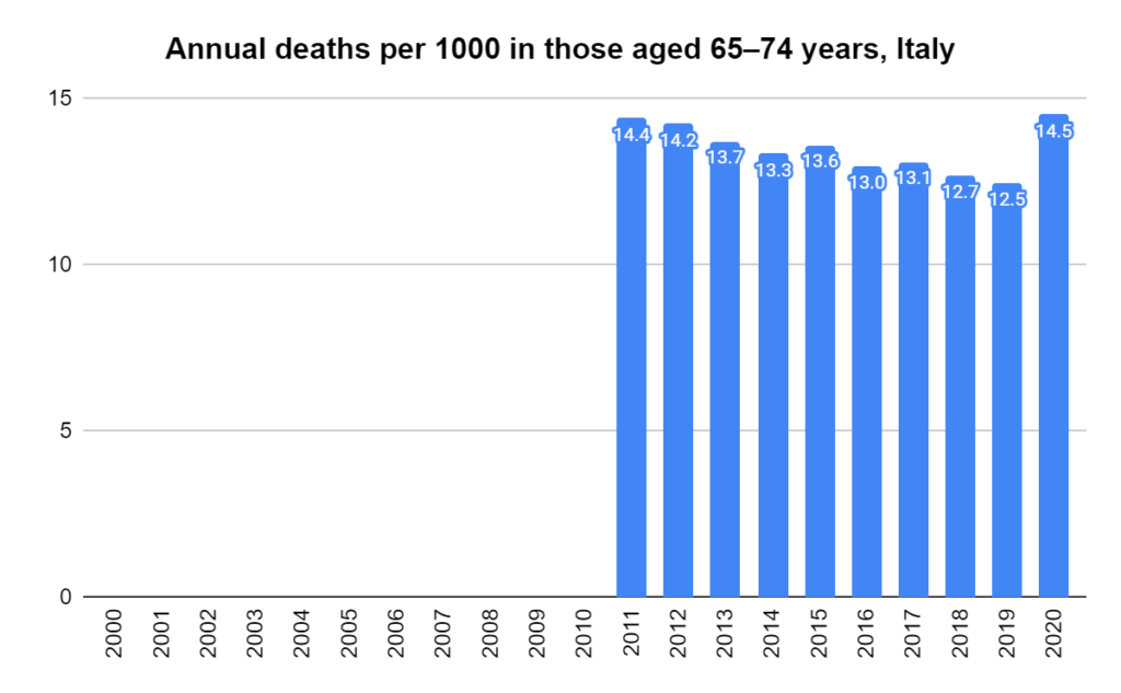
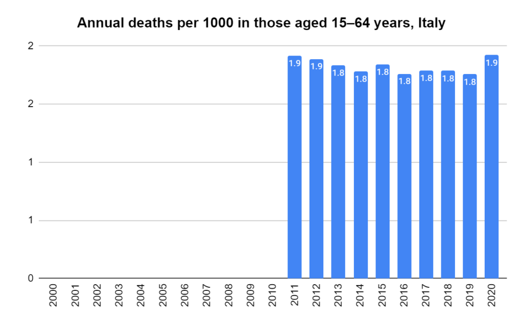
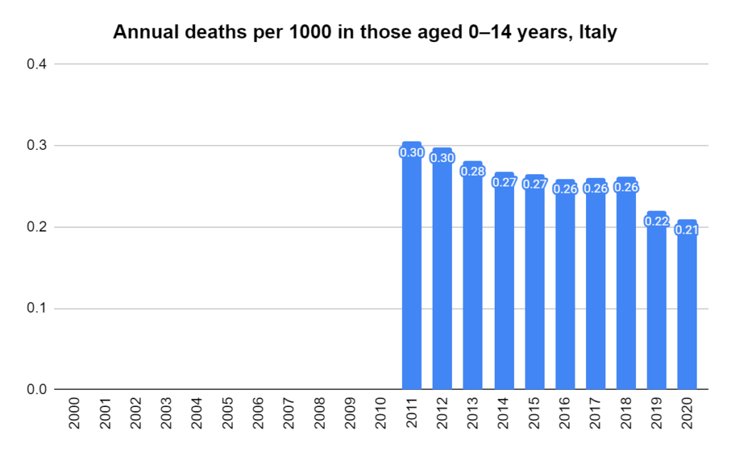
Under normal circumstances, an average of around 12,000 people die each week in Italy.  Therefore, over the four weeks that it took to accumulate the 4000 COVID-19 deaths, we would expect 48,000 deaths to have occurred.  Let’s assume for a moment that the official assumption is correct, and that the 4000 COVID-19 deaths were additional to the expected deaths from other causes, giving a total of 52,000 deaths from all causes.

We’d like to know how many of these 52,000 were or had been tested for COVID-19.  As already mentioned, we can’t determine that.  What we do know, though, is that 4000 of them were declared COVID-19 deaths.  So, at a bare minimum, those 4000 were tested.  We can, and probably should, surmise that many more than this were tested — possibly all, or nearly all — but we do know for certain that at least 4000 were tested.  Taking 4000 as the minimum, then, we can confidently say:

Comparing the testing rate of the dead (at least 7.69%) with that in the general population (0.33%), we can see that the effort to locate infected people proceeded in the dead with at least 23 times the intensity that it did in the living.

This is understandable: Italy had a policy of testing all hospital admissions, and those in the process of dying are commonly admitted to hospital.

Mind you, Jones too had good reasons for focussing his tallying efforts on the dead ducks.  Unfortunately however it meant that he failed to properly tally the living ones, and that’s what led to his problems.

Italy was not the only country for which a fatality ratio was estimated, of course.  There were many of them — and all calculated their fatality ratios as we did above.  At the start of March, the World Health Organisation (WHO) announced that the global average fatality rate was 3.4 per cent.  They contrasted it with seasonal flu, which they said “generally kills far fewer than 1% of those infected”.

Such fatality ratios were quoted frequently in the media, drumming up intense alarm and seeming to justify the drastic actions that we were about to take.  The ratios varied considerably between communities, and even within communities over time; but, until recently, all of them arose from this flawed methodology.

Which fatality ratio?

Some will think that I’m conflating two different fatality ratios.  This section is particularly for them.

There are two types of fatality ratio frequently discussed: the Case Fatality Ratio (CFR) and the Infection Fatality Ratio (IFR).  The CFR is the number of deaths divided by the number of confirmed cases, and the IFR is the number of deaths divided by the number infected. 

Note that they share the same numerator (top number): the number of deaths.  Their difference lies solely in their denominators (bottom number).  One uses confirmed cases, and the other uses infections.  Of most illnesses, a confirmed case is defined as an infection accompanied by a specific set of clinical manifestations.  That’s not the case with COVID-19.  The WHO defines a confirmed case of COVID-19 as a lab-confirmed infection irrespective of clinical manifestations.  That means that, in the case of COVID-19, the denominators for the CFR and the IFR are practically identical — one is a lab-confirmed infection; the other is an infection.  Hence, for all practical purposes, the two rates are the same; the only difference being ascertainment.  Put simply, any difference reported between the CFR and the IFR for COVID-19 is nothing more than a measure of how well we ascertained infection — again, regardless of clinical manifestations.

Having read Parts 1 and 2, you may guess that case ascertainment for COVID-19 was poor.  Indeed, the results of recent studies, which I will discuss in the next instalment, suggest that it was woeful.  

At any rate, the question on everyone’s lips is: what’s the danger if I get infected?  It’s not: what’s the danger if I get infected, and someone notices that I’m infected, and I happen to be tested at the right time, and that test happens to turn up positive?

How to count properly

There are ways to accurately estimate the true number of infected people, even when it’s impractical to count them all.  In the duck-farm story, Jones should have chosen option two — taken a random sample of the ducks, counted the speckled ones amongst them, and extrapolated that proportion to the entire farm.

A similar approach can be taken with infections in a population.  By conducting a serological survey (serosurvey for short), we can estimate how many individuals have been infected.  Serosurveys use a test that’s different from the COVID-19 test we’ve been using to ascertain cases: rather than test people’s mucus for presence of the virus, it tests their blood for antibodies to the virus, indicating whether they have been exposed to it at some point.  Testing a representative sample of the population provides a gauge of the number in that population who have been infected.

It has been quite some time since I published Part 2 in this series, and I promised that I’d follow it with a post about deaths.  I’ve been awaiting the results of these serosurveys.  They have started trickling in, but, as you may have foreseen, they have met with considerable resistance.  I can understand why, as they correct the flaw in the “method” described above and thereby demand a very uncomfortable rewrite of our recent history.

In the next instalment, we’ll take a look at serosurveys.  These represent our first real attempt to estimate a relevant denominator and thence a legitimate fatality ratio.

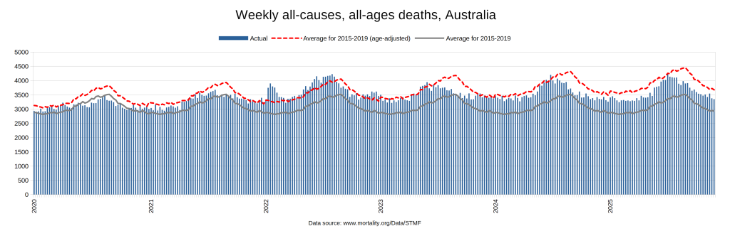
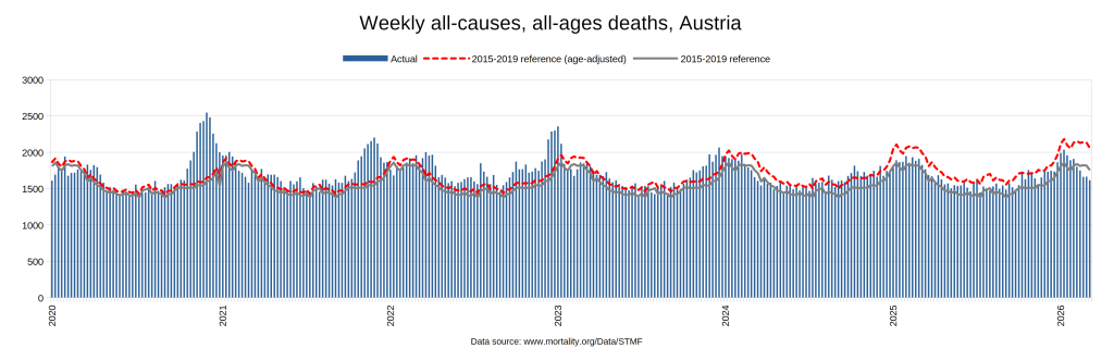
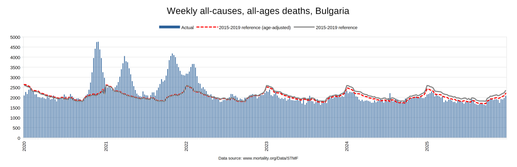
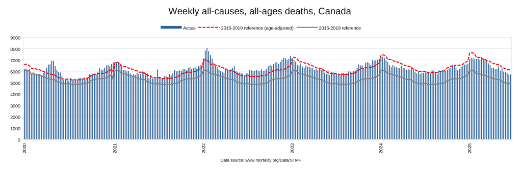
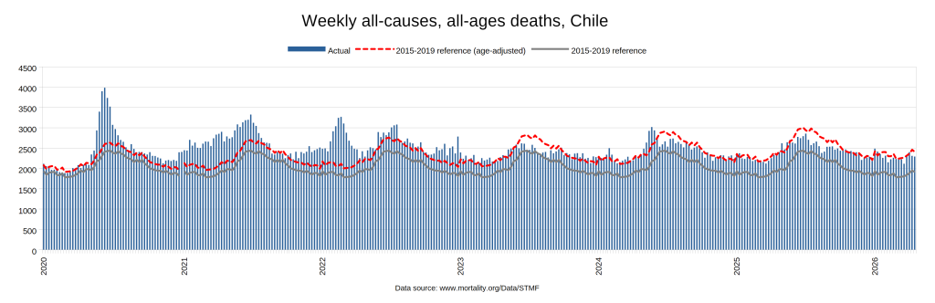
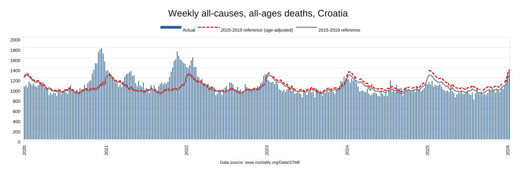
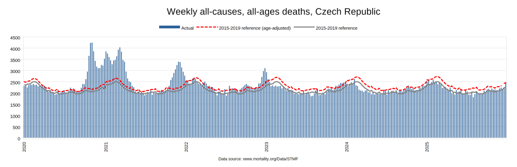
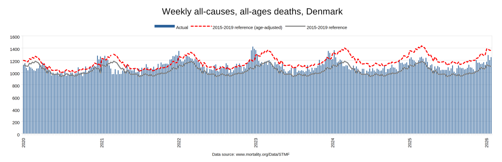
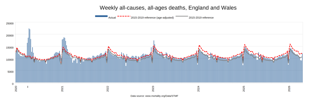
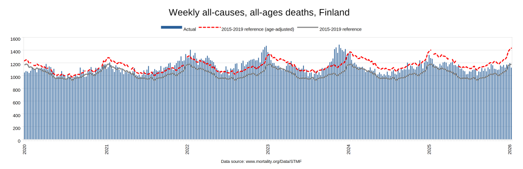
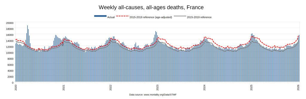
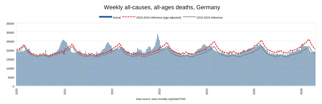
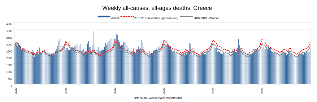
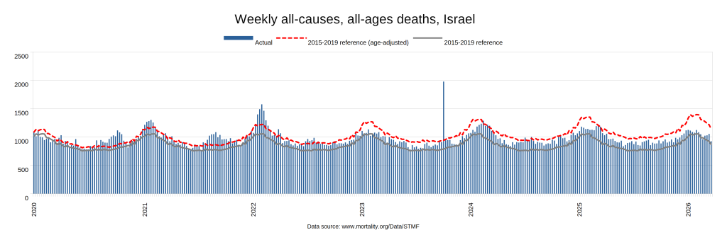
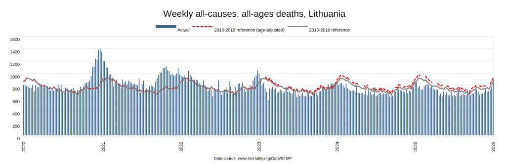
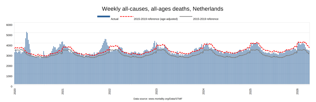
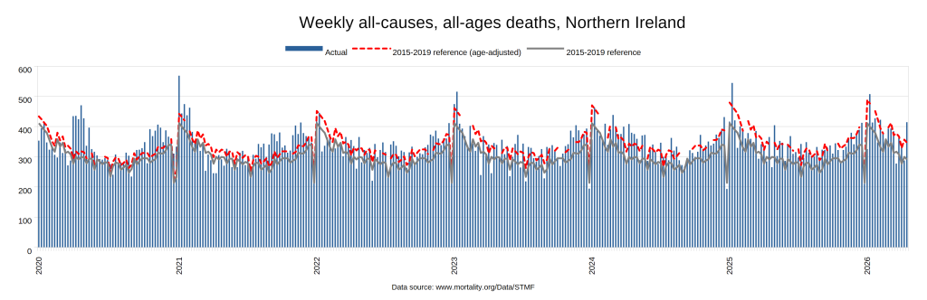
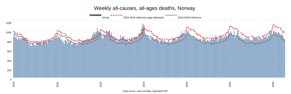
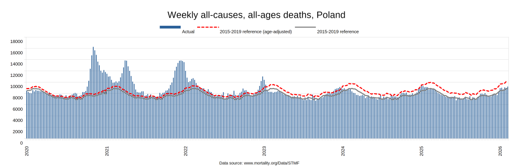
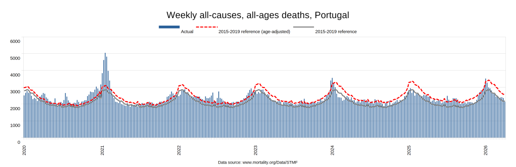
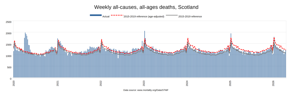
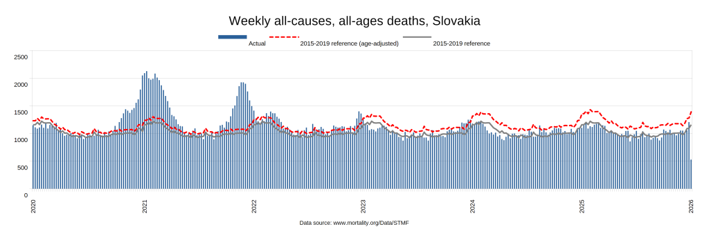
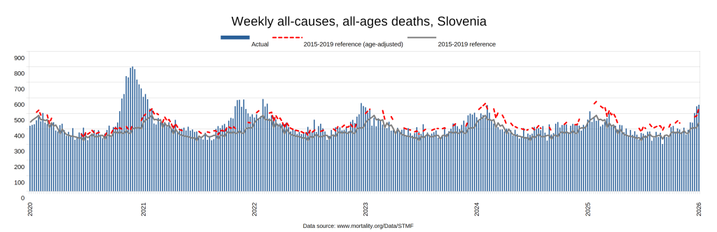
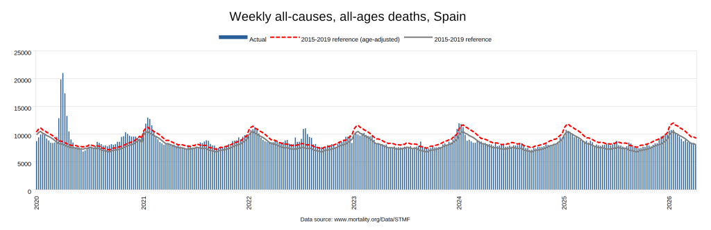
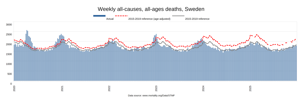
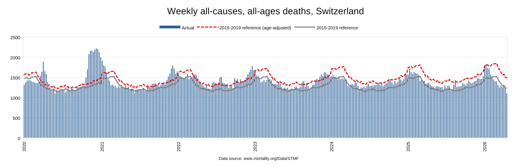
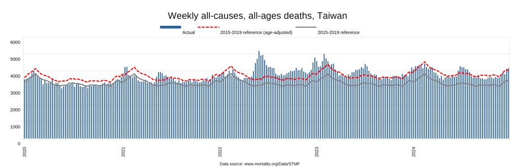
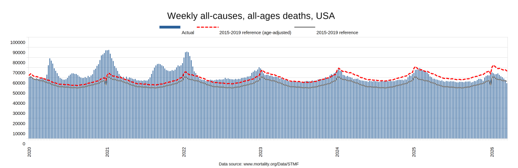
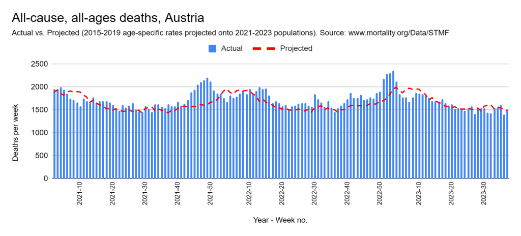
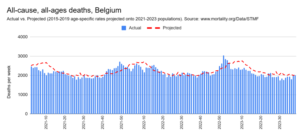
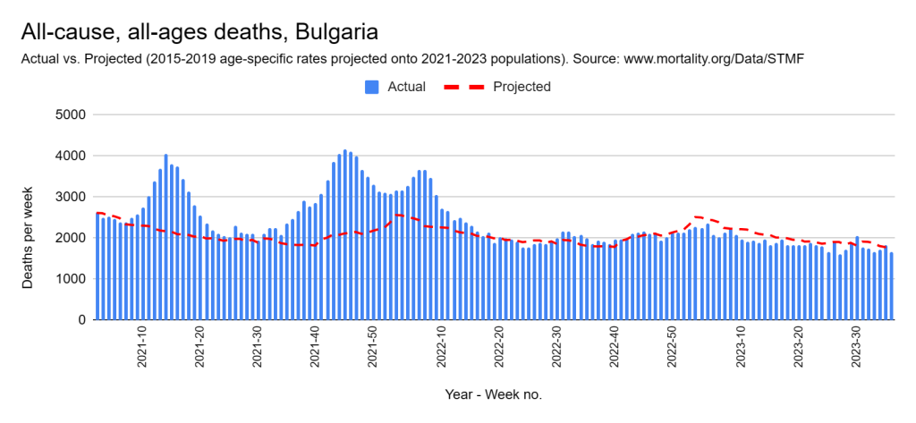
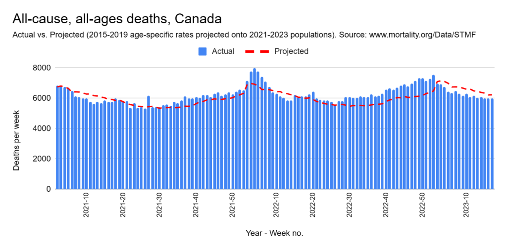
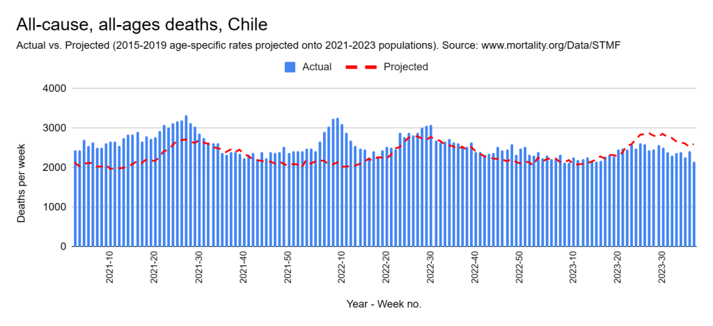
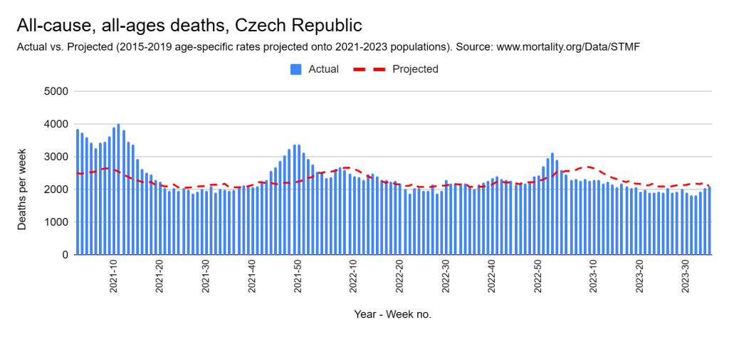
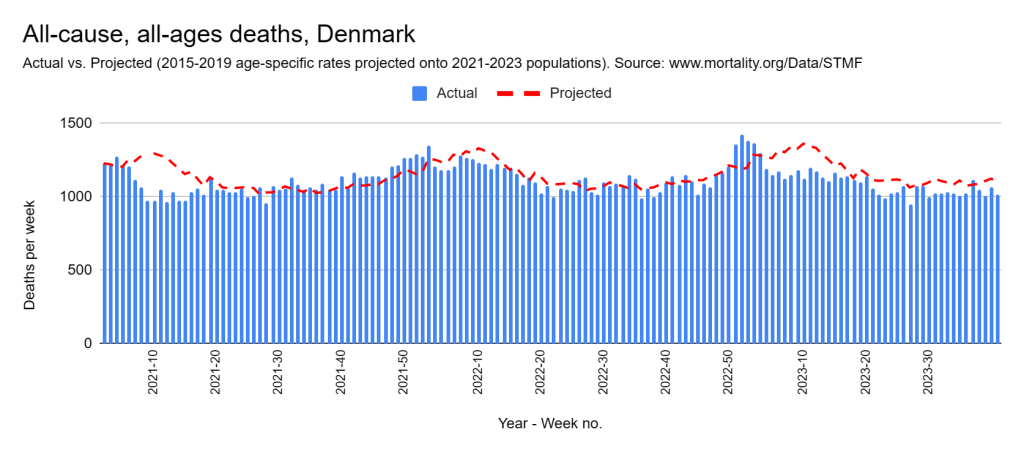
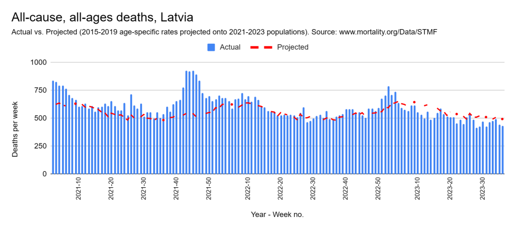
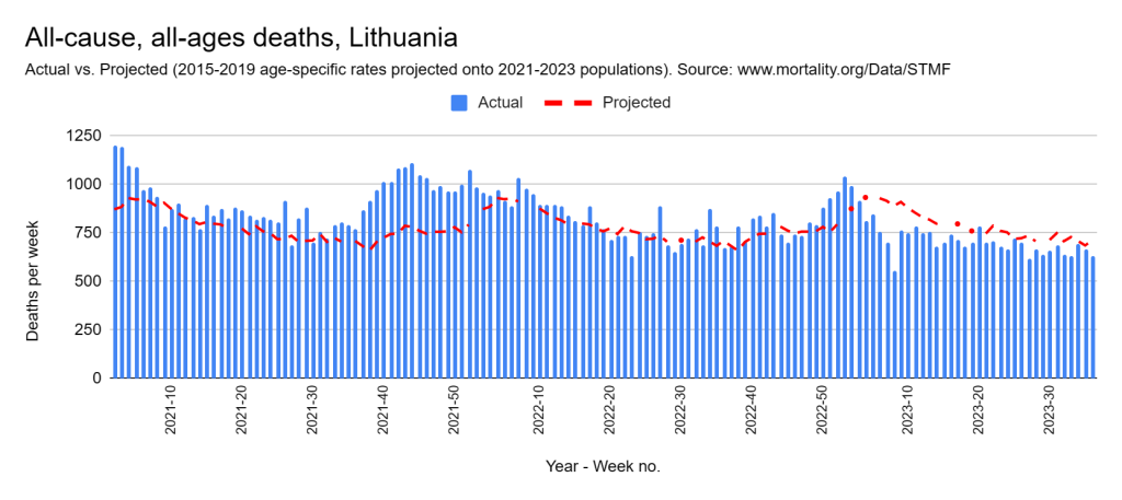
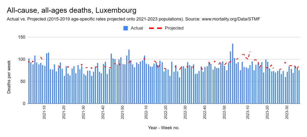
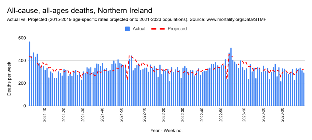
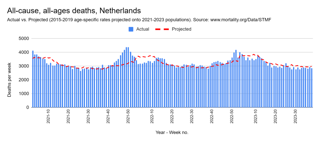
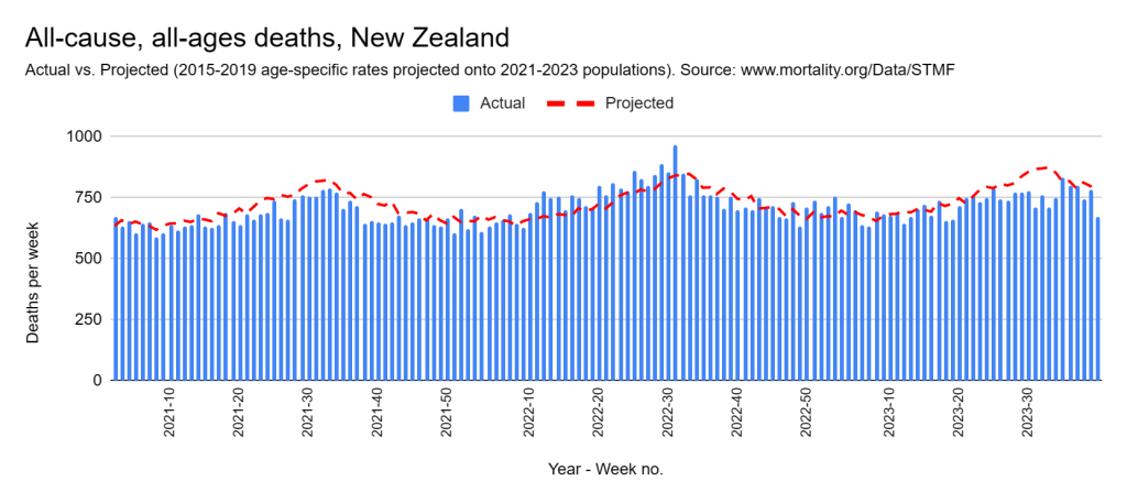
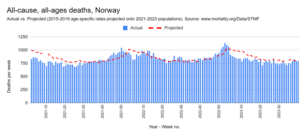
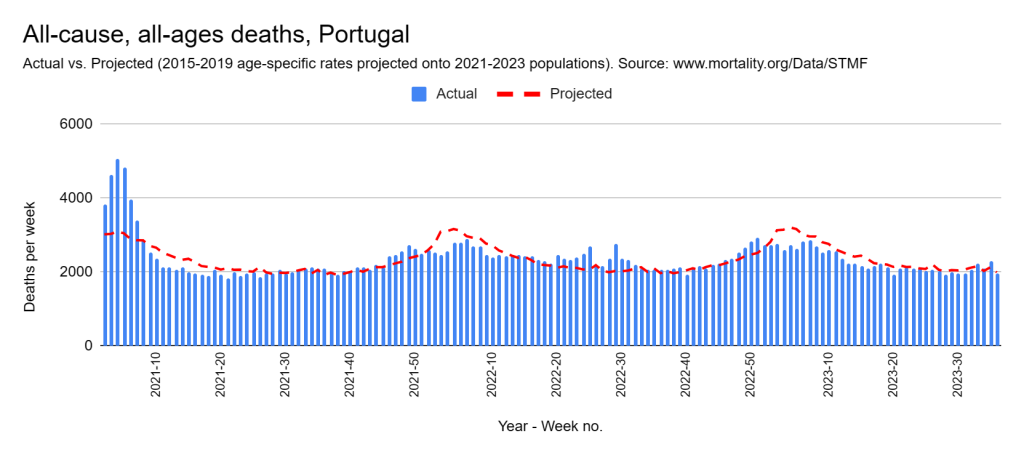
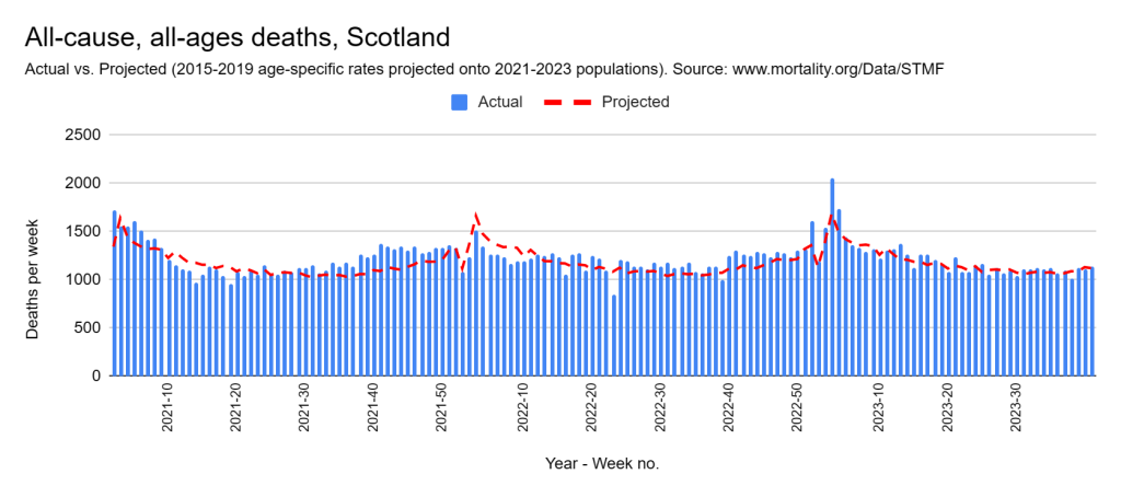
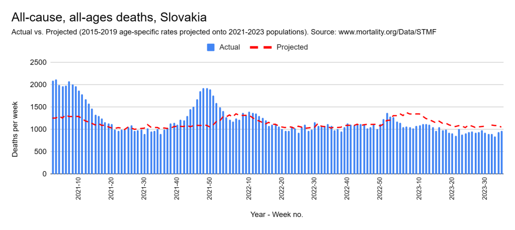
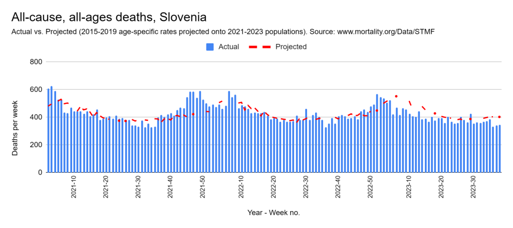
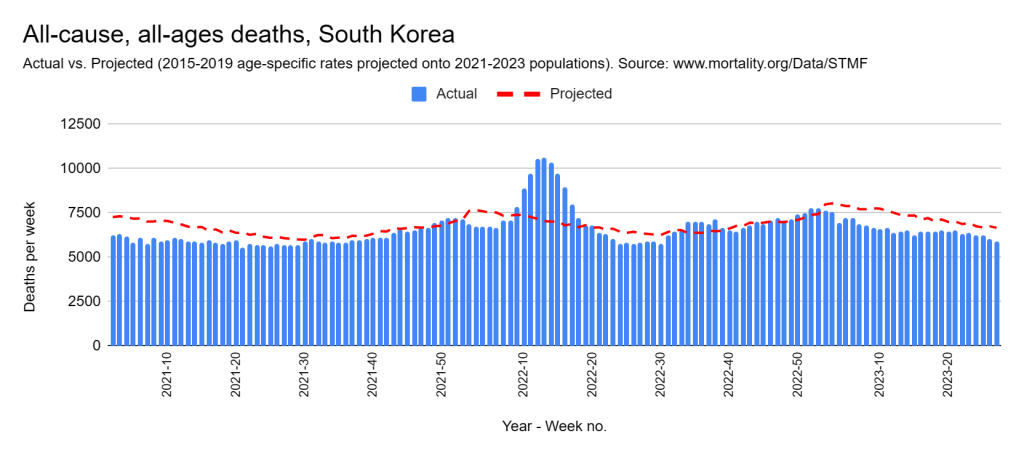
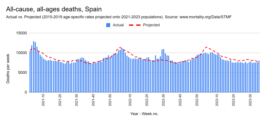
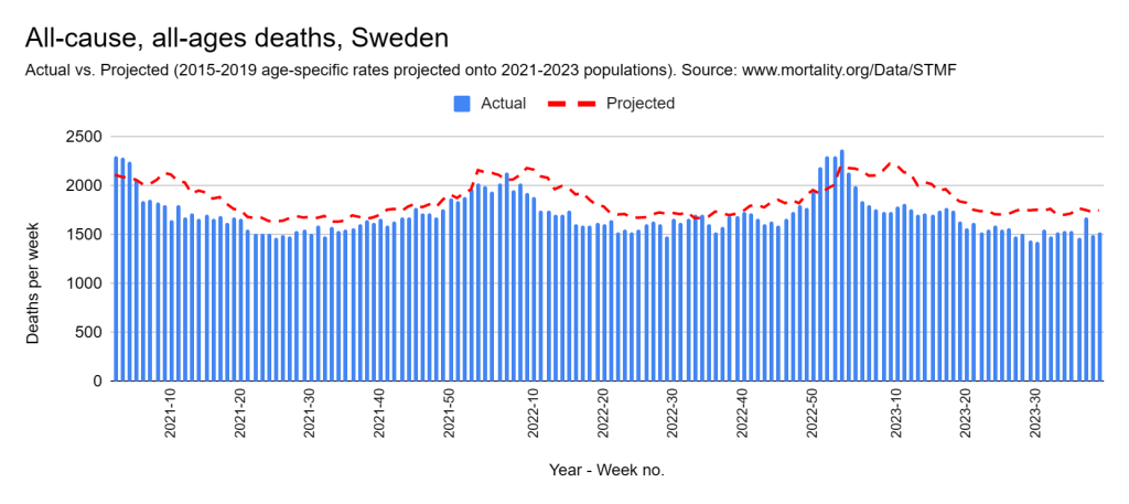
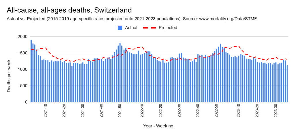
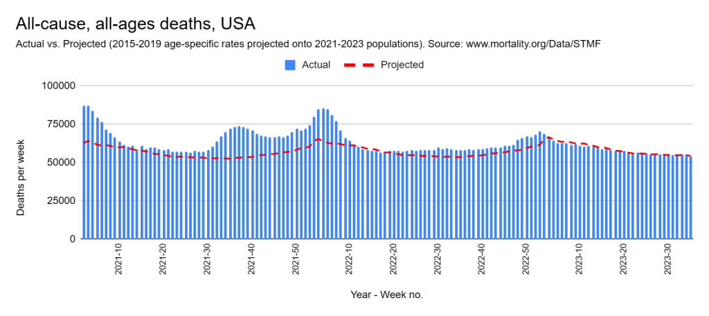
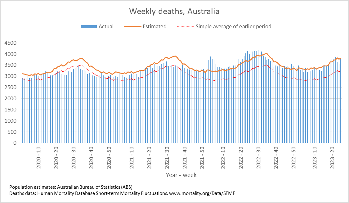
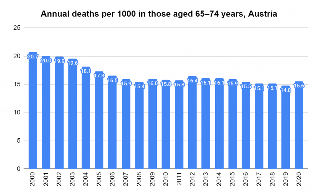
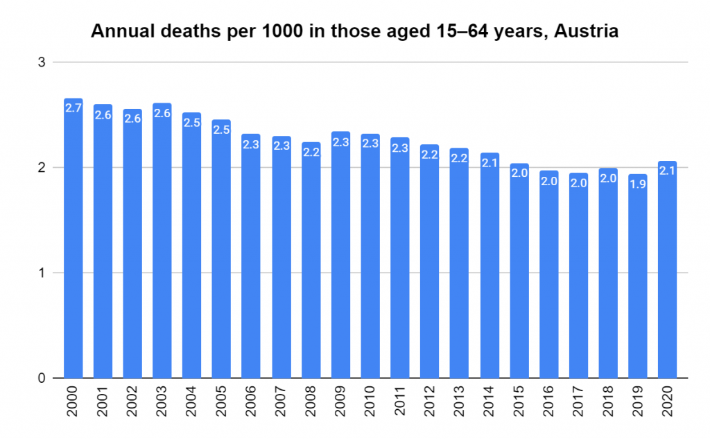
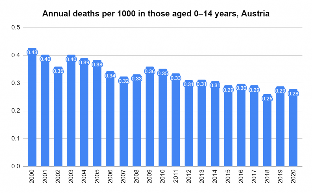
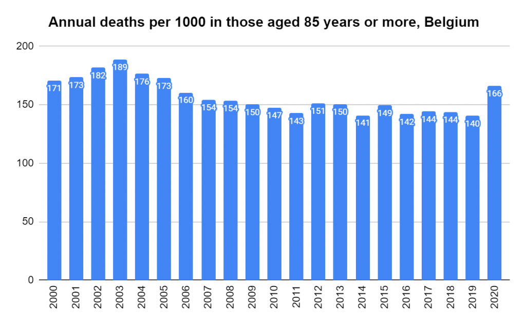
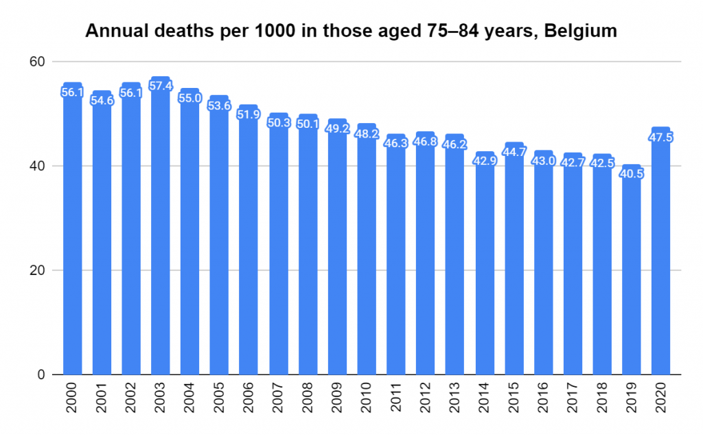
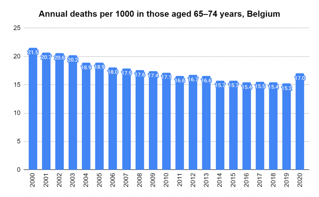
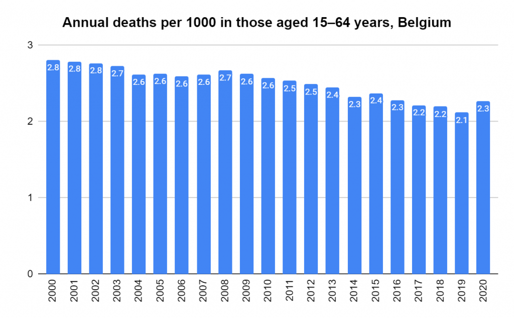
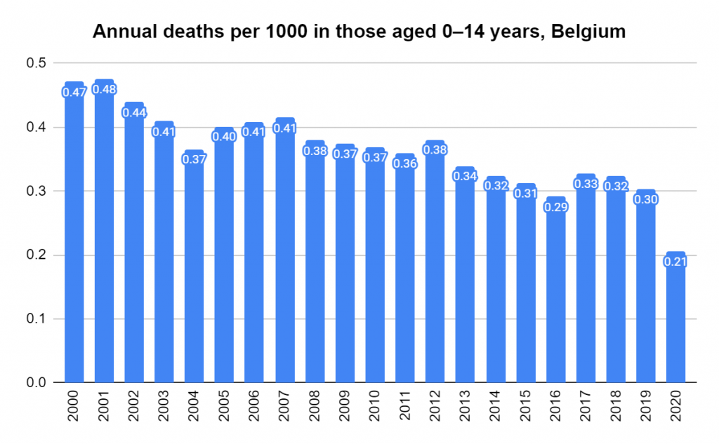
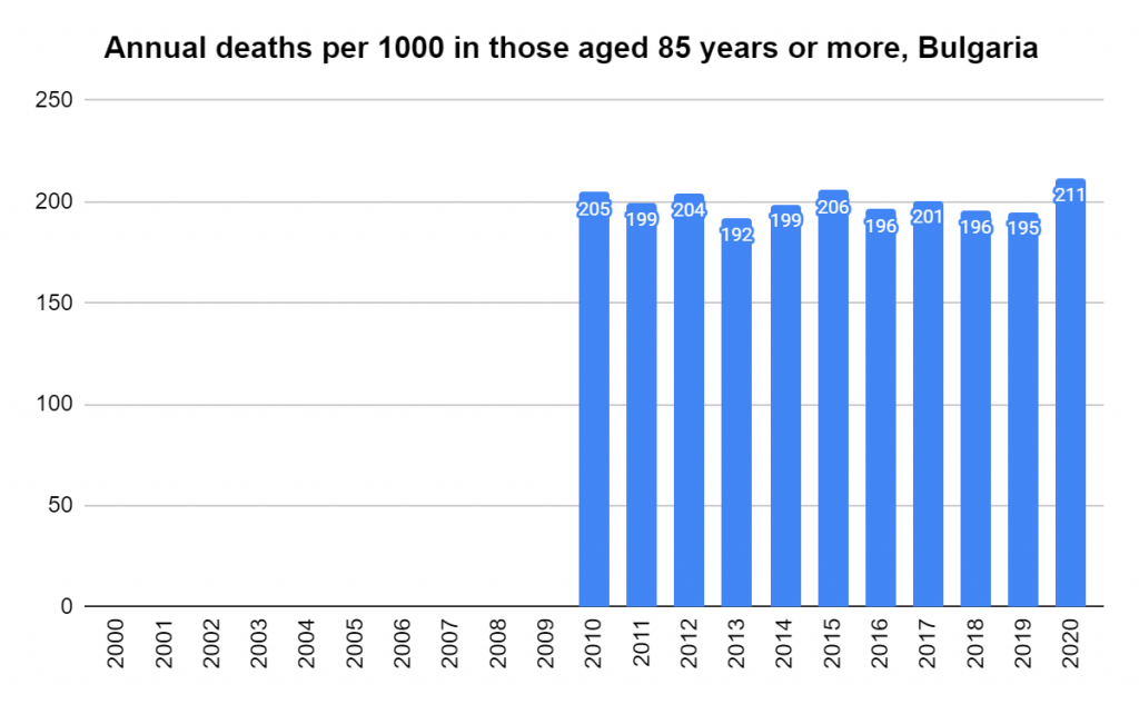
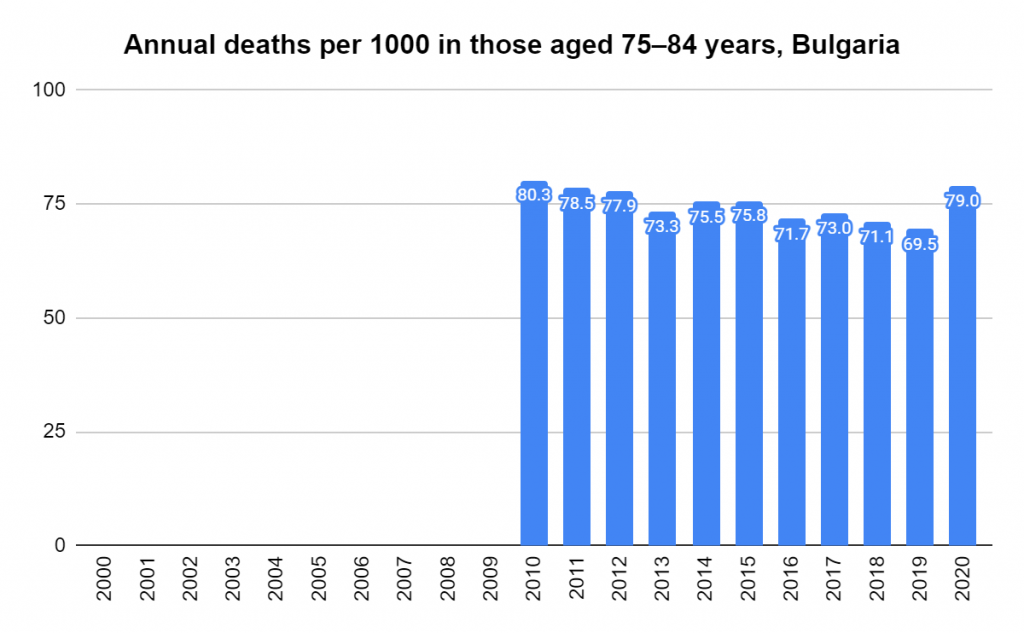
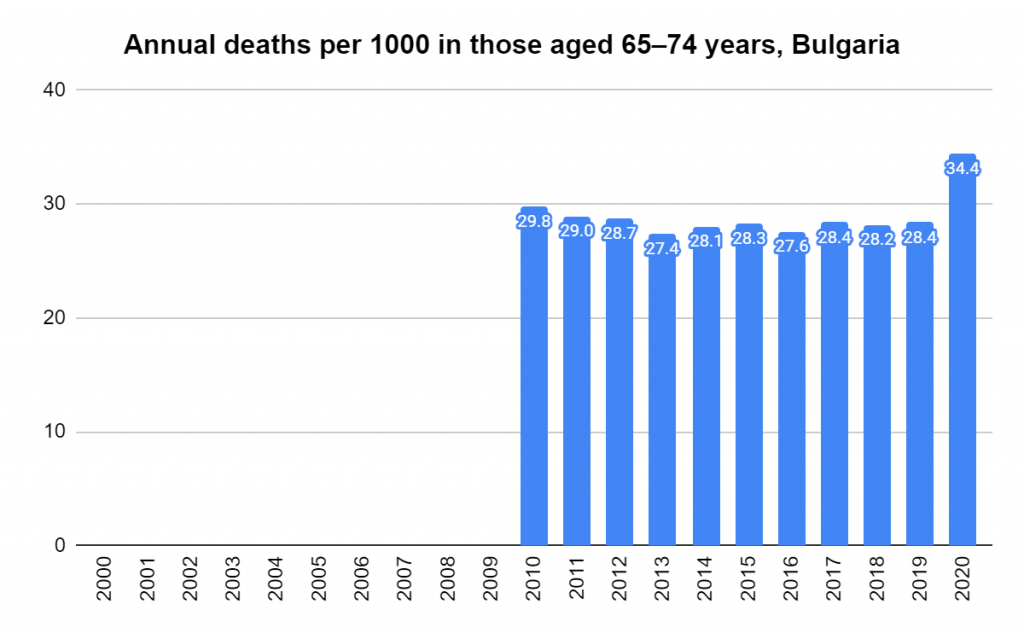
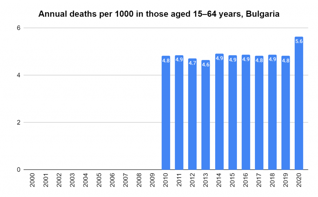
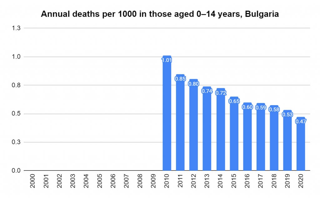
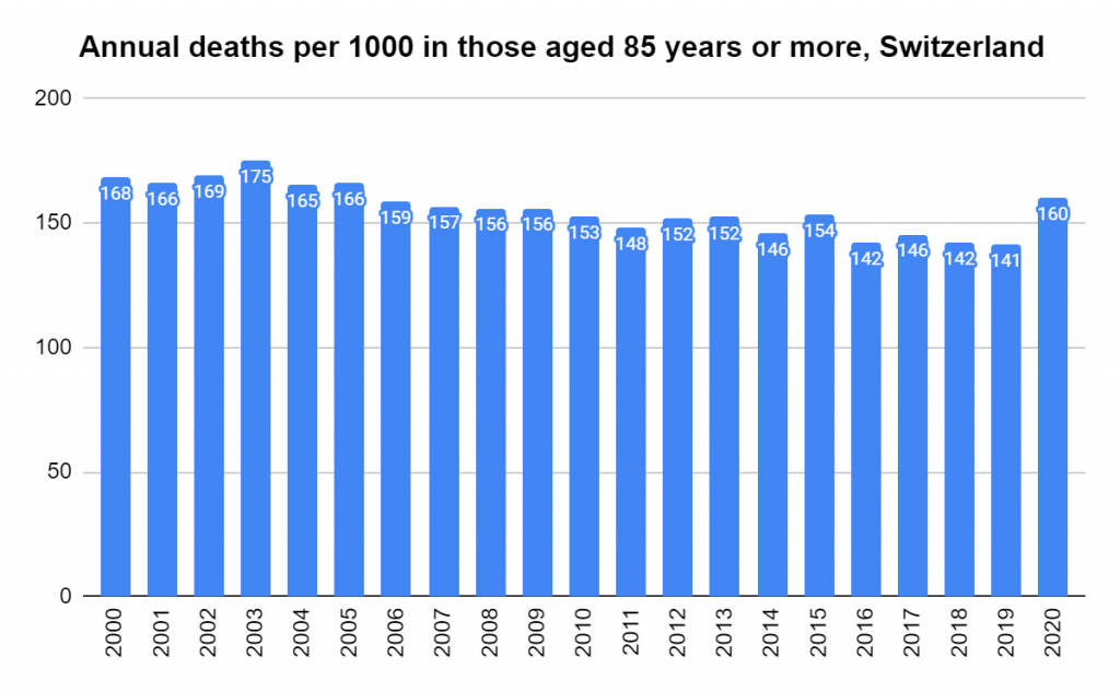
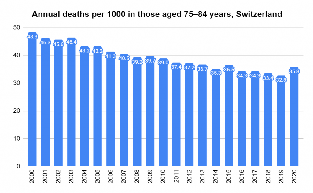
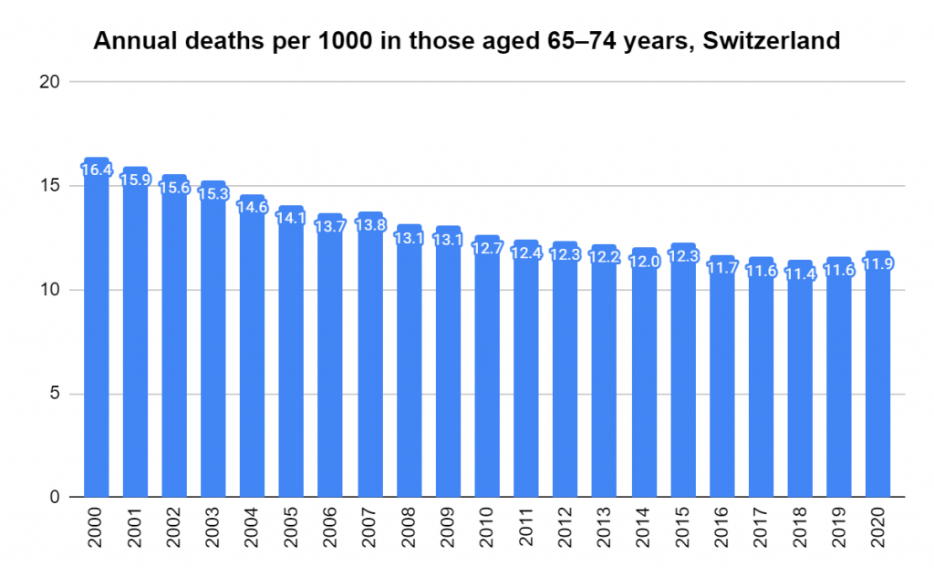
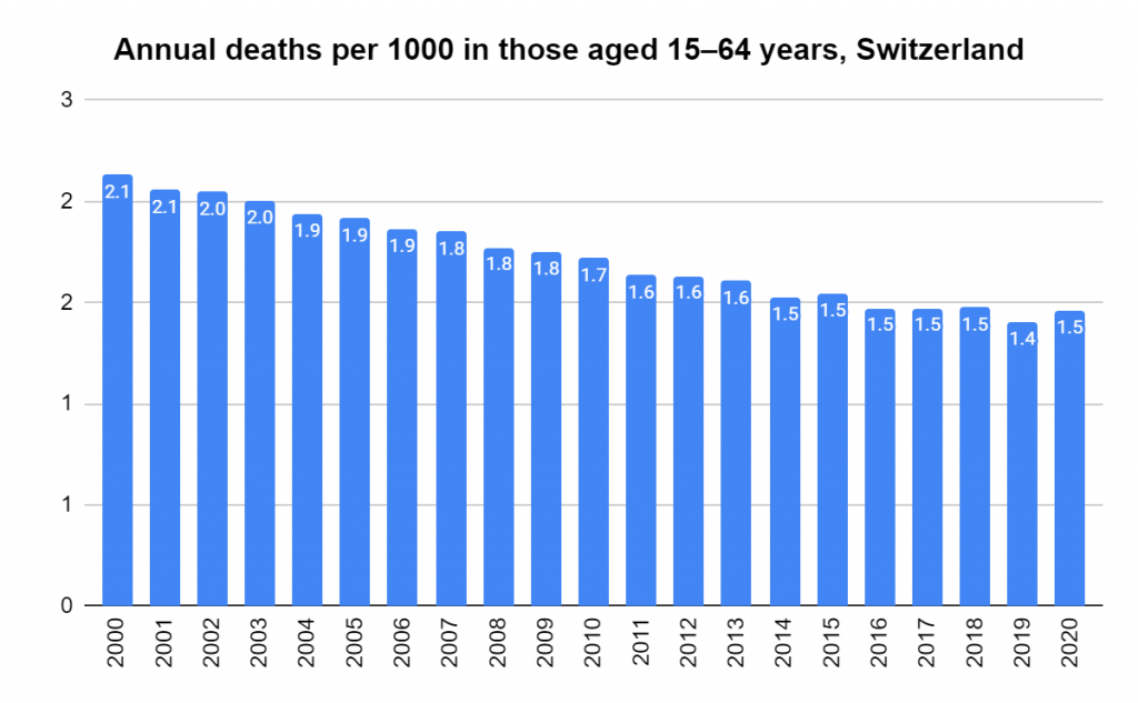
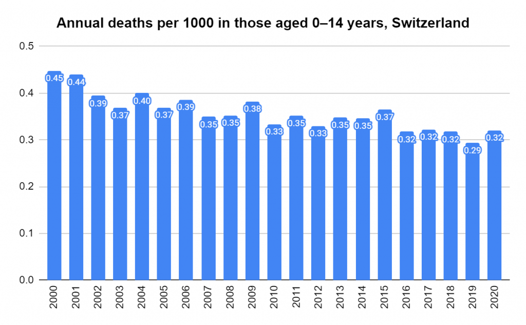
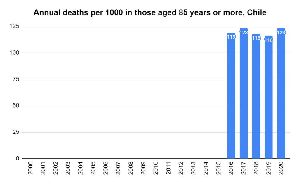
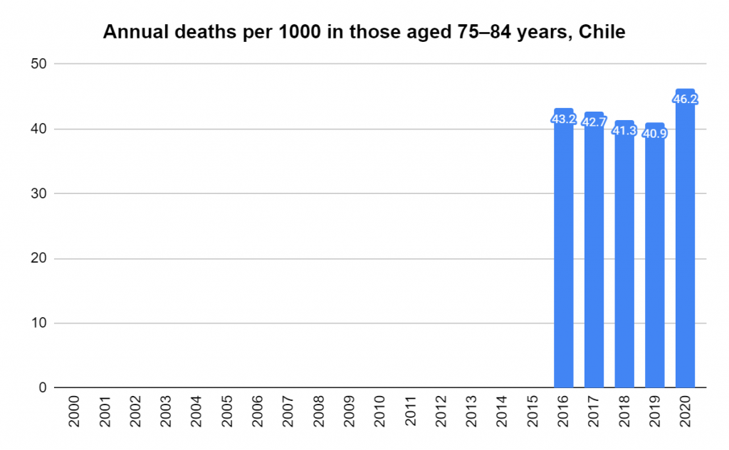
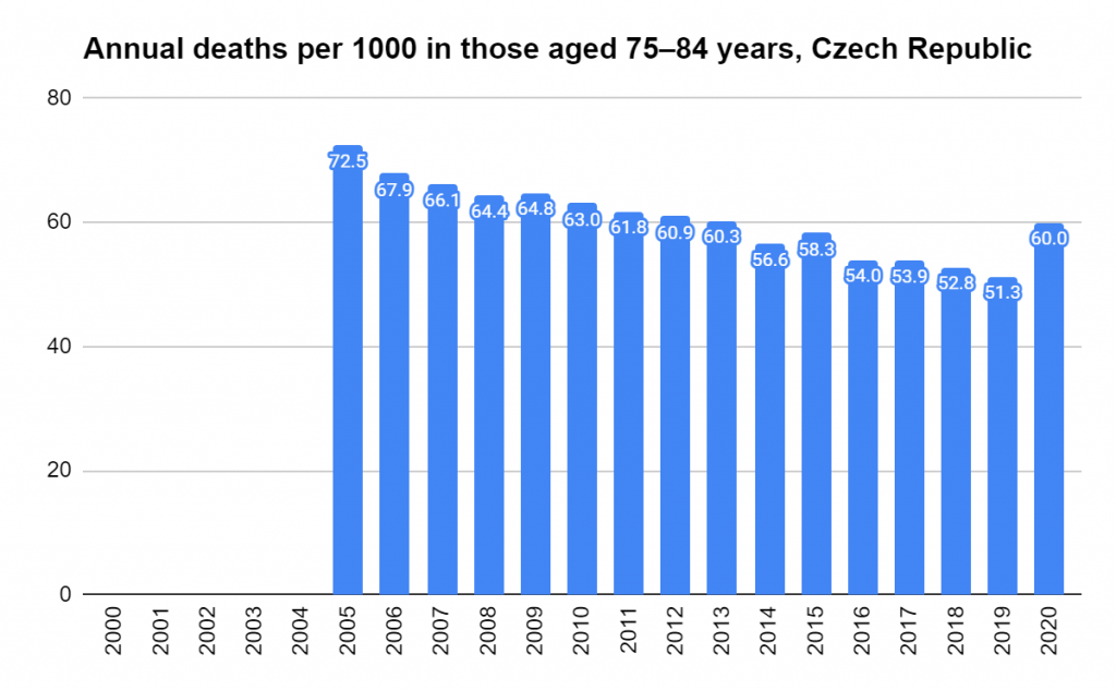
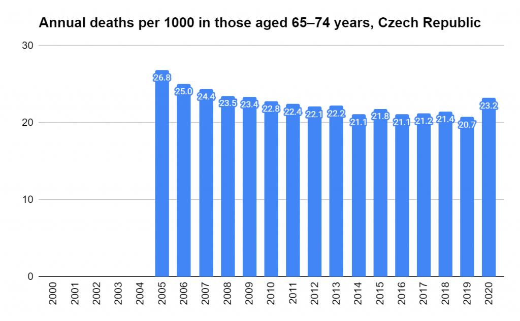
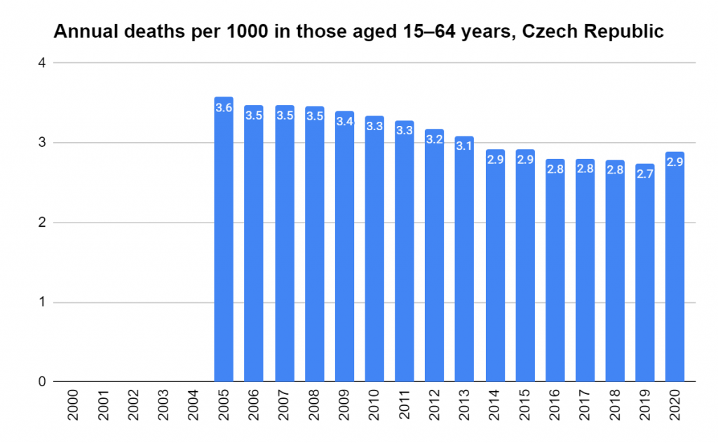
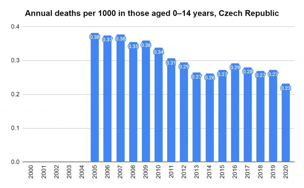
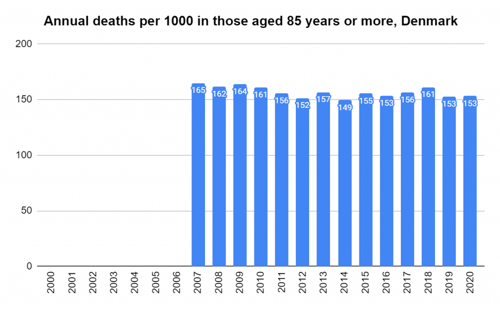
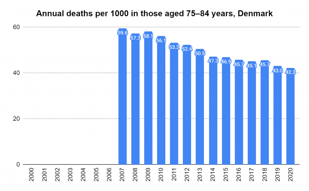
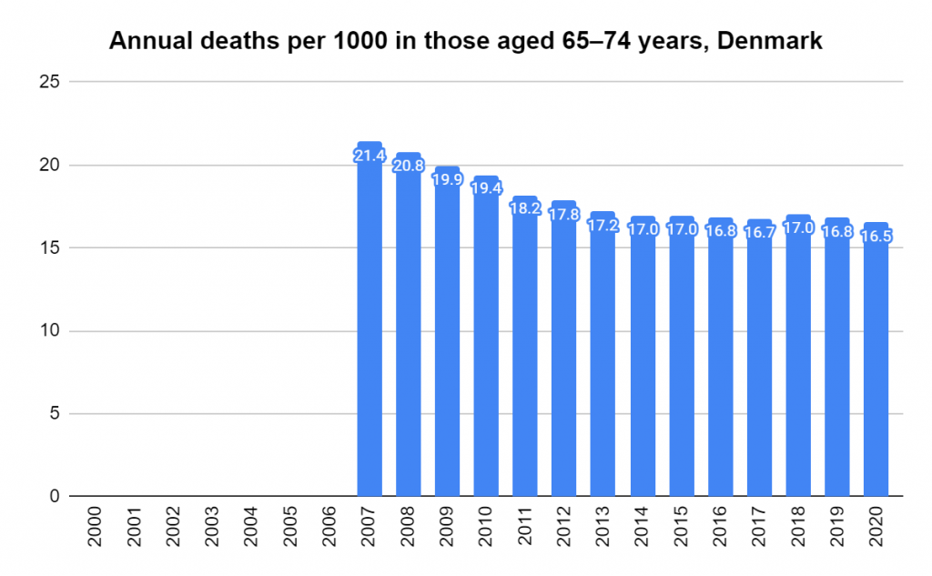
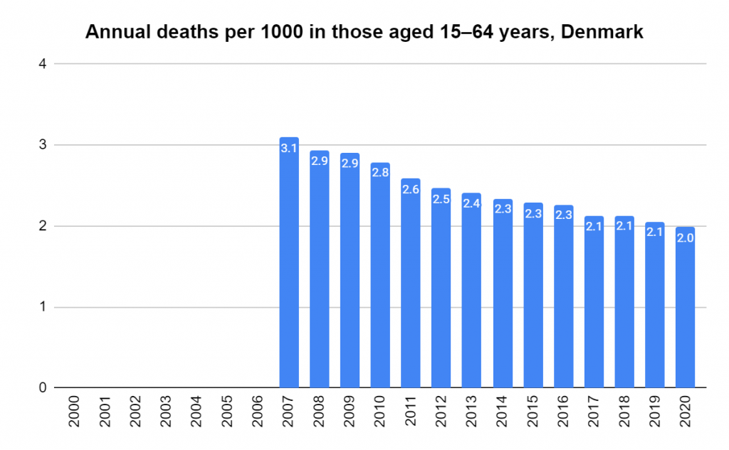
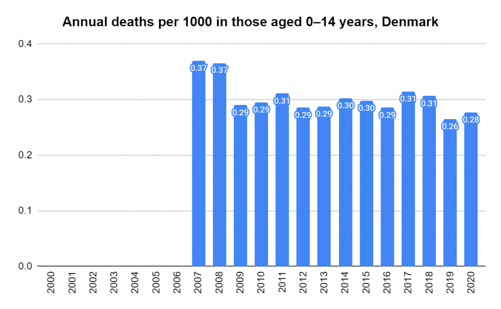
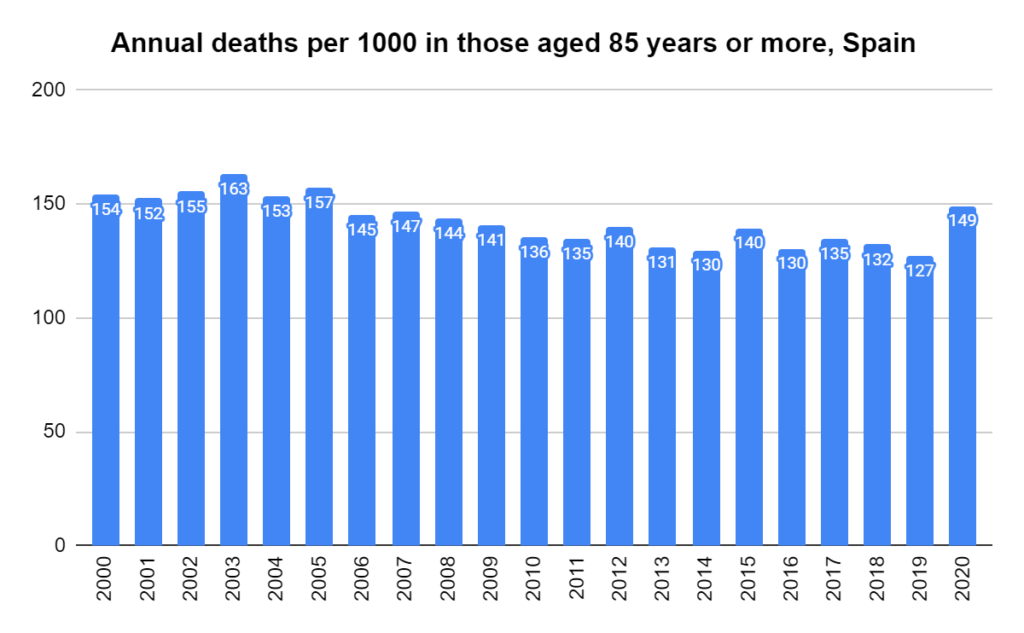
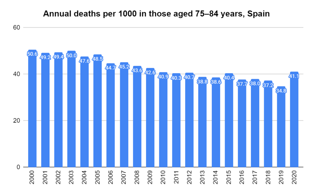
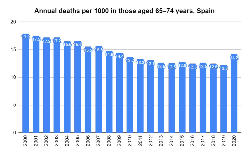
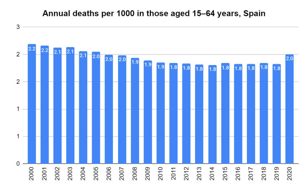
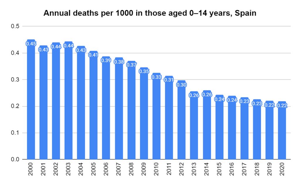
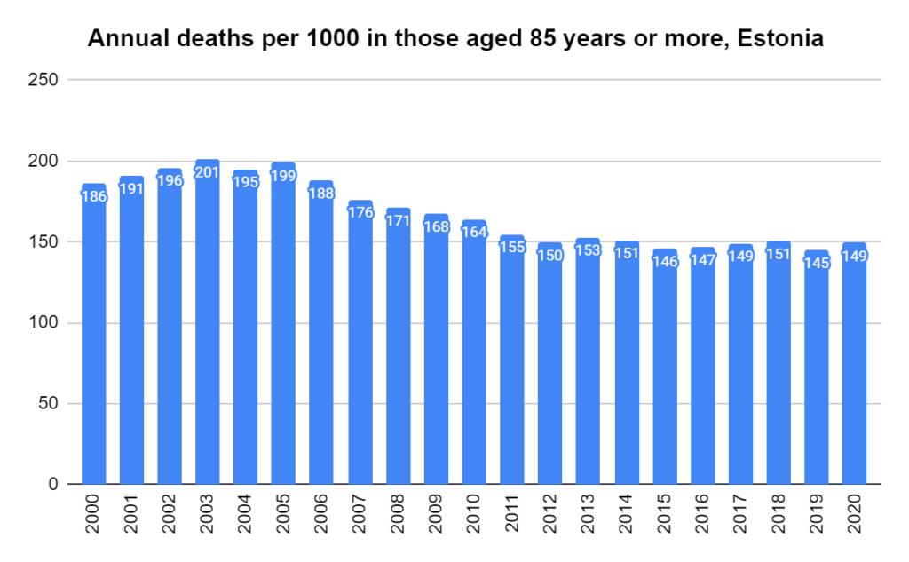
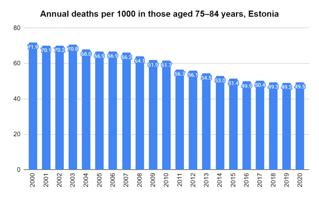
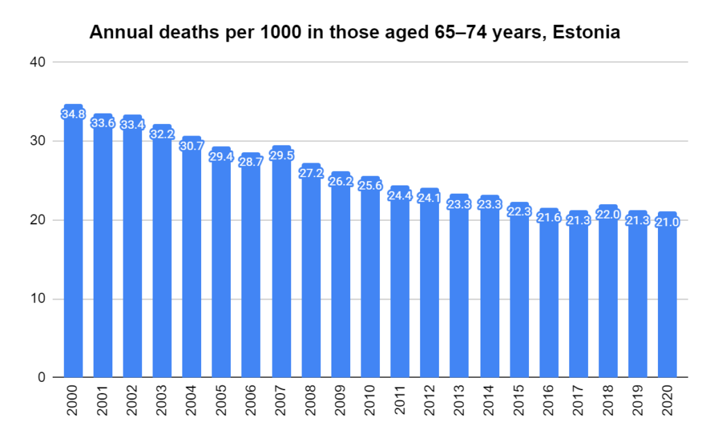
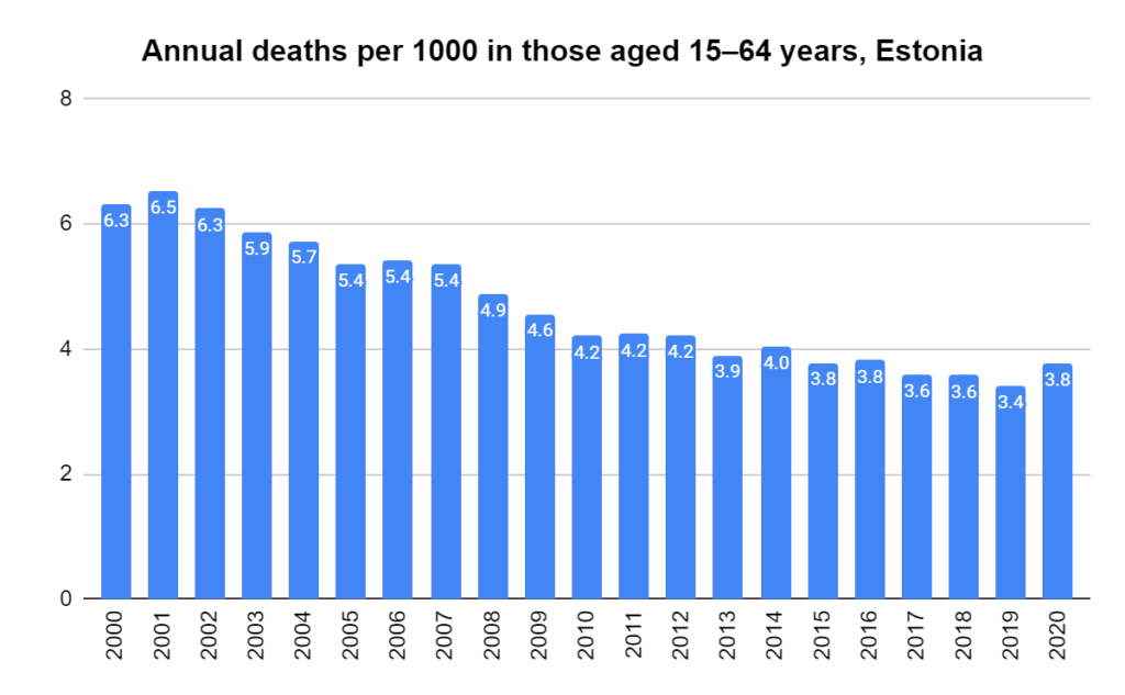
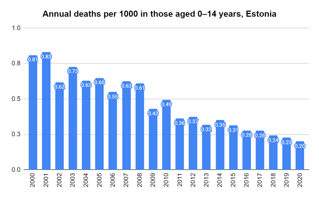
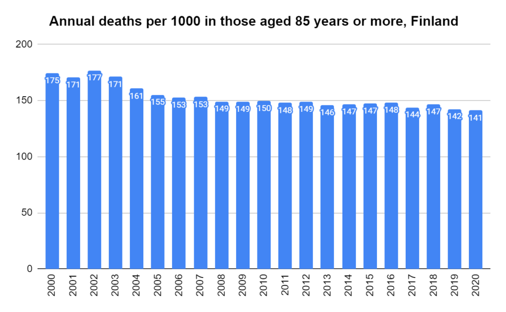
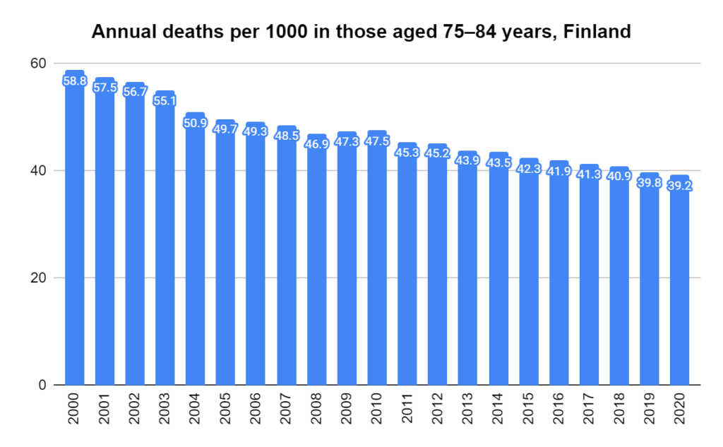
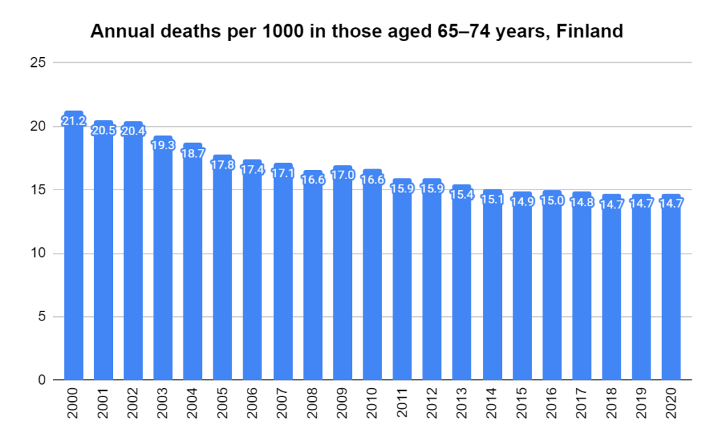
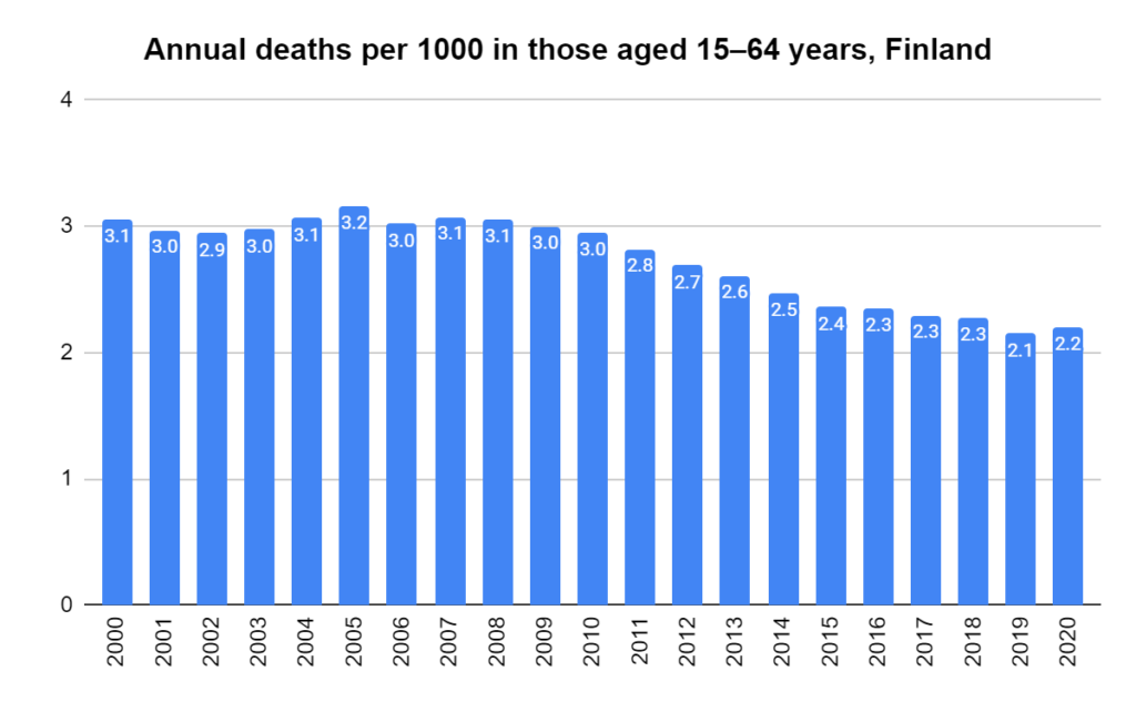
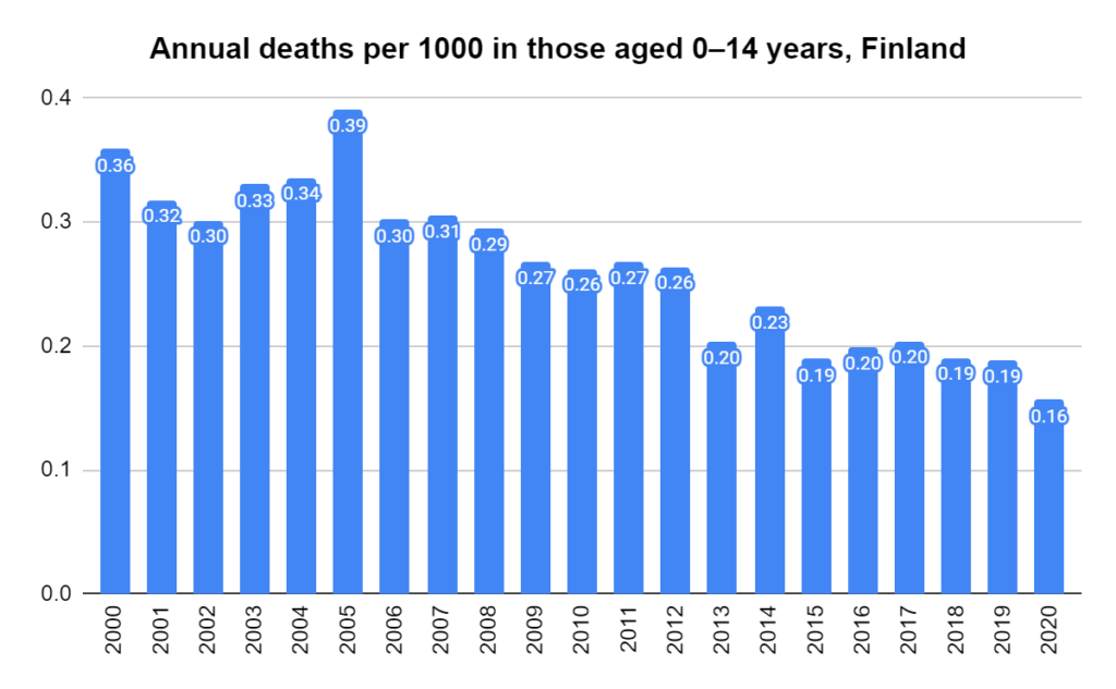
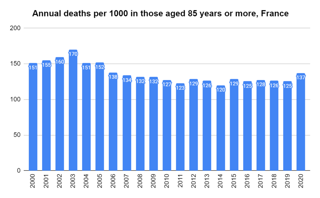
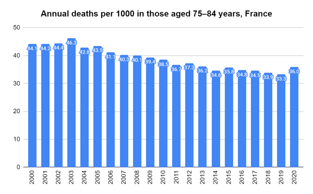
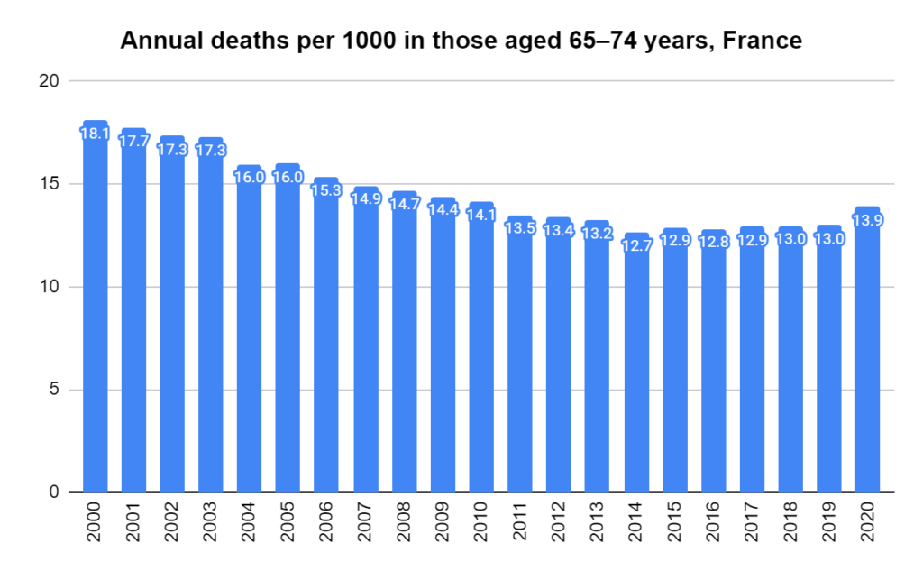
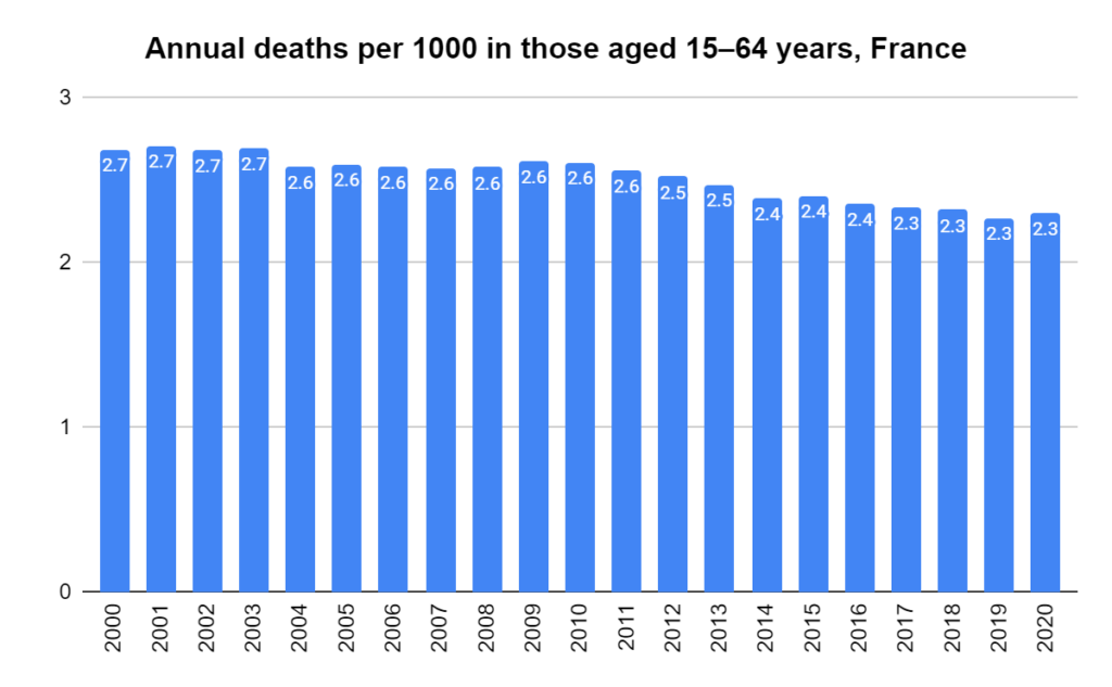
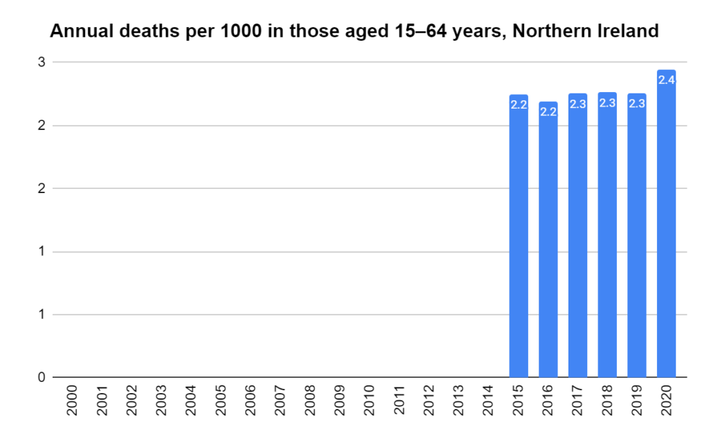
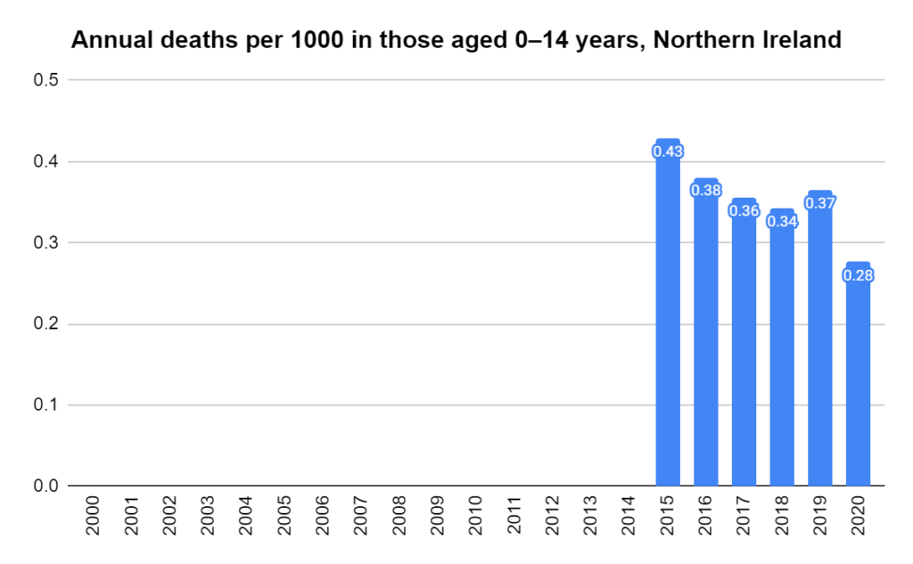
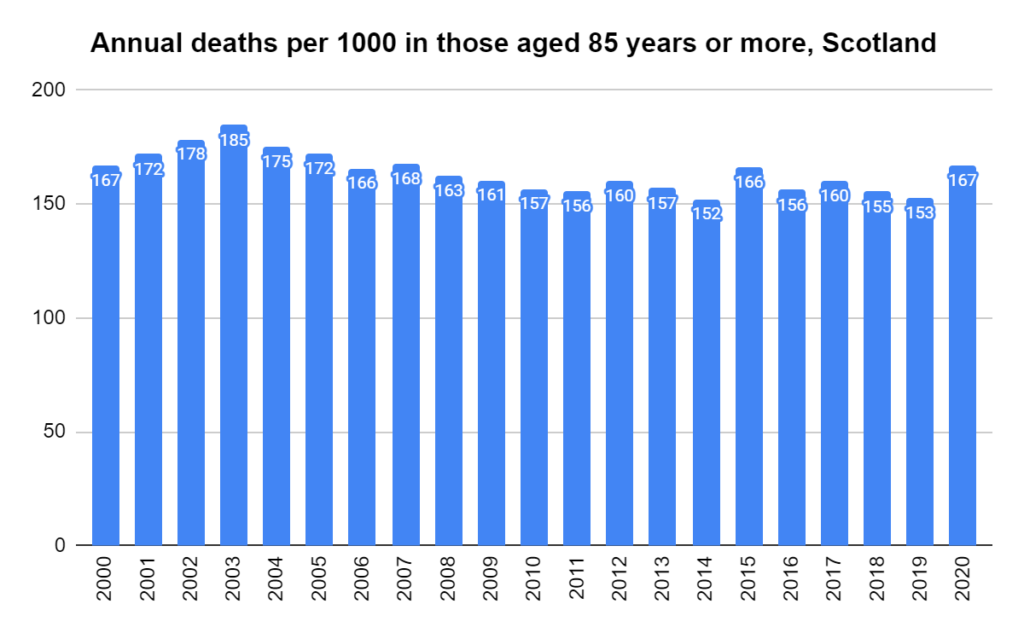
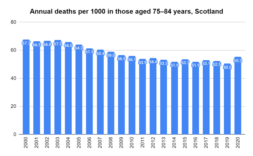
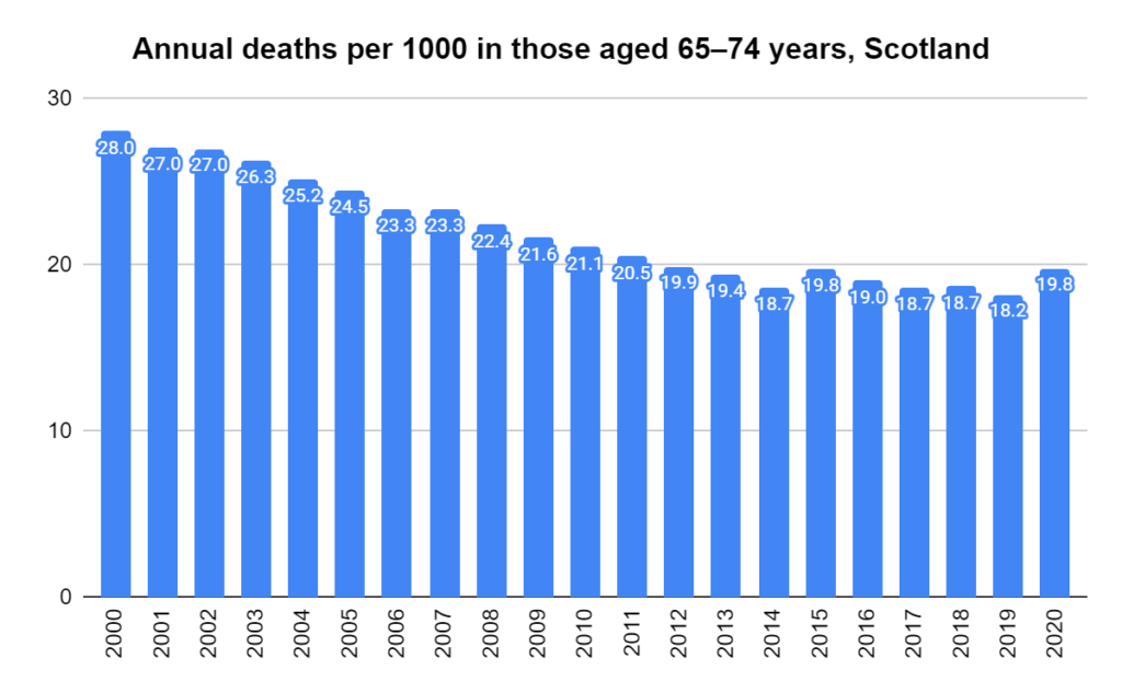
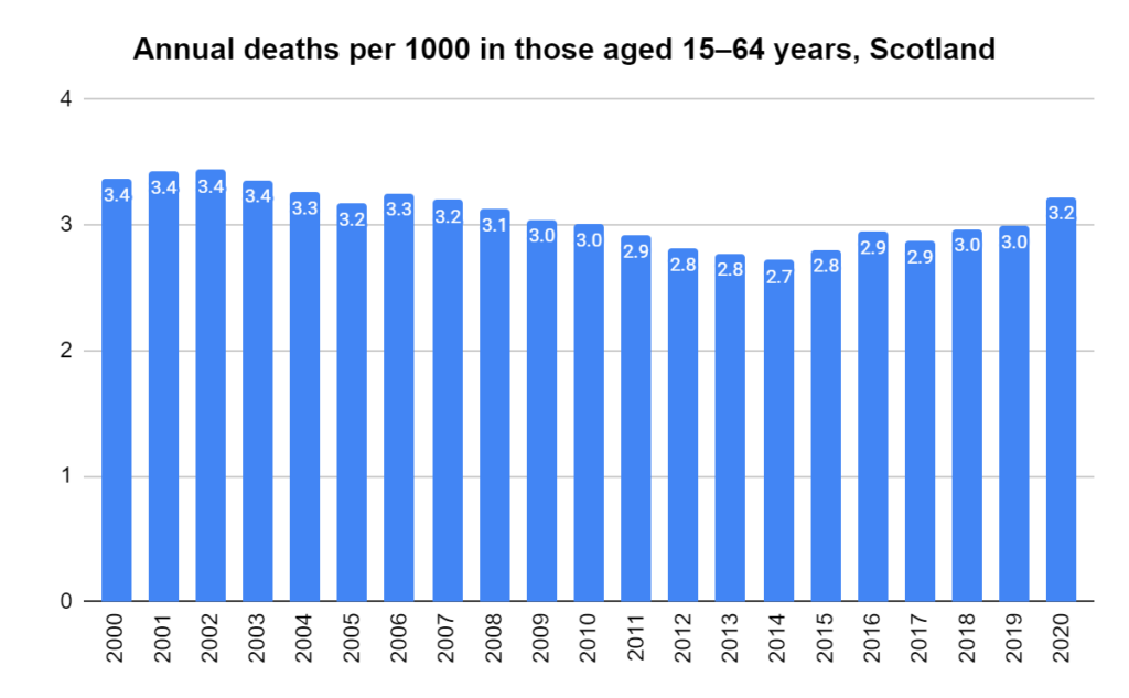
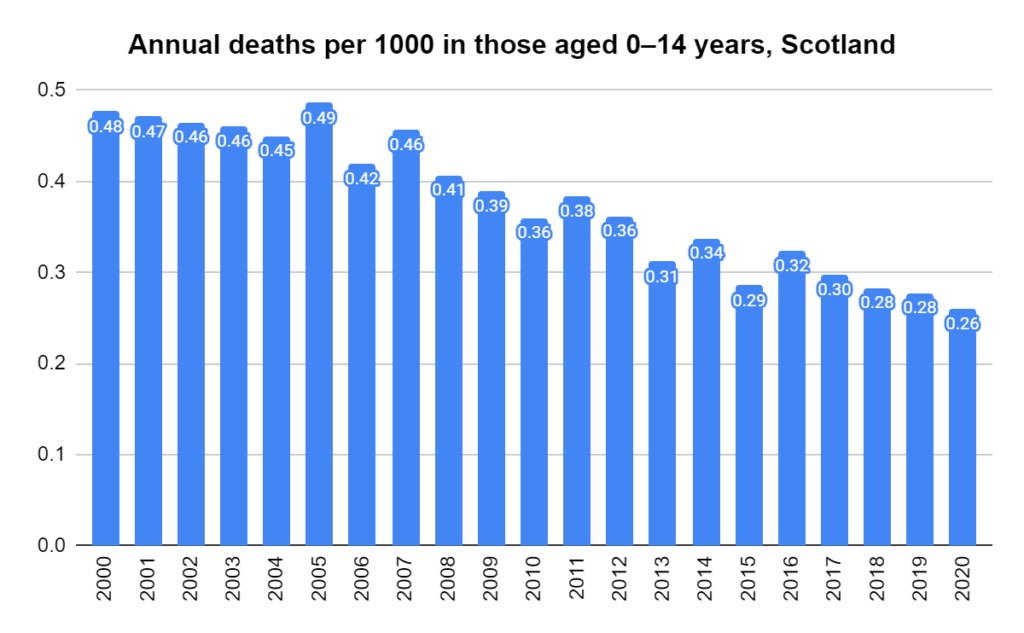
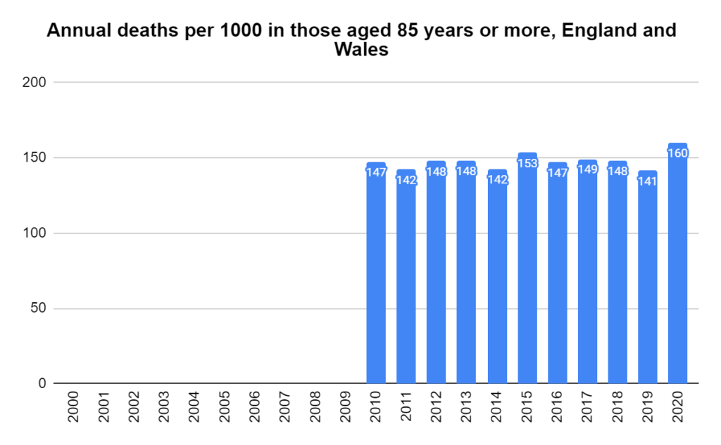
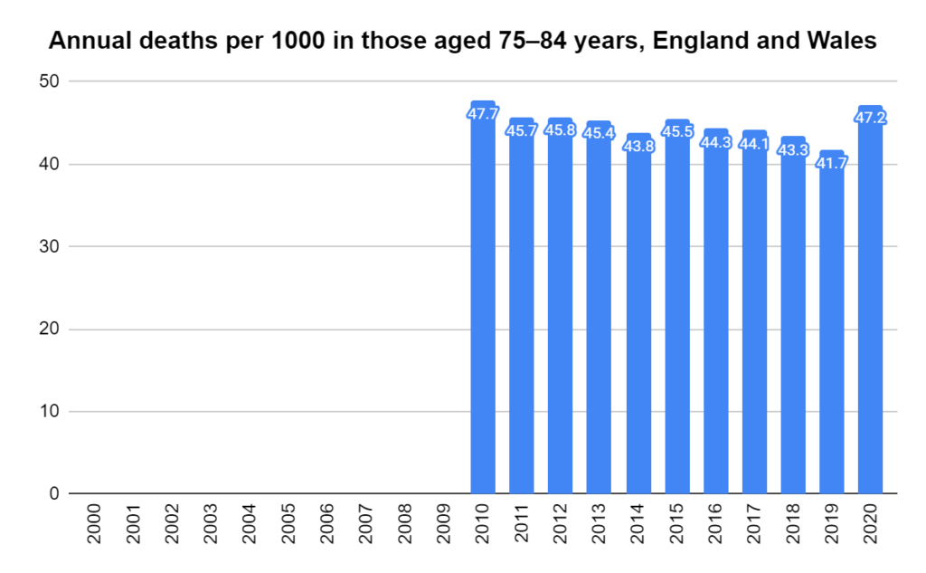
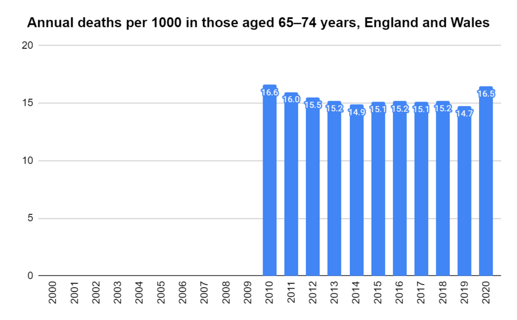
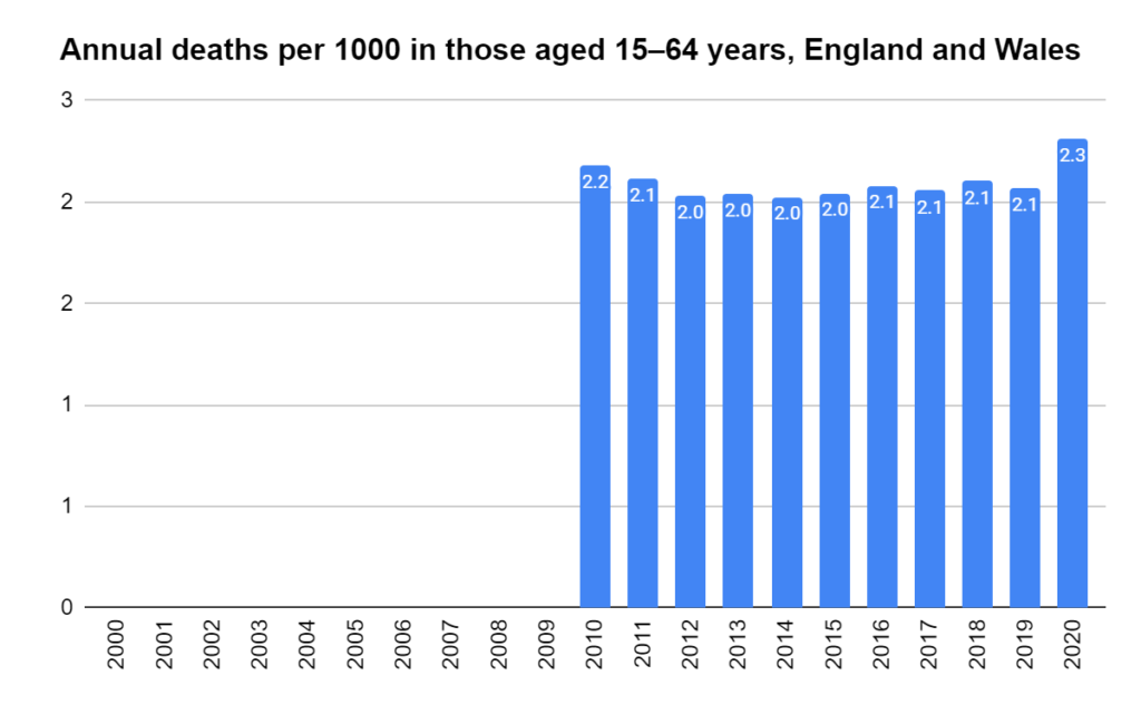
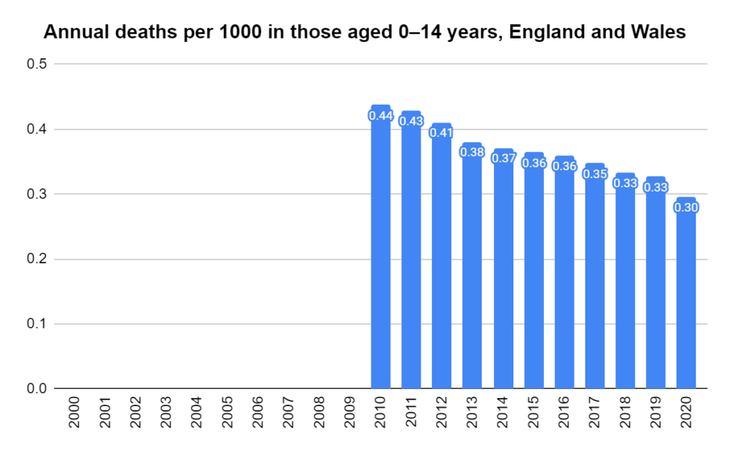
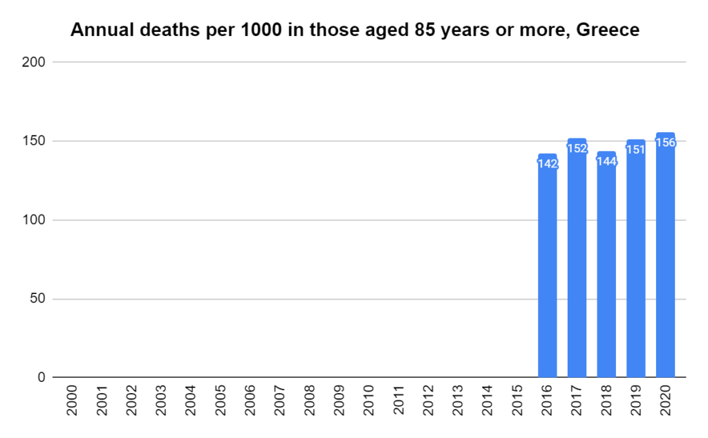
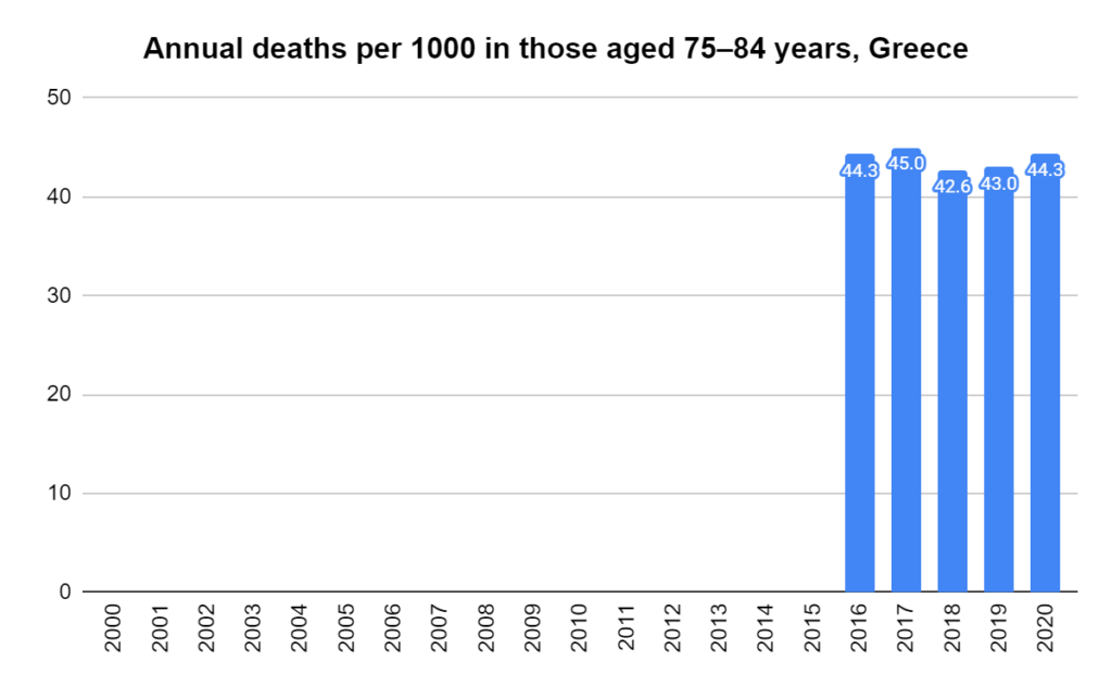
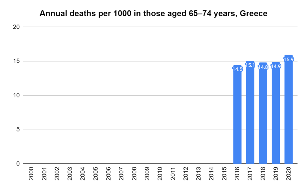
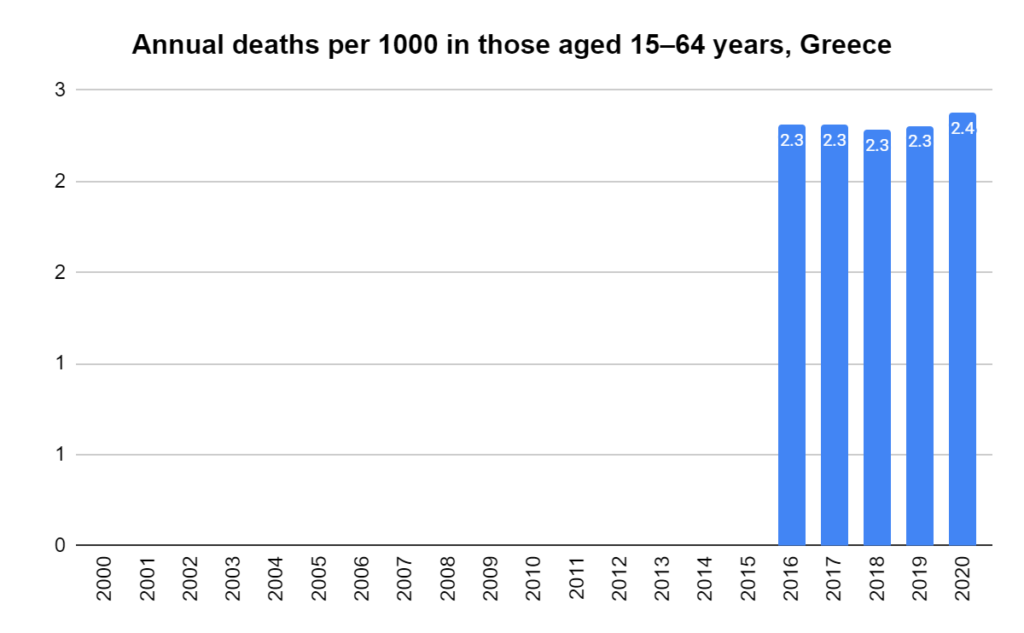
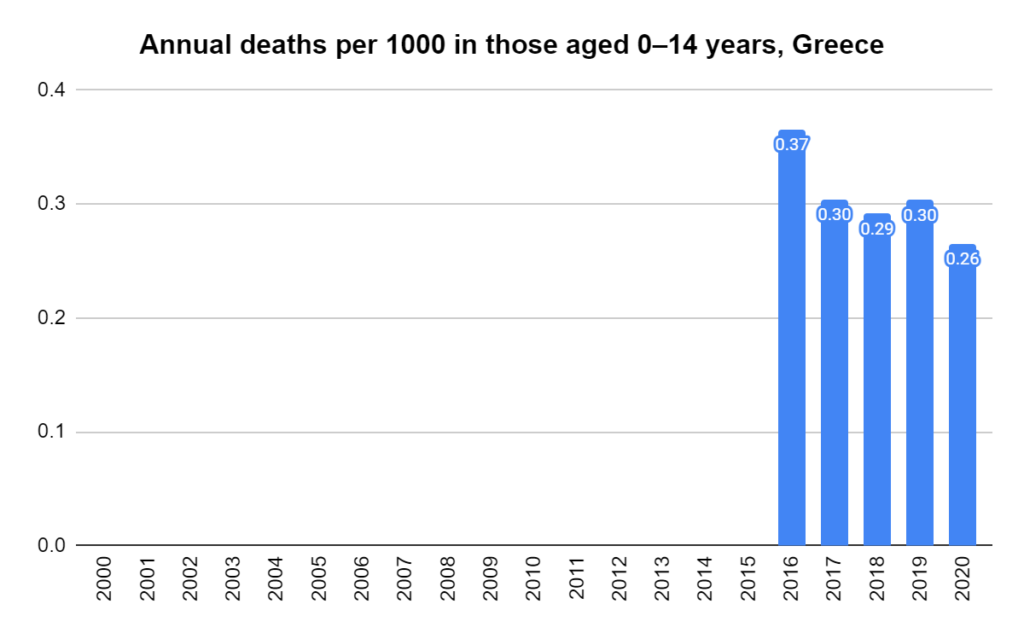
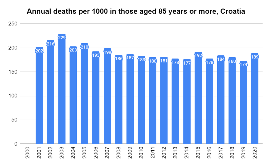
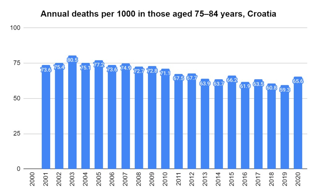
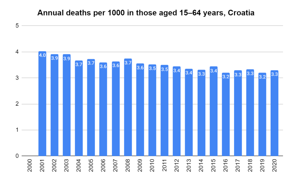
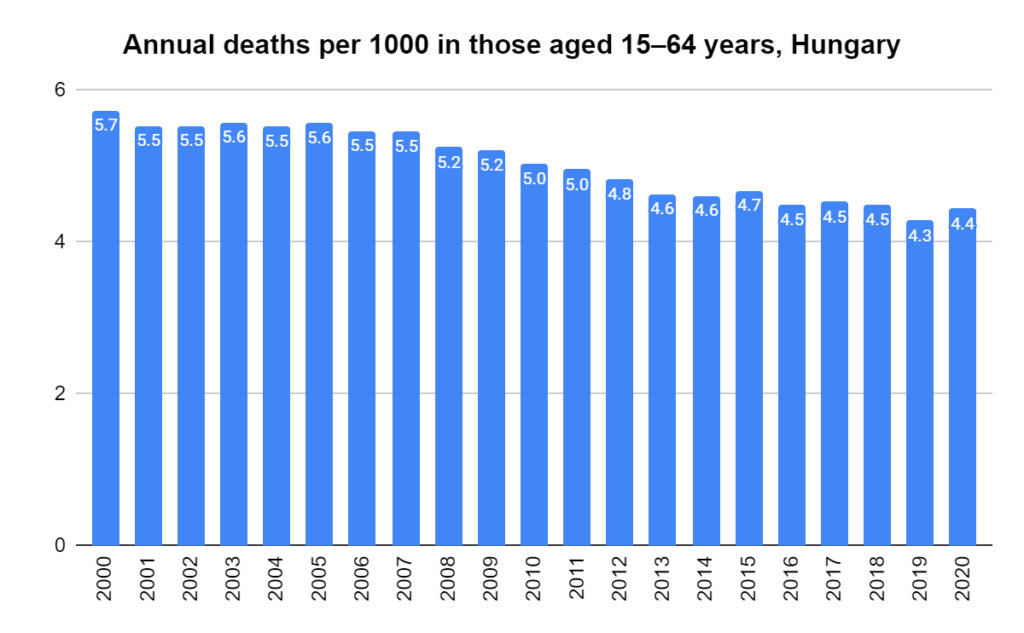
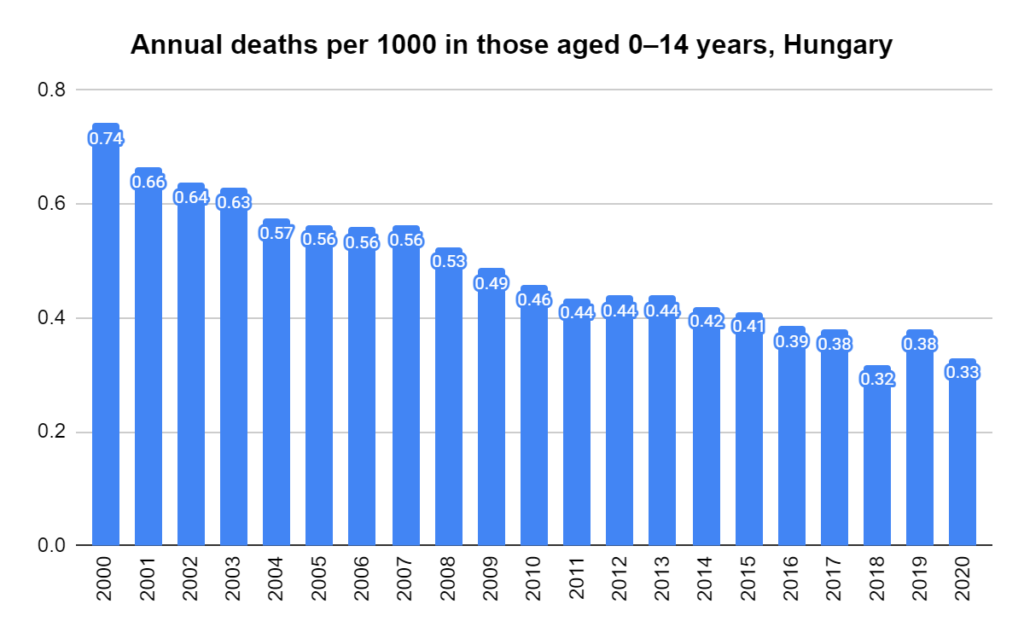
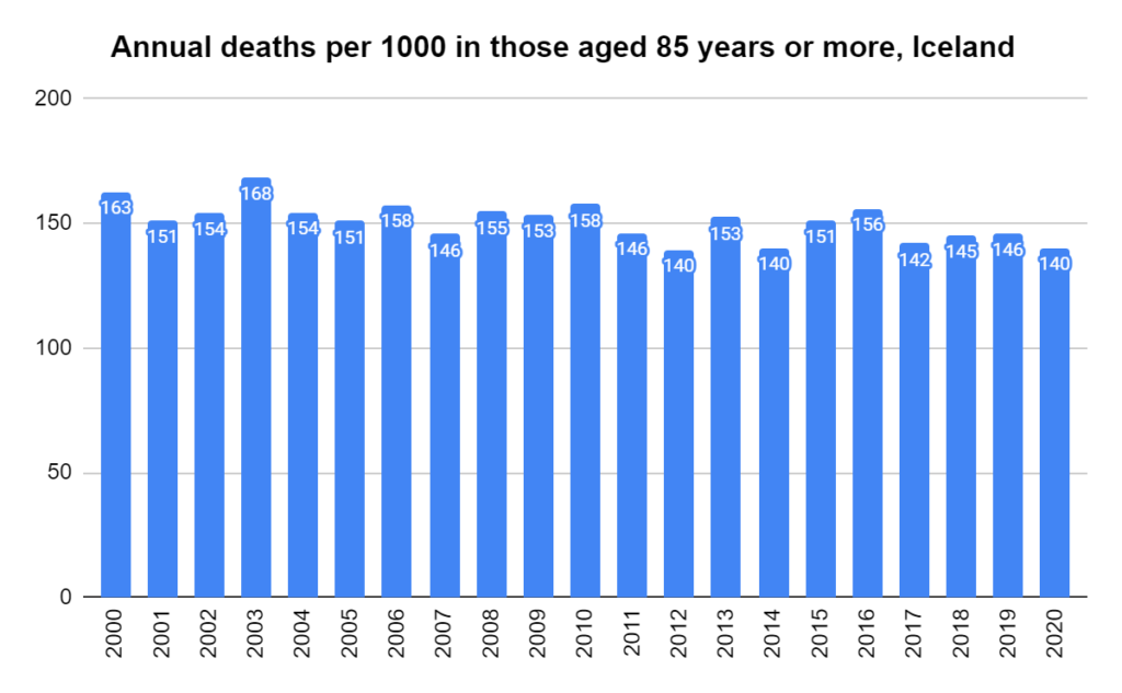
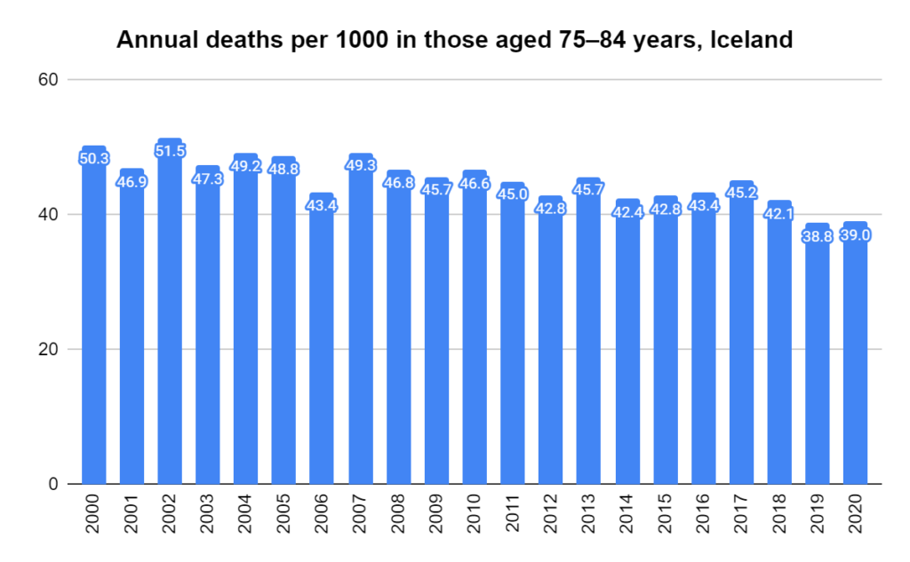
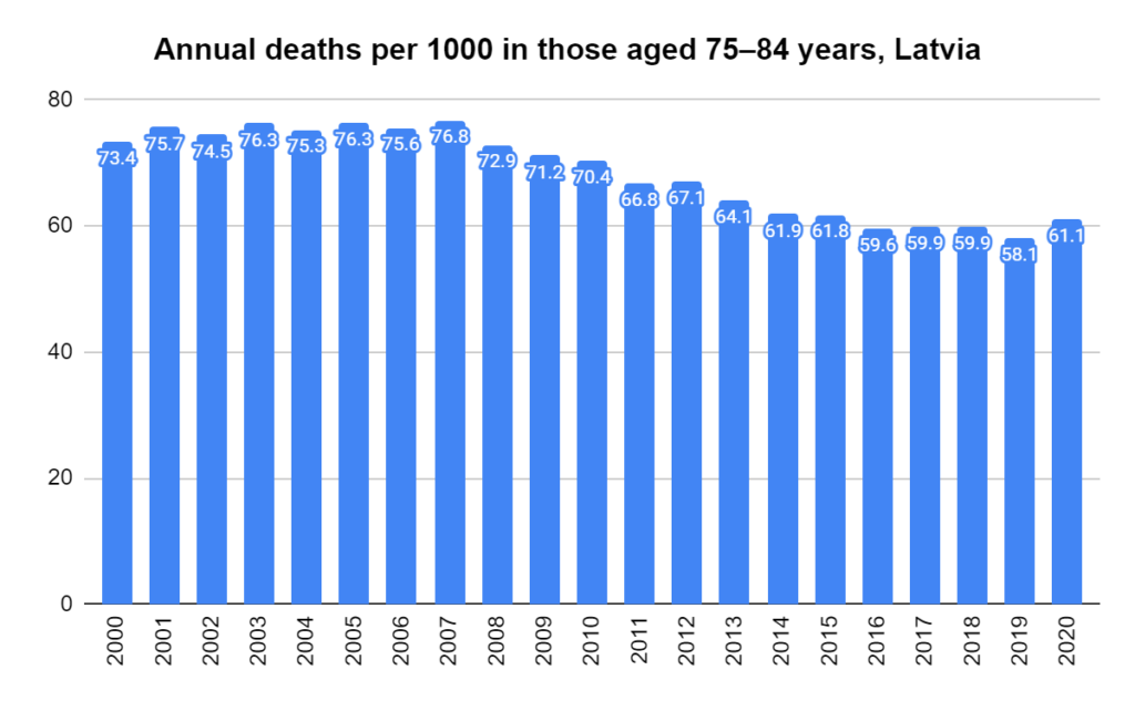
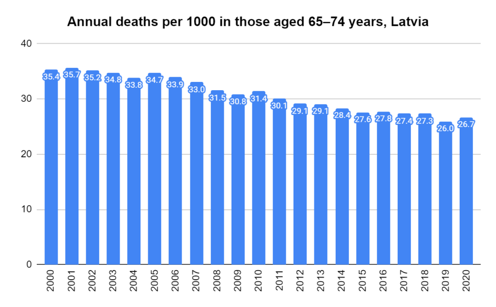
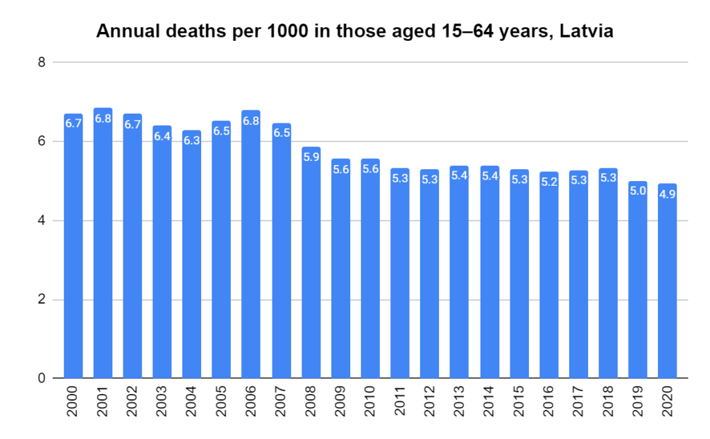
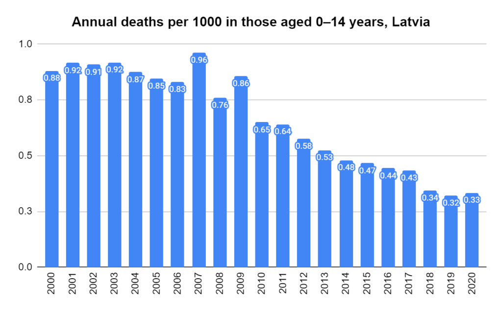
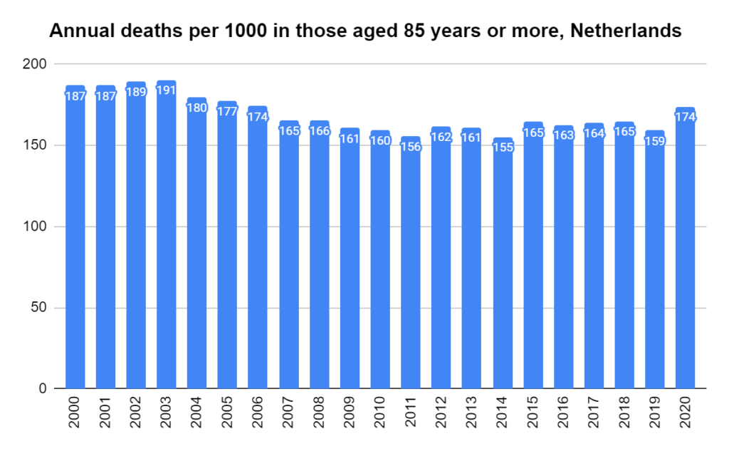
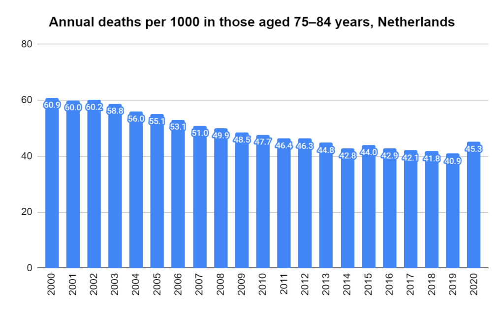
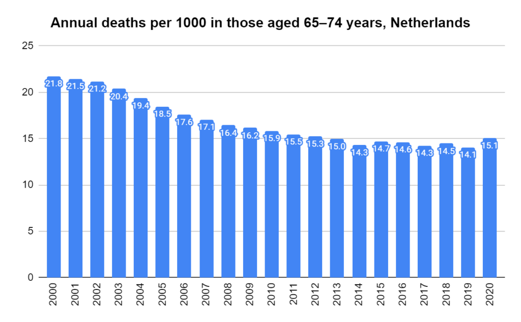
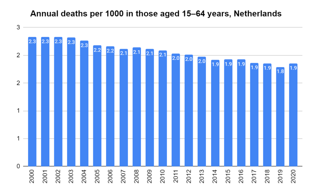
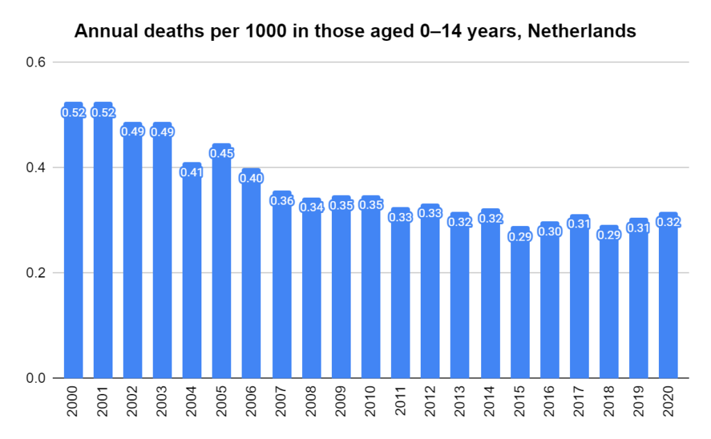
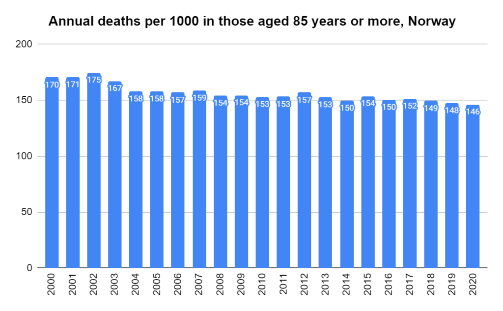
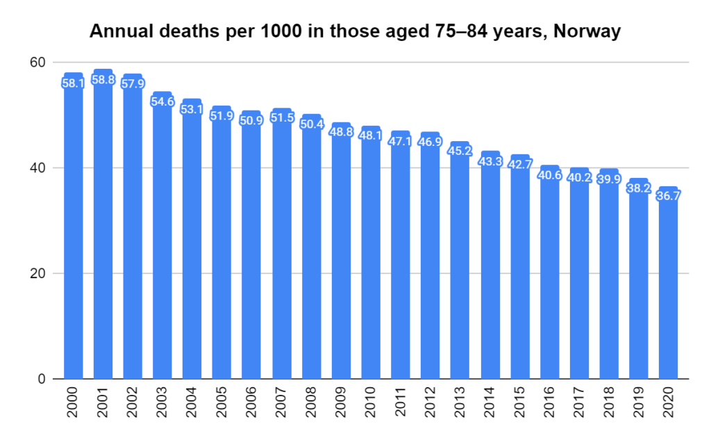
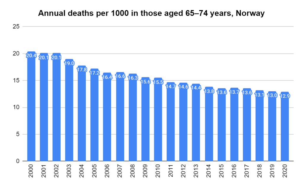
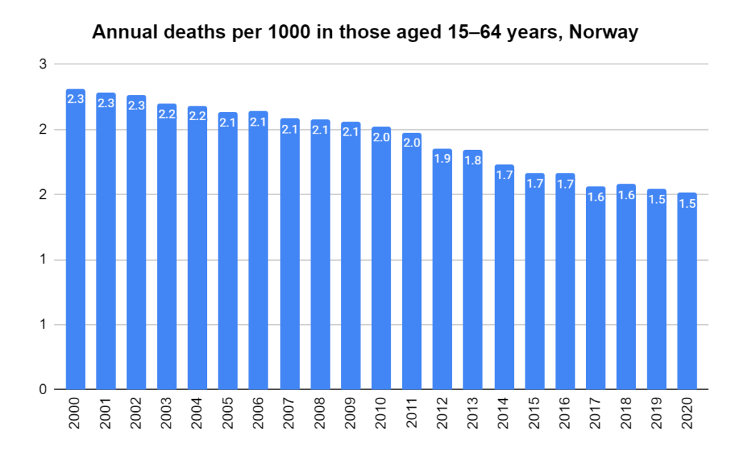
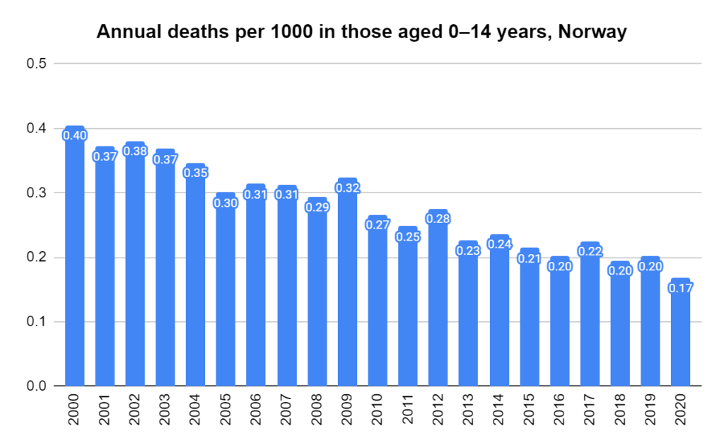
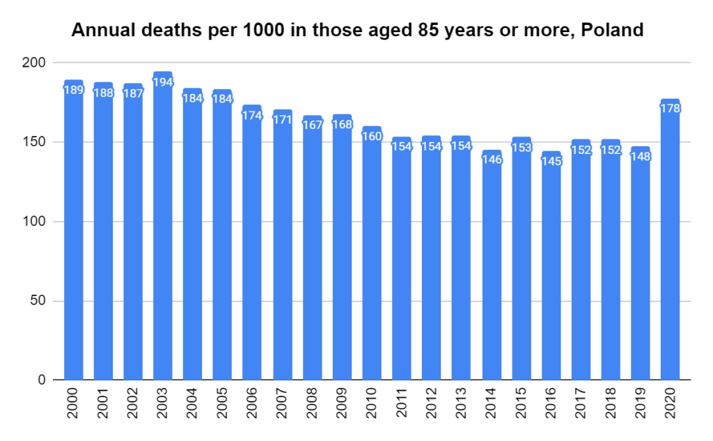
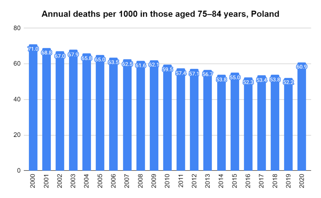
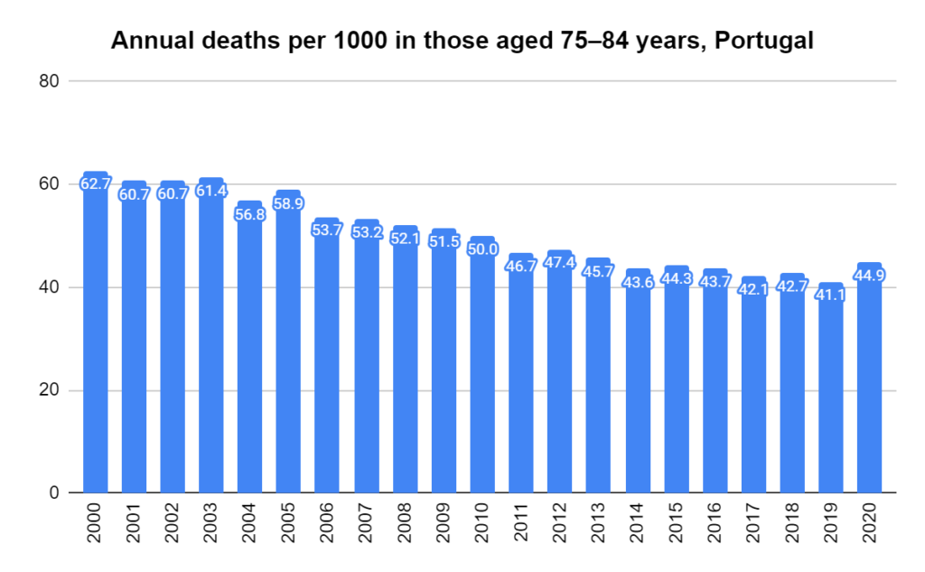
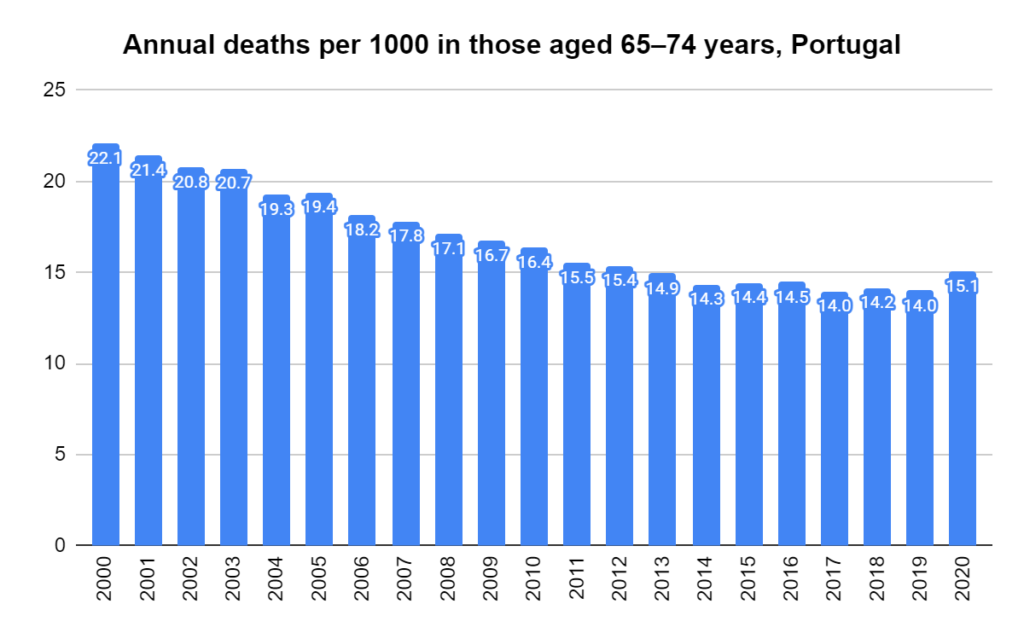
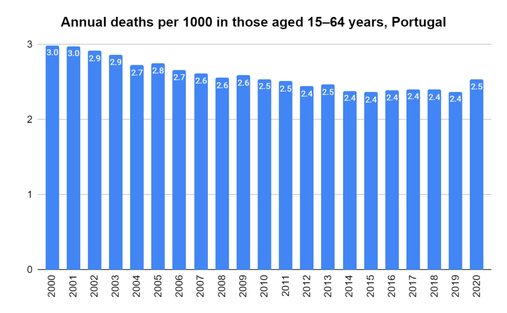
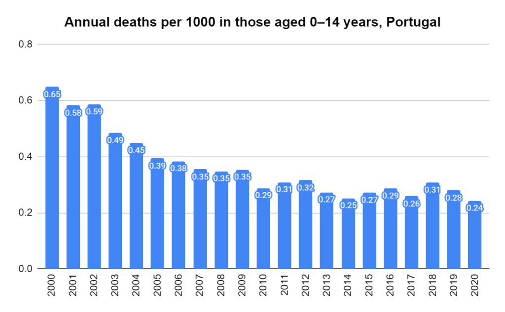
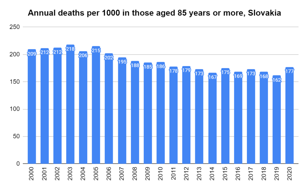
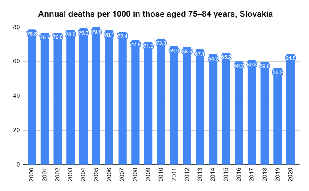
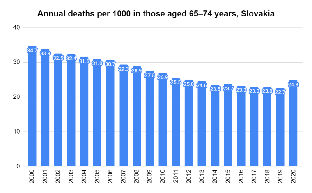
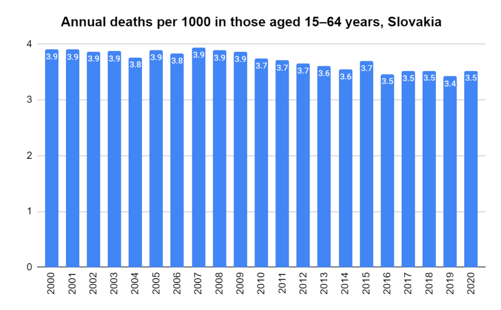
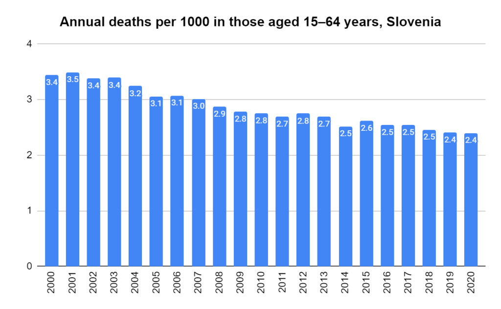
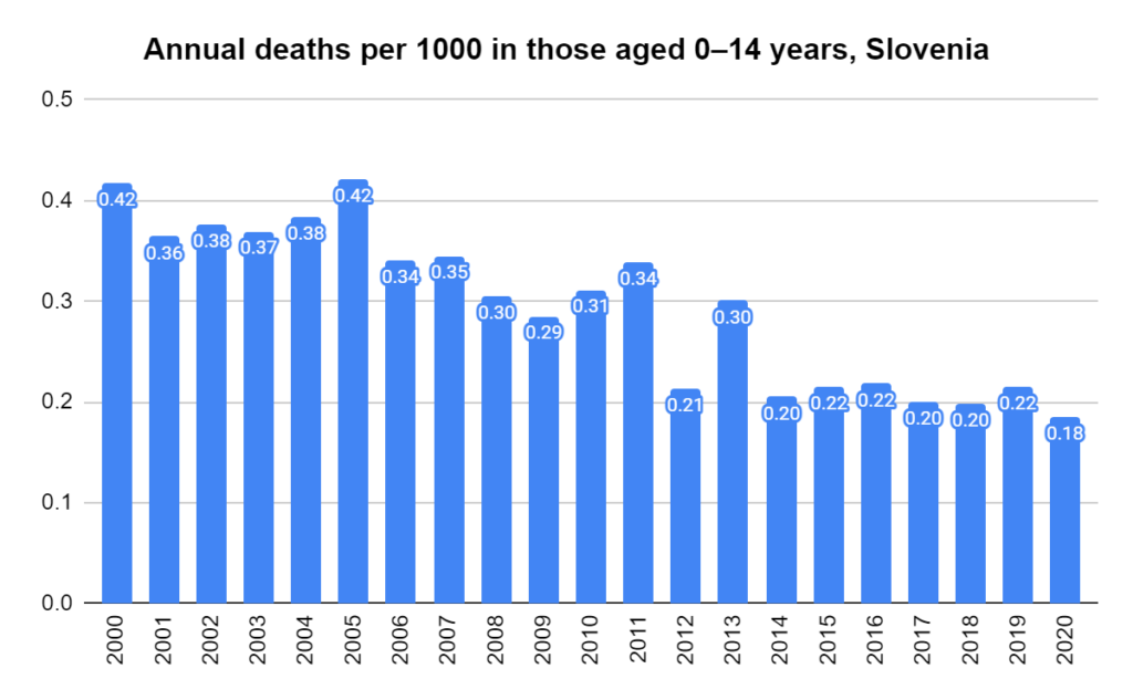
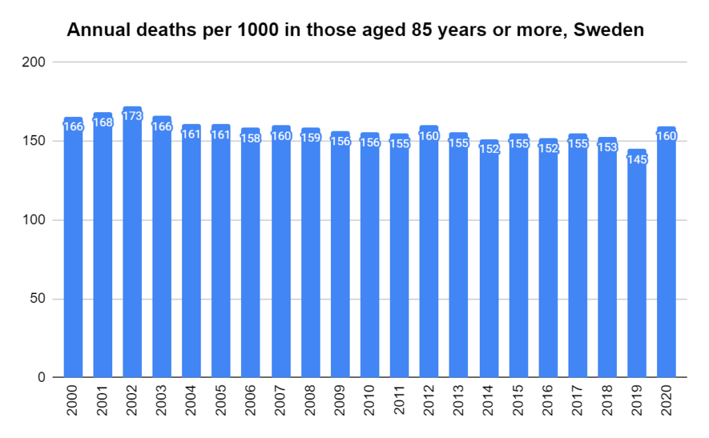
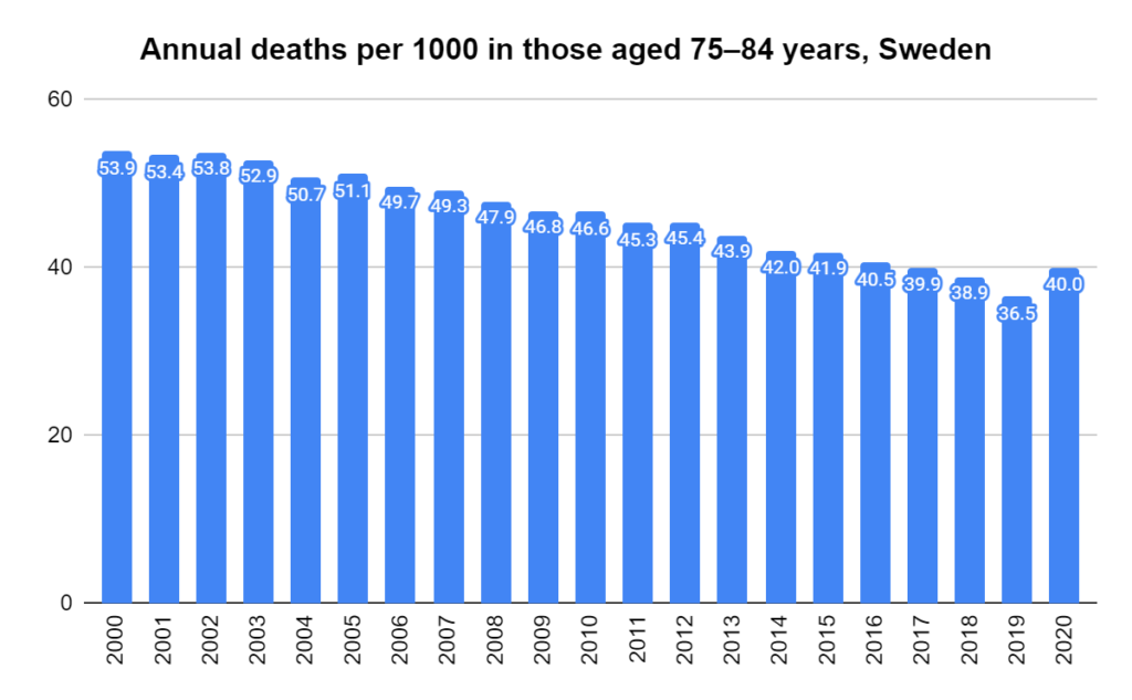
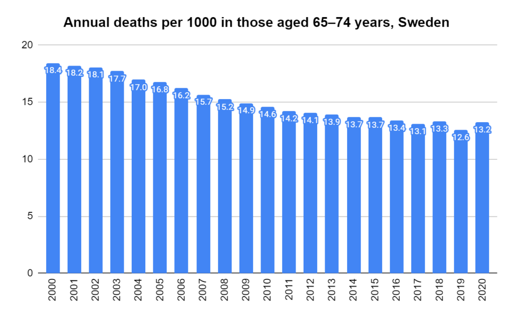
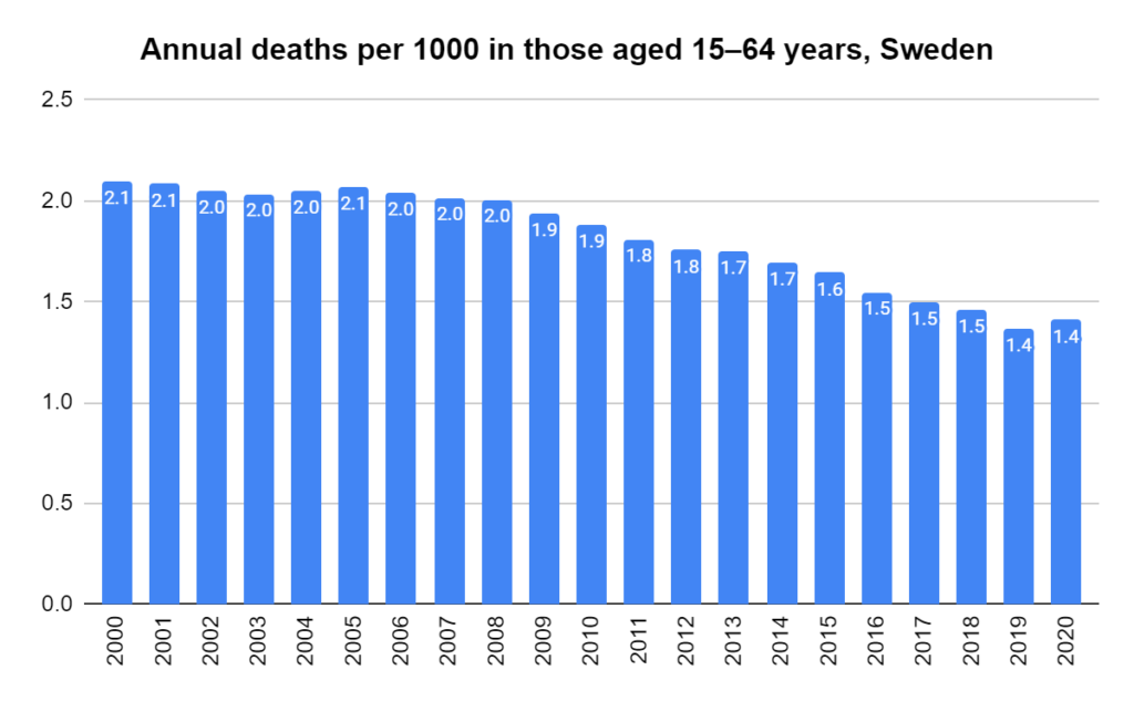
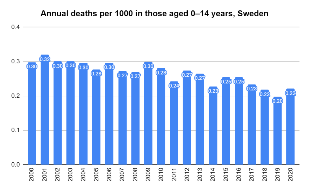
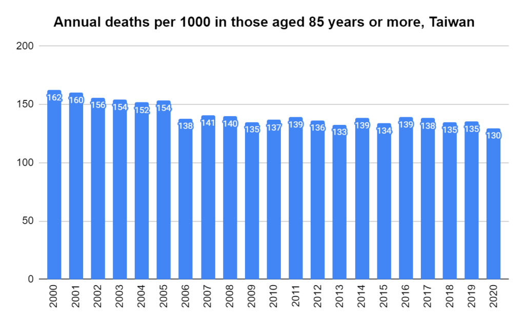
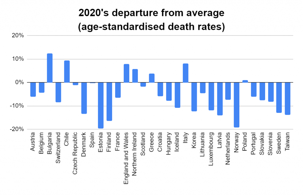
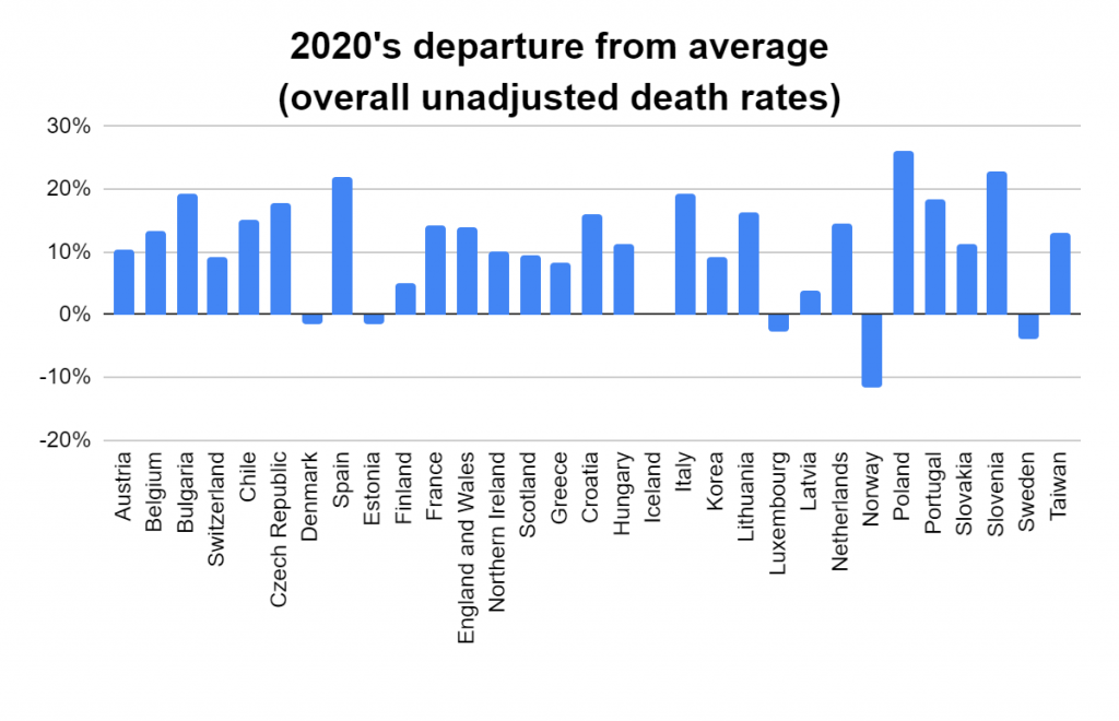
Later, we will explore all-cause mortality, which refers to all deaths in a population.  This measure follows a surprisingly consistent pattern throughout the years.  It deviates from that pattern during crises such as war, famine, economic depression, and epidemic illness.  All-cause mortality is great in that it can tell us exactly how many have died, free from the various problems of undercounting, sampling bias, and distinguishing who died from what.  And, although it can’t tell us what caused any deviations, it can help us to identify possible causes, by examining the deviations’ timing and extent.

COVID-19. Part 2 — Is it (or was it) spreading?

Part 2 in a series covering the COVID-19 issue. Please read Part 1 first.

It was the declaration that COVID-19 was spreading in epidemic fashion that justified the unprecedented restrictions we’re now living with. Was that declaration based on evidence?

When the media and, later, health experts all around the world, noted that the number of people testing positive was increasing substantially each day, they announced that the disease was spreading uncontrollably. But in Part 1 we discovered that they were overlooking something vital: that the number not testing positive was growing in parallel.

This is a basic mistake in science. Very basic. Let’s use another example to illustrate. Say we want to assess the extent of left-handedness in our city. We start by counting five left-handed people in our own street. A couple of days later we count 50 in our neighbourhood. We then recruit some helpers and count 500 in a whole suburb. The following week we ask the team to spend the next three weeks covering the whole city. Let’s say they count 5000.

Would that mean that the extent of left-handedness in our city increased dramatically from five to 5000 in the space of one month?

This naturally raises, then, another question: whether the available evidence supports the thesis that COVID-19 is or has been spreading.

To answer that question definitively, we need to know whether there has been an increase in COVID-19 incidence: cases per capita. This can be determined only by comparing random, representative samples of the population over time.

Unfortunately, on COVID-19, we don’t have such data. It is possible, though, to test the thesis here and there.

Daily testing figures from many countries have been published, and, as mentioned in Part 1, some of these include day-by-day totals for both the positive and negative test results. Although these samples are neither random nor representative, being fresh daily surveys of a defined subset of the population makes them worth looking at; and the eligibility criteria for this subset has remained fairly constant throughout. So plotting the ratio of positives to negatives for each day should let us gauge the trend. If the disease is spreading, the positive-to-negative ratio in a region should rise; and if the disease is spreading in epidemic fashion, the ratio should rise exponentially.

So let’s take a look at that. Starting again with South Korea, Figure 5 reminds us of the simple case count (i.e. the positives only) that was the basis for the pandemic declaration. (The data used to plot the following three graphs can be compiled from official South Korea media releases.)  It looks convincing at first, doesn’t it.

Fig 5. COVID-19 positive test results (daily and cumulative), South Korea

Remember, it was these numbers, reproduced for each country in turn, that prompted media calls for urgent action. (I’ve highlighted the steepest part of the rise in red; I’ll explain why shortly.)

Let’s now plot the daily ratio of positives to negatives. In a disease increasing in typical epidemic fashion, we should see this ratio increase markedly as the days pass. Let’s first examine the entire period that Figure 5 covered, before focusing on a particular part of it.

Fig 6. Daily COVID-19 positive to negative ratio, South Korea

I’ve included a computer-generated ‘line of best fit’ in these plots to help us visualise the trend. As mentioned above, in an epidemic we should see an increase; in fact, it should be an exponential increase. But here we see the opposite: a decrease.

Hold that thought.

Now let’s check the most dramatic segment of the period: the part marked in red in Figure 5. Clearly this represents the steepest increase in cases. If that represents a spread in the disease, we should at least see an increase here in our ratio of positives to negatives (Figure 7).

Fig 7. Daily COVID-19 positive to negative ratio, South Korea

But, as you can see, we see no such increase. Even during this — apparently, South Korea’s worst — period, there was no increase. Significantly, too, the South Korean Government imposed no lockdowns, curfews, or other severe social restrictions on the population. Was this because South Korean health experts read the signs correctly? They focussed on extensive testing, quarantining only those who tested positive but not otherwise introducing physical distancing.

Let’s now take a look at the U.S.A., where a lot seems to have happened since I published Part 1. Again, we’ll start with a reminder, in Figure 8, of the image that prompted first the media and, later, health experts to call for severe social restrictions to curb the ‘pandemic’. (Data for the following two graphs is available from the COVID Tracking Project.)

Fig 8. COVID-19 positive test results (daily and cumulative), U.S.A.

Now let’s jump straight to the daily positive-to-negative ratio over the same period, in Figure 9.

Fig 9. Daily COVID-19 positive to negative ratio, U.S.A.

This time, I’ve coloured the dots blue up to March 16 and red thereafter. I did this because the U.S.A. went into virtual lockdown after the 16th, giving us an opportunity to compare before and after and a line of best fit for each of the two periods.

The first thing to note is that the ratio decreased in the first period, just as it did in South Korea — and has increased since.

The blue half was the period during which the country was accused of dragging its heels: no social restrictions. President Trump was accused of not taking the threat seriously, and he came under intense international pressure to do something. So he did. It is only since then that the U.S.A. has been under ever-increasing lockdown, and only since then that test results suggest any evidence of COVID-19 spread.

Are you seeing a pattern yet? South Korea:- no lockdowns; COVID-19 incidence decreasing, even during the apparently worst period. The U.S.A.: no lockdowns, and incidence decreasing; then lockdowns and incidence increasing

I mentioned in Part 1 that the published data for Australia were scanty. One state, however, has published enough data to enable a similar analysis: New South Wales. Figure 10 shows the ratio of positives to negatives in that state from early March. I have again split the data into before (blue) and since (red) restrictions were put into place.

Fig 10. Daily COVID-19 positive to negative ratio, New South Wales

In Australia, restrictions date back to March 13, when the Prime Minister announced that outdoor gatherings were to be limited to 500 and indoor gatherings to 100. From that day, offices began instructing staff to work from home, and university students began switching to online classes. People were advised to stay 1.5 metres apart. On March 23, pubs, clubs, gyms, cinemas, and places of worship were closed by order, and restaurants and cafes were restricted to take-away trading. Gatherings were further restricted to 10, before being limited on March 27 to just two.

Again we see a downward trend in the ratio of positives to negatives prior to the restrictions, and an upward trend following them.

Since writing Part 1, some readers have urged me to present Italy’s data. Case numbers can be found via the official Italian source, or an English translation from Wikipedia, but, unfortunately, neither provides a day-by-day count of ‘negatives’. Although it’s tempting to calculate these by subtracting the ‘positives’ from the total number tested, I’ve resisted doing that so far, because it’s actually not the correct way to do things. Due to the time it takes to process tests, the positives reported on any day represent outcomes of tests that were likely carried out one, two, or even more days beforehand.

Fig 11. Daily positive as a fraction of total daily COVID-19 tests, Italy

The data in Figure 11, showing the number of positives reported on each day as a fraction of the total tests reported on that day, will therefore be somewhat inaccurate due to such date slippages. Nevertheless, the numbers suggest a modest increase throughout most of the month of March, followed by a decrease at the tail end. Italy was under severe restrictions for the entire period graphed. The country’s lockdowns began on February 27 in several northern regions, and increased as the days went on, culminating in a strict nationwide lockdown on March 11. For two weeks following this strict lockdown, a very high proportion (around one-quarter) of tests returned positive results.

Back to the point

I present all of this not in order to argue that the restrictions were counterproductive, although they may have been, but rather to demonstrate that the justification for imposing them did not exist. Data for both Australia and the U.S.A. showed no indication that we were facing an epidemic that required unusual intervention, let alone the restrictions we now face; and South Korea, one of the most densely populated countries in the world, demonstrates that such measures were not needed there.

Of course, there may be other explanations for what we have observed here:

  • there may be further data that the various governments have not published (although the possibility that they had published some of the data but left out the bits that provided the justification for their actions is so bizarre as to be unlikely);
  • in the cases of Australia, the U.S.A., and Italy, the increases observed after restrictions would have been much worse had restrictions not been imposed (although South Korea suggests quite the converse);
  • the data were of poor quality and shouldn’t be used for this (which, though valid, would raise the questions of what data they did base their decisions on and why they did not share them).

In relation to the last point, it’s worth noting that the tested population is not necessarily representative of the wider population (as those tested have had to meet certain criteria) and will change as the eligibility criteria for testing become more inclusive. To my knowledge, the criteria have been stable over the period examined in this post, at least in Australia. At the time of writing, however, news is emerging that the requirement to have had overseas travel or contact with a known case is about to be relaxed.

Hindsight is always good; I realise that. Nevertheless, the decision to impose social and other restrictions, the likes of which we’ve not seen before and hopefully will never see again, was evidently not justified even at the time it was made. Hindsight merely rubs that in.

One final point: even if we were facing a substantial threat, what is the evidence that lockdowns and other restrictions are the answer? Writing about the harms of exaggerated information in relation to COVID-19, John Ioannidis, one of the most cited medical researchers in the world, wrote that “A systematic review on measures to prevent the spread of respiratory viruses found insufficient evidence for entry port screening and social distancing in reducing epidemic spreading.”

Of course, we have not yet addressed the deaths ascribed to COVID-19. And I’m afraid that that topic will have to await the next instalment.

COVID-19. Part 1 — What could be worse?

READ THIS FIRST:

The data and conclusions below are all factually correct. Although they are extremely alarming, I believe the new illness discussed herein offers us a greater understanding of our current predicament. But please read to the end of this article before buying more toilet paper!

What could be worse than COVID-19?

We’re in the grip of a pandemic. Most of the world is in lockdown, to some degree. Businesses are closing, social support structures are disintegrating, and human interaction is systemically breaking down. In some parts of the world residents are not allowed to leave their homes. Many pundits are forecasting widespread economic collapse.

The justification for all this is that we have a new disease on our hands that is spreading uncontrollably, threatening to invade every corner of the world unless it’s arrested. Every day we hear that the cases are soaring, along with headlines such as “Medical services at breaking point”, or “Virus out of control”. 

Right? What could be worse?

Well, there is something, and it’s actually much worse: a ‘new’ illness on the radar. It actually emerged at the same time as COVID-19 and has risen at the same rate as COVID-19 over exactly the same period of time. But for some reason we’ve heard nothing about it. To top things off, it has exactly the same symptom profile as COVID-19. In fact, the two are clinically indistinguishable!

Coincidence? Maybe. It’s been given the mysterious name “NC-19”. I’ll explain why later.

Getting hold of good data on NC-19 is difficult. At the time of writing, a search on “NC-19” turns up nothing; several mainstream media corporations have, however, been slowly uncovering it, including reporters from The Atlantic (U.S.A.) and The Guardian Australia. I will discuss what they’ve found shortly and lead you to where you can find the data. But first I want to show you something breathtaking from the country considered to have collected the best data on both COVID-19 and NC-19.

Figure 1 is a graph of South Korea’s NC-19 cases, both the cumulative count and the daily ‘new’ cases.

Fig 1. NC-19 cumulative and daily case count, South Korea

For comparison, Figure 2 shows South Korea’s COVID-19 cases over the same period.

Fig 2. COVID-19 cumulative and daily case count, South Korea

Note the similarity. Now look closer at the vertical axes… and hold on to your seat! There have been more cases of NC-19. Quite a few more. Almost 40 times more, in fact.

What’s going on? Why have we not been told about this before?

Let me repeat: The two illnesses emerged at the same point in time, and they spread at the same rate, over the same period. As well as this, NC-19’s symptoms mirror those of COVID-19 exactly.

Oh, there’s one more thing. All cases of NC-19 have been lab confirmed.

The only difference is that the cause of NC-19 has not been found. Of course, those familiar with lab confirmation will ask “how can it be lab confirmed if the cause isn’t known?” Good question. I’ll explain later, but, for now, please just accept that the cases have been lab confirmed, because they have.

So what’s going on?

If you feel like you’ve missed something, you’re not alone. Why have the media been silent on NC-19? Not a peep from anyone. Could it be that the disease is only in South Korea? The answer to that is an emphatic “No”. This is happening all over the world. It’s just that South Korea has published a fairly full set of data on it.

Clearly, whatever we have to fear from COVID-19, we face in a far bigger sense with NC-19. But we hear nothing about it. For some reason, the entire world is focusing on one disease and ignoring another that’s much larger.

As mentioned earlier, reporters from The Atlantic have managed to collate a limited set of data on cases of both (COVID-19 and NC-19) in the USA for the month of March 2020. Again the results are mind-blowing (see Figures 3 and 4).

Fig 3. NC-19 cumulative and daily case count, U.S.A.

Fig 4. COVID-19 cumulative and daily case count, U.S.A.

The story is similar to South Korea’s except that this time NC-19 is only around five times the problem that COVID-19 is. Why might that be? An explanation may be found in the fact that the U.S.A. has come under heavy criticism for its lack of testing. 

Note that the numbers on the graphs are multiples of 1000. That means that, despite the lack of testing, as of this writing the U.S.A. will likely have confirmed more than half a million cases of NC-19. That’s about the same as the entire worldwide tally of COVID-19.

In my home country of Australia, reporters from The Guardian Australia have collated all publicly available data on NC-19. Unfortunately they’re too scanty to graph day by day, but the latest case numbers they’ve cumulated (up to the time of this writing) are in the table below, with their COVID-19 comparisons.

NC-19COVID-19Ratio NC/COVID
NSW76,284140554
ACT3,6986259
WA11,28823148

These data come only from three states; but, as you can see, Australia appears to have roughly 50 times more NC-19 than COVID-19 cases.

Again, why have we heard nothing of all this? Could it be that the situation is simply too dire? The world is almost at breaking point with COVID-19. How much more could we handle?

Discussion [IMPORTANT — MUST READ!]

This is clearly a distressing situation. For many it will be the first time hearing of NC-19. It’s tempting to hope that there’s something wrong with the data. There’s not, although while the media stay silent such hope will continue. Once the story breaks, it’ll be different.

But did you see what I did there? Probably not. Those who understand the situation are likely laughing their heads off, because they know exactly what I did.

I just did to you exactly what the media has done to you.

I used factual data. (Yes, it’s completely factual. You can check it for yourself using the links below.) I presented it graphically and with no tricks. But I made you think it was something big, when the truth is that it means nothing. That’s exactly what the media did to you with COVID-19.

By the way, I was the one who gave it the name NC-19. It stands for “NOT COVID-19”. That’s the only part that was made up. 

So what is NC-19 exactly? The simple answer is that it’s all the people tested for COVID-19 who turned up a negative result. All are identical to COVID-19 cases in every respect except the test result.

Hence:

  • the two diseases emerged at the same time;
  • all were lab confirmed (positive if they were COVID-19 and negative if they were NC-19);
  • all were sick with exactly the same symptom profile (having had to satisfy the same criteria).

I promised that you could confirm the data for yourself. Just remember, I gave the disease the name — so don’t expect to see “NC-19” listed at any of the following links. Just look for the test results: positive means COVID-19, and negative means NC-19. Here are the sources:

  • South Korea – you’ll need to go through all the media releases one by one;
  • USA – all collated for you;
  • One example of criticism of the USA for poor testing and record-keeping;
  • Australia – collated but, as mentioned, scanty.

There’s one thing left to explain. Why did the numbers rise at the same rate? COVID-19 is spreading throughout the country because it’s a ‘new’ virus, right? And that’s what all the panic is about, right? NC-19 isn’t a ‘new’ virus, so why is it doing the same thing?

And that’s the whole reason for this article. Read on for the important take-home message!

You can’t count on just counting.

When something is new — or even not new but just something we didn’t know was there before (perhaps because we couldn’t see it) — and we start noticing it for the first time, obviously how many times we find it depends on how much effort we put in.

Does that make sense?

With COVID-19, we’ve been increasing the number of people we test each day. For example, Australia had tested fewer than 200 people by the end of January (according to official reports). By the end of February, we’d tested well over 2000; by mid-March, more than 20,000; and now, as we approach the end of March, close to 200,000. That’s an exponential rise in testing.

Can you see what’s happened? The more tests we conducted, the more results we got – both positive and negative. That’s why we see the startling graphs above. It does NOT mean either of the diseases is increasing. It only means that testing is increasing. Because our testing rose exponentially, our results — both positive and negative — also rose exponentially. That’s no surprise: of course they did!

But the media have turned that simple observation into headlines such as “Cases rising exponentially”. The correct headline would have read “Testing rising exponentially”.

This covers just one aspect of the conundrum. It’s a very important one, as it has laid the foundation for this evolving apparent emergency. But there is much more to cover. What, for instance, about the deaths? What about Italy? For now, although it may be easy to assume that the more severe later symptoms (including death) must be commoner in those who have tested positive than in those who tested negative, no evidence supporting that has been published. In fact, there’s no suggestion that those who have tested negative have even been followed up — implying that the test could simply be turning away many who are actually ill.

In the coming days I’ll write more about COVID-19 to try and shed new light on what’s going on.

I will also discuss the role that the media have played in all of this.
In the interim, talk to your friends. Explain to them what has happened to cause a perceived rise in cases. With all of us doing our little bit to apply critical thinking to what we’ve learnt of the situation, perhaps we will find a way to restore it in our communities.

Read Part 2 — Is it (or was it) spreading?

Vaccination destroys herd immunity?

The theory of herd immunity goes something like this:

1. Vaccines produce antibodies, which are like guards that stay resident, ready to catch a particular villain if it tries to enter. This is called immunity;

2. Mass vaccination creates mass immunity, or herd immunity;

3. When the herd is immune, the disease has nowhere to go; it’s refused entry, everywhere; so it doesn’t hang around;

4. This herd immunity protects those who, for whatever reason, can’t be vaccinated.

Sounds like a good idea, doesn’t it? I don’t subscribe to it myself. But if you’re one of the majority that do, prepare to be disappointed by the study I’m about to discuss.

First, a bit of background. Intravenous immunoglogulin (IVIG) is manfactured from blood donations. It contains antibodies and is used to treat patients with immunodeficiency disorders – that is, those who can’t produce enough antibodies on their own.

But a problem has emerged recently in that the levels of measles antibody in donated blood have been declining over the years, and are now too low to reliably meet the requirements (at least those in the USA) for IVIG.

There’s been speculation within the industry that the decline is due to vaccination. So a peer-reviewed study published just 13 days ago set out to address that question.

In a nutshell, the researchers pooled the donated blood into lots based on donor birth year. They then analysed the mean levels of measles antibody separately for those who, based on their birth year, would have received:

a) no vaccine;
b) a single dose of vaccine (either killed or live vaccine); or
c) two doses of live vaccine.

According to the findings, the unvaccinated cohort were brimming with immunity. They had three times the level of antibodies as the single dose group, and eight times that of the double dose group!

The reason there’s been a slow overall decline is that, as the unvaccinated population ages, it is gradually replaced by a doubly-vaccinated population that has almost no antibody.

Put simply, mass vaccination, rather than creating herd immunity, is destroying it.

So, those who believe in the concept of herd immunity now have something to grapple with. Especially if they believe it can be achieved via vaccination.

Good luck!