Many are still talking about growing ‘excess deaths’. And some are suggesting it is linked to the COVID vaccine. So, I thought I’d update the graphs from Part 8 to see what’s happened in the last 2.5 years. You’ll find them below.
There are 37 graphs, covering all the countries included in the Human Mortality Database’s Short-term Mortality Fluctuation (STMF) dataset (except Russia). Please read parts 7 and 8 for more detail.
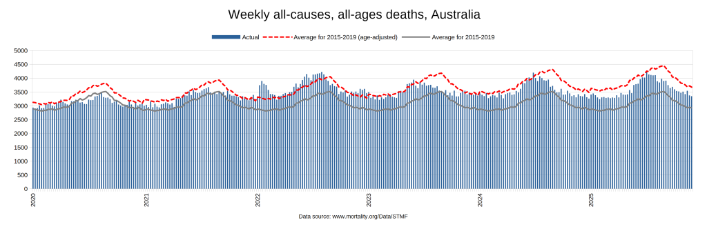
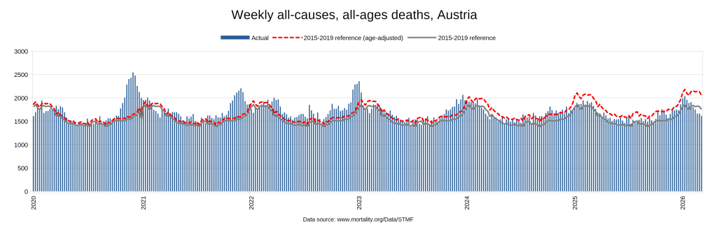
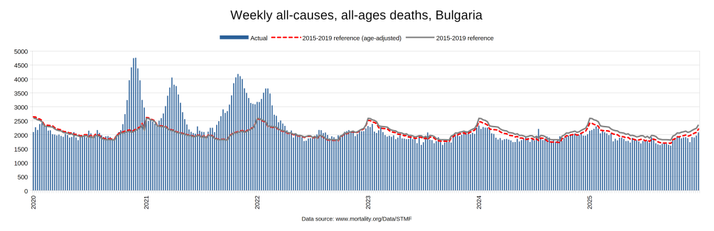
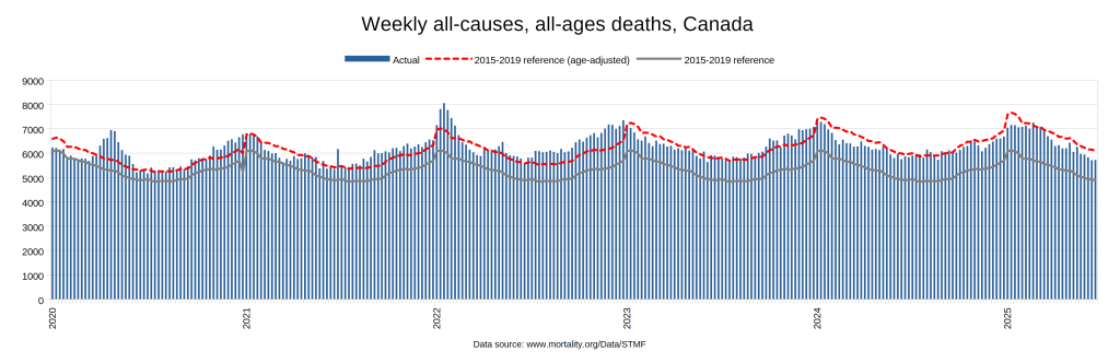
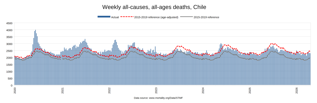
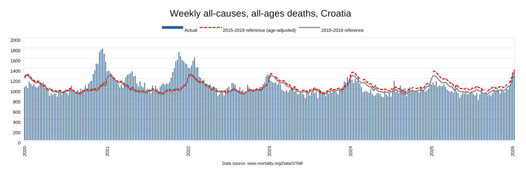
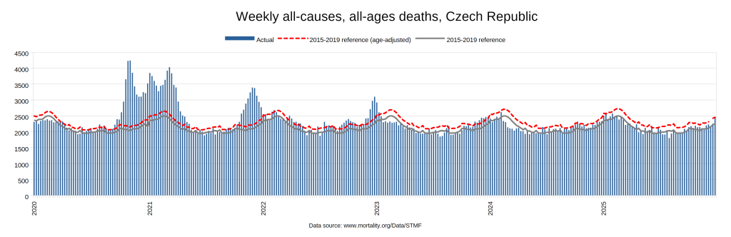
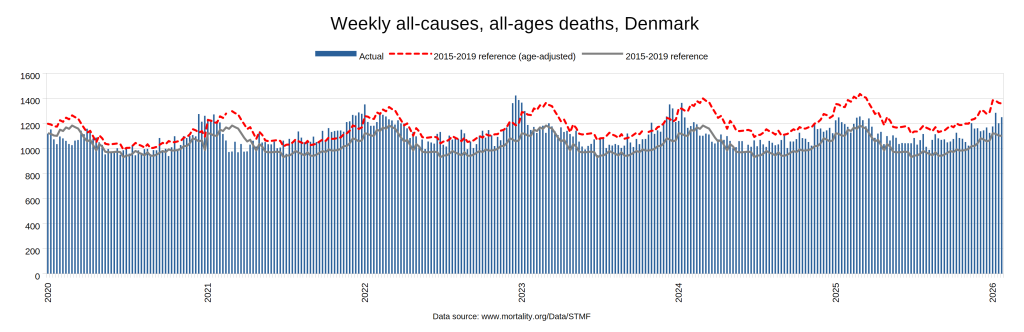
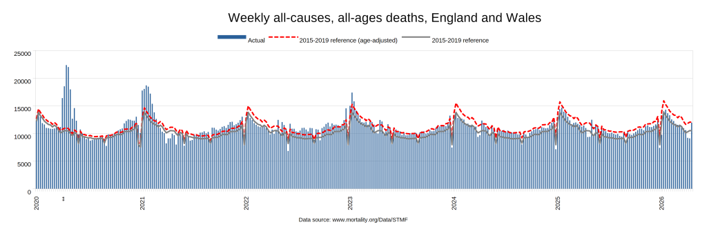
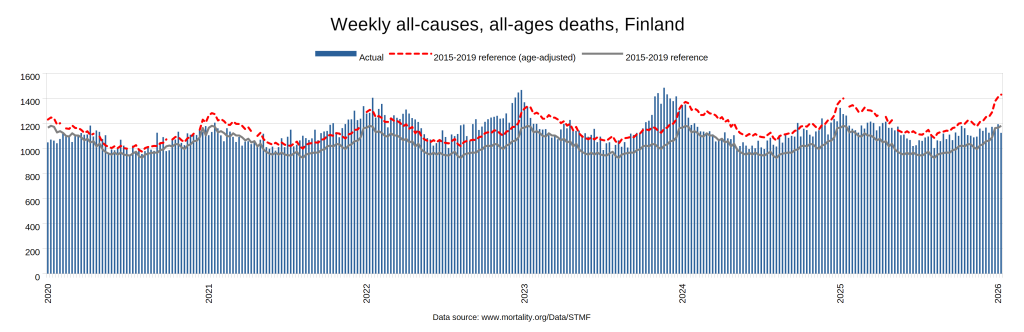
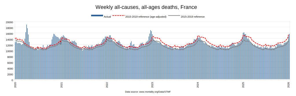
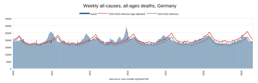
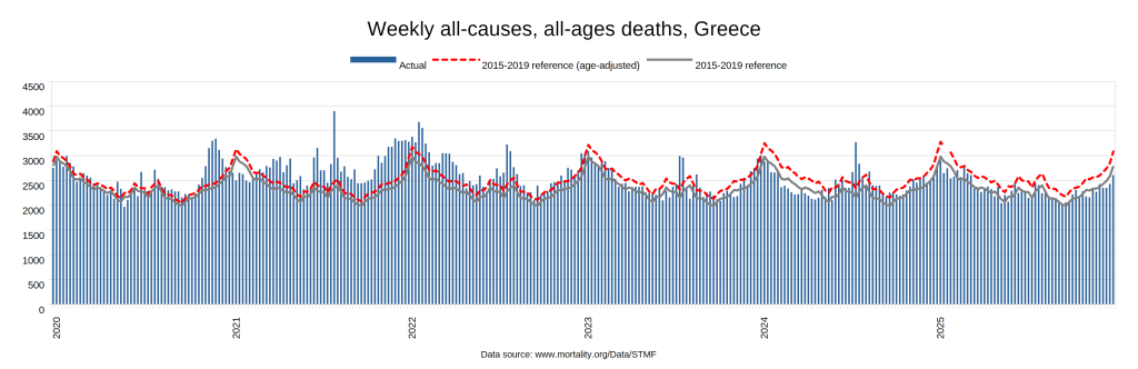
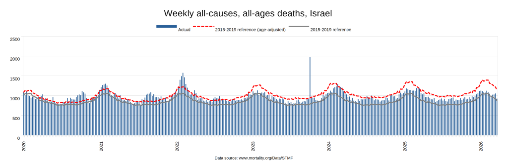
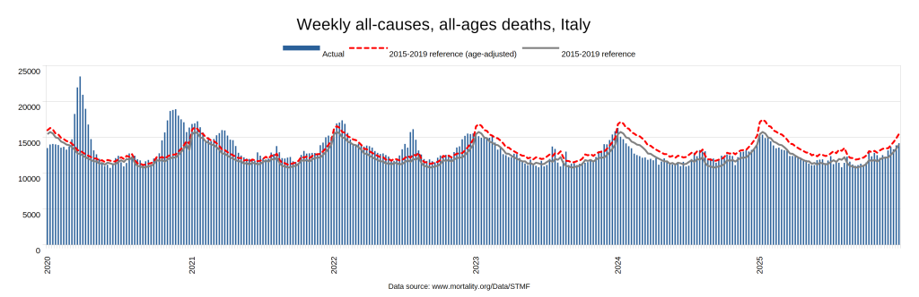
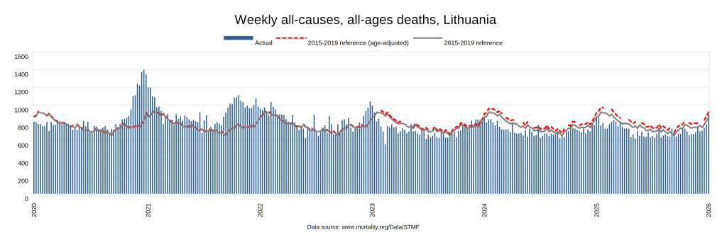
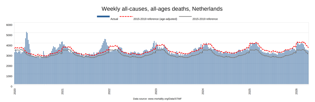
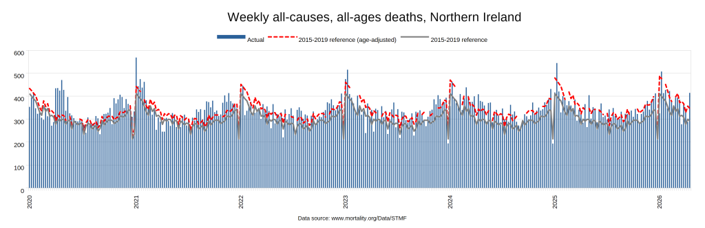
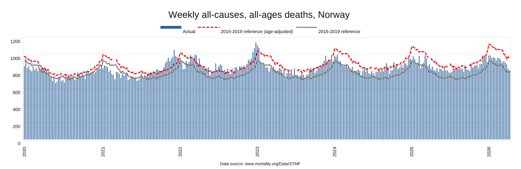
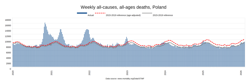
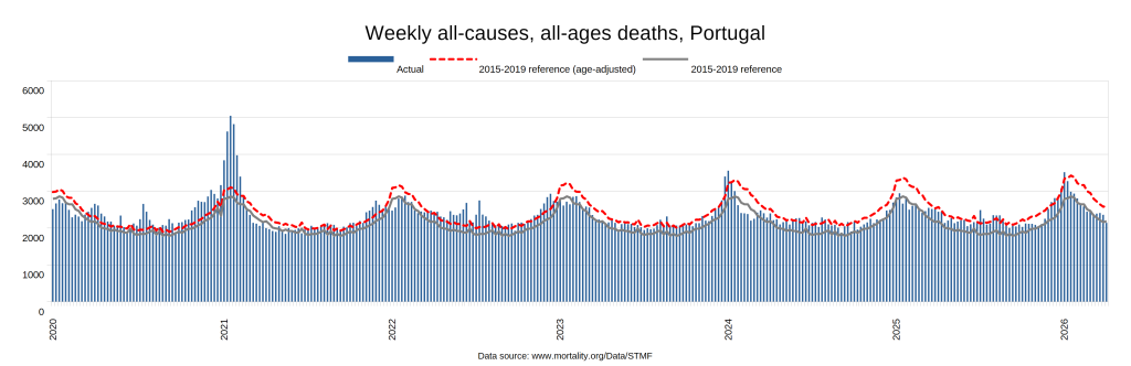
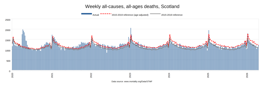
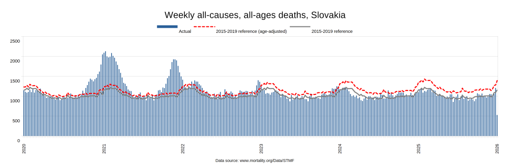
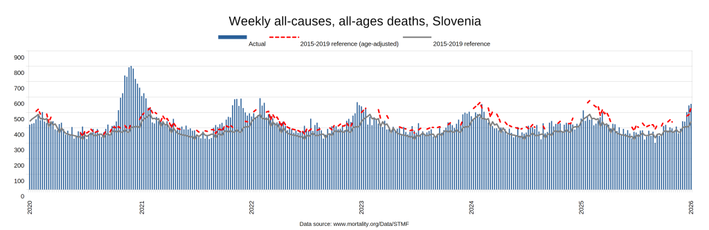
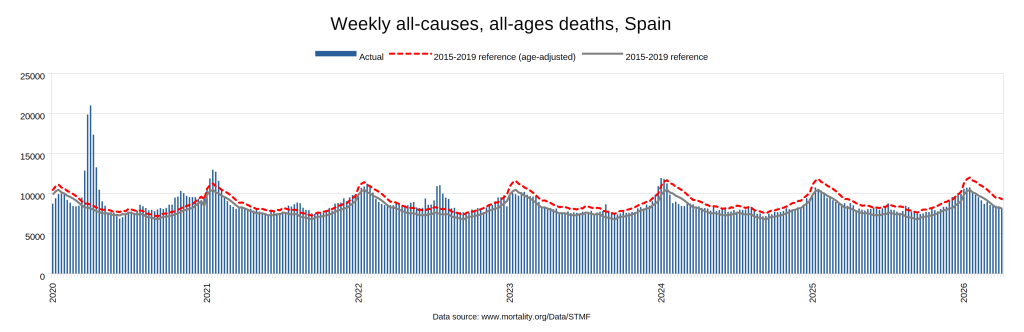
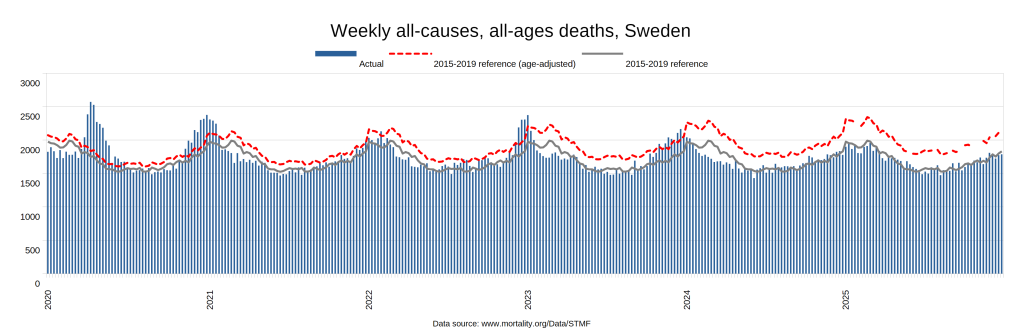
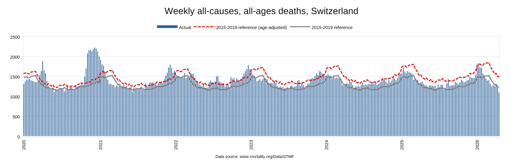
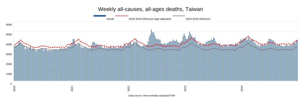
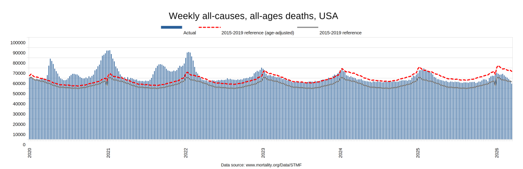
In each graph, the blue bars represent the actual weekly deaths recorded since the start of 2020. The grey dotted line, which depicts the average deaths from the preceding five years, is simply projected onto these years. The red dotted line is the one we need to focus on. It’s the same idea as the grey line, but adjusted for each country’s changing age structure as we move into 2020 and beyond.
So, the red line is the one we need to compare with the blue bars in order to spot ‘excess’. The grey line (which is the one most people have been using) is a trap. I’ve included it to show why people think that excess deaths have grown since 2021. Please read Parts 7 and 8 for a greater understanding of why the grey line is a trap.
The first week of each year is indicated on the horizontal axis.
You’re welcome to conclude what you like from the graphs, but here are some points I think are worth noting:
- There is still no pattern of excess, all-cause death in ANY of the 37 countries in recent years.
- In most cases, the red and grey lines tend to grow further apart as the years progress. This is simply an indication of how much the age-structure of each population changed from the 2015-2019 period.
- For a couple of countries (Iceland, Luxembourg) the death counts in the younger population were so small that age-adjusting produced some null results. Hence the inconsistent red line.
- The STMF dataset has not received updates for South Korea since late 2023.
- I have not included Russia, as it’s most recent data update was 2021.
- The methodology can be found in Part 8.
Here are the graphs: